What Types of Grill Restaurant Logos Attract Patrons the Most?
Consider the possibility of trying a steak at ten different grill restaurants. No names, signs, or identifying symbols are displayed on the food presentations at any establishments. Would you still be able to distinguish between the steaks? How would you rate each restaurant on a scale of 1 to 5?
A successful restaurant requires more than just great food. You must make your restaurant the obvious choice if you compete with many businesses that sell similar food. A strong brand will help you attract new customers and build loyalty with your existing customers. A good place to start is by designing a grill restaurant logo for your eatery.
Your grill restaurant logo is a simple and visually appealing design. The attractive visuals play on diners' impulses and immediately remind them of your delicious food. Today we will take a closer look at 12 components to include in a logo design for a grill restaurant to attract a target audience; further, we will also discuss which logotypes are the best. So let's get started.
12 Things in Grill Restaurant Logo that Attract the Customers.
Here are 12 things to remember that attract customers when designing a grill restaurant logo.
1. Distinguishing Factor
Identify the reasons why you are different from your competitors. Authentic restaurant logos have a distinct personality reflected in their product packaging and service. You only need to think about all the famous grill restaurants worldwide. Like the Frankin barbecue restaurant logo, which was redesigned, uses the image of its owner Aaron Franklin.
The design clearly communicates family, quality, and old-fashioned values. Franklin BBQ does not serve any food that would not be good enough for its own consumption.
Conversely, consider JimmyJacks BBQ restaurant logo shown, which has the wording Smoked Slow-n-low meaning your steak is cooked slowly, which makes it tender and tastier. Also, the gril restaurant logo lists some famous menu items that customers can remember. This is a very good example to learn from. Prepare a list of selling points that distinguish your business from the competition.
2. A Typeface That Expresses Emotion
Sometimes there is no need for symbols in a strong restaurant logo. The wordmarks of Mymangal Grill, Cousins SmokeHouse, and Lava Island BBQ shown below don't depend on an icon to show grilling equipment or emotion and solely rely on a typeface for branding, and you can see they are still quite memorable.
Therefore, it is important to create unique lettering that lends a sense of distinction to the name of your grill restaurant business logo. Your business's tone should be reflected in the font you choose. For example, using a fancy script is not appropriate for a casual breakfast restaurant.
Being creative does not mean going overboard. Even if a professional logo designer creates your grill restaurant logo, it is important to customize it to reflect your brand story.
Consider the example of La Mexican, a Mexican restaurant logo design, which serves Mexican food and has the letter ‘X’ shaped in the form of spices. To a simple design, they add the perfect finishing touch.
3. Customization
Choosing a unique typeface is the best way to get the most impact. Some restaurants like Pancheros Mexican Grill have their lettering customized, making it difficult for other restaurants to copy what they have done easily.
4. Tells a Story
You should make it easy for diners to identify your logo with your products. Ensure you understand your core customers and why they choose to do business with you. Is your establishment family-friendly? Is it authentic? High-end? Is it innovative? Can your food be customized? Is it healthy? Are you traditional in your dining approach?
Smok’n Waynes is a grill restaurant established in 2009. The grill restaurant logo captures the quaint history with an image of a man at the top and the bottom the words ‘All Purpose Seasoning and BBQ Rub.’
It suggests that the restaurant offers a versatile and flavorful combination of seasonings and rubs that can be used to enhance various dishes. The grill restaurant logo design conveys the message that the eatery is committed to delivering a diverse and exceptional flavor experience to its patrons.
The restaurant's imagery shows a Southern atmosphere and a sense of hospitality.
5. Having a Balanced Shape
Don't haphazardly combine strange elements when designing a grill restaurant logo. For example, having round shapes competing with sharp ones is not a good idea. Moreover, large logos appear odd with small inner shapes, leaving a lot of space between the shapes. The presence of a cluttered logo is likely to confuse customers and is not likely to promote your brand. Shapes that are out of balance immediately turn customers off, even if they do not know why.
Therefore, using familiar shapes and proportions as the basis for your barbecue restaurant logo is prudent. Take a moment to recall well-known logos of grill restaurants. Pay attention to the largest shapes in each logo and observe how the smaller ones complement them. Grill restaurant logos are generally composed of circles, rectangles, triangles, and squares.
For example, Texas Roadhouse is a well-known grill and steakhouse chain, and its logo has a balanced and iconic design with a stylized longhorn steer head.
6. Warm and Inviting Color Palette
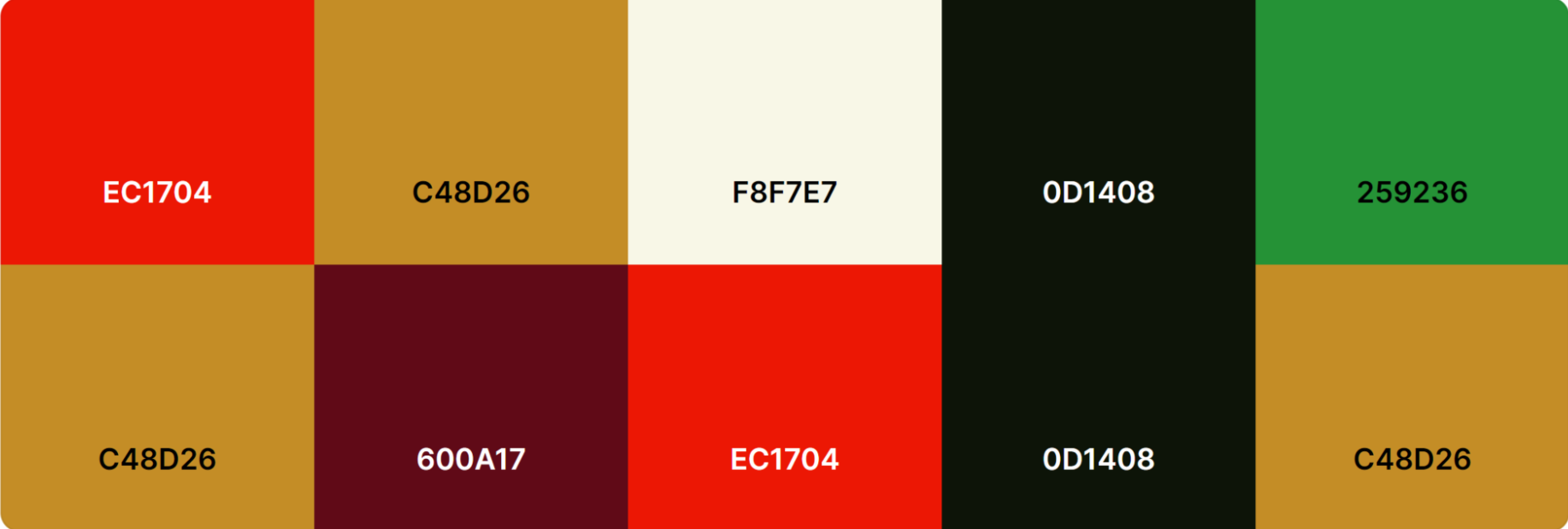
Colors play a crucial role in evoking emotions and setting the tone for a dining experience. Warm and inviting colors like red, orange, and brown are often associated with comfort, warmth, and hearty meals. These colors create a cozy and welcoming ambience, aligning with the comfort of freshly grilled dishes. Here are some color palettes to help you get started with your barbecue and grill restaurant logo design.
7. Emphasize on Grilling Equipment
To make your grill or BBQ restaurant logo stand out and be relevant to your audience’s interest, you can add grilling equipment or related cooking utensils to it. Grill marks, barbecue skewers,tongs, or a grill grate are useful symbols associated with grilling. They represent the restaurant's expertise and passion for crafting delicious grilled dishes.
8. Add Some Flames or Smoke Elements
Flames and smoke are quintessential symbols associated with grilling that you can add to your grill restaurant logo design. Flames show the cooking process, as everyone knows. They also evoke the feeling of food being expertly prepared over an open flame, which must be delicious and scrumptious.
9. Incorporate Some Creative Symbols
Some grill restaurant logos incorporate innovative symbolism that speaks to the restaurant's unique selling points or style. For example, a logo might feature a chef's hat, signaling the expertise of the grillmaster, or a combination of grilling equipment and barbecue sauce bottles, indicating a focus on unique and flavorful marinades.
10. Balance the Symmetry of Shapes on the Grill Restaurant Logo
A clean grill restaurant logo design should emphasize on symmetry if you are mixing different shapes. A logo does not need the same appearance on both sides to be considered symmetrical. The key to a successful design is controlling the amount of space on the design of BBQ restaurant logo.
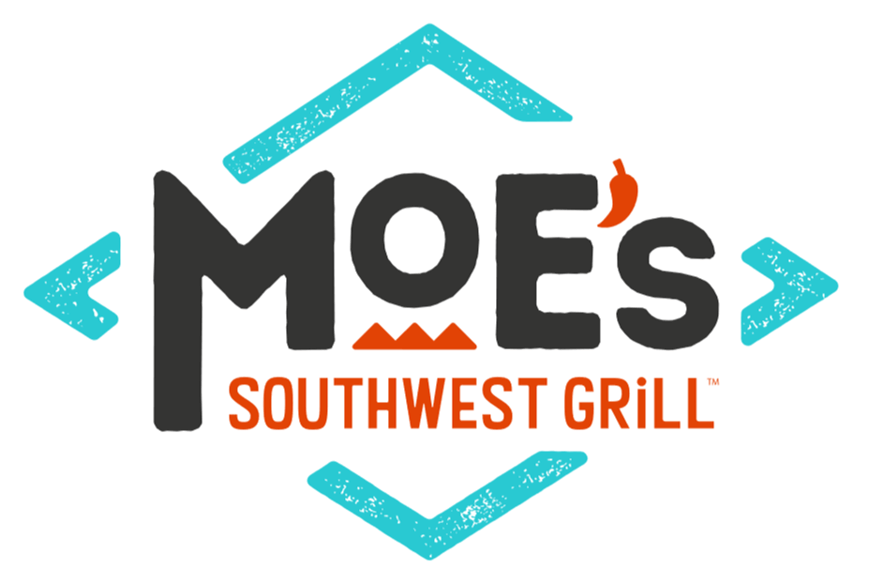
Like the Moe’s Southwest Grill logo shown below. A diamond emblem featuring an abstract grate in the center, with the letters and a chili as an apostrophe balances out the shape and the lettering nicely.
11. BBQ Logo Must Give of Positive Associations
Restaurants must present an upbeat design as they do not want to send negative vibes to their customers. Generally, diners care about their food and prefer to eat in restaurants with a good reputation.
Joy, satisfaction, anticipation, and excitement are positive feelings a BBQ logo can evoke. By tapping into these emotions, the logo is positively associated with the restaurant, influencing the customer's perception.
11. Simple and Easy to Understand
Some stinkers will inevitably pop up along the way. An excellent BBQ and grill restaurant logo takes time to create, but it should be easy to understand. Until you have removed all unnecessary elements, keep editing just like the logo of Memphis style Central BBQ restaurant. A flourish here and there is fine if you don't dilute the design.
Listen to your most loyal customers and get inspiration for your logo. The type of individuals you want to attract in the future may have the right opinion, and you might benefit from their input.
Useful Tips For Designing a Grill Restaurant Logo
If you are unfamiliar with graphic design, designing a logo for a grill restaurant can be challenging. But fret not; here are some important tips to remember. You can hire a graphic designer to design the custom logo, or you can organize an online logo design contest and ask the participants to design a grill restaurant logo per your requirement and choose from numerous logo concepts.
1. Know Your Restaurant Brand
You should determine what your brand stands for before you begin to think about logo design ideas . Consider your restaurant's specialty dish as well as the cuisine you serve. To visualize these details, you can use a logo maker to create a logo representing your restaurant perfectly.
Consider the example of a diner whose speciality is grilled burgers. A burger can be added to the logo. A good example is Burger King, which has a burger as part of its logo. In the case of a grill restaurant logo, you can add grilling action, grilled food and similar to show you specialities.
2. Do a Competitor Analysis
Consider your competitors as well. Creating a logo for your BBQ restaurant that differentiates your eatery from your competitors is essential, but you can also learn from them. See what the logos of competing restaurants look like.
You could benefit from borrowing an idea or two from your competitors to help you reach your target market.
3. Stay True to Your Colors
It is crucial to pay attention to the colors in a business, especially in restaurants, due to the psychological effects of color on patrons’ perception. They can significantly impact your customers' dining section, so you should pick your color palette carefully. Additionally, when designing a BBQ restaurant logo, the colors you choose should complement the aesthetics of the dinning area, location, and ambience.
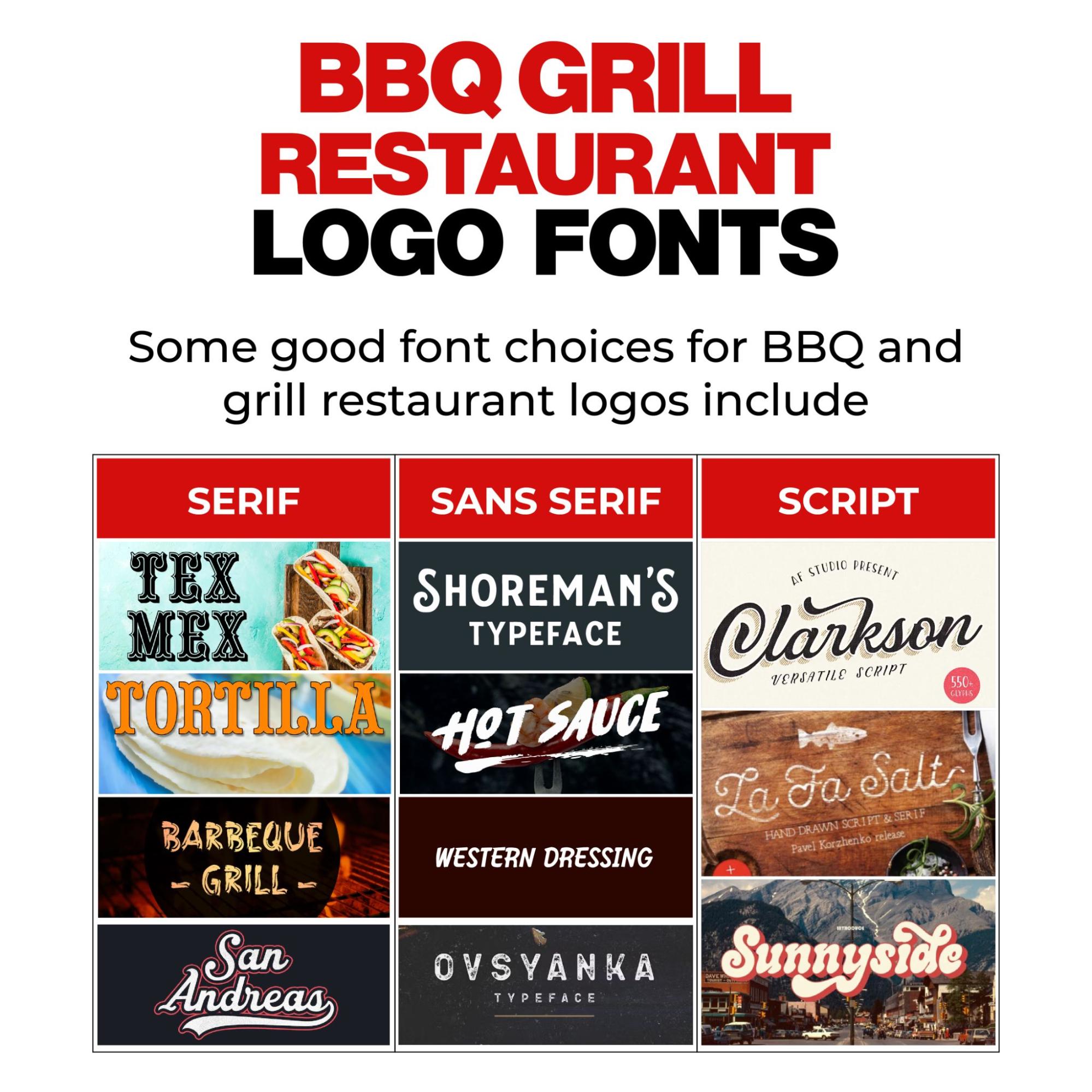
4. Select a Font That Stands Out
The choice of fonts has a major impact on the design of a logo for a business. A font visually represents your brand's class, fun, uniqueness, etc. Your logo can have a negative impact on people's perceptions of your restaurant if you choose the wrong font.
5. Add Relevant Pictures
Symbols or illustrations can accompany eatery logos. Most brands use wordmark logos (logos without images), but you can do whatever fits your restaurant's style. It is also possible to combine the two.
Pictorial logos can assist customers in recognising your BBQ dining business without having to read a name. For instance, look at the ‘Papaws Pit BBQ’ logo below. The image of a person with a grill in his hand is easily recognizable by customers from anywhere.
Similarly, BroBQ has a pig and a cow standing in the logo, which lends it a friendly and welcoming vibes.
6. Your Logo Structure
Lastly, let's take a look at how your BBQ restaurant logo design is structured. Most grill restaurant logos are illustrative and tend to be designed in monogram or badge type of layouts. It is very important in designing a restaurant logo to establish this first because it will determine the type of logo you will end up with. You have a wide range of options to choose from including squares, circles, diagonals, etc., but make sure the design matches your aesthetic preferences.
Conclusion
Grill restaurant logos that attract patrons the most are bold and appetizing imagery, warm color palettes, and custom typography.
The balanced use of grilling equipment and flames adds authenticity, while versatility for branding and positive emotional associations create lasting connections with potential customers. A well-crafted grill restaurant logo sets the stage for an unforgettable dining experience, enticing patrons to savor the rich and savory world of grilled delights. At ZillionDesigns, our graphic designers help restaurant owners achieve the desired look for their brands with skilled and professional logo designs. If you are searching for an outstanding grill logo design for your establishment, this is the best place to start.


