How Chef Logos Express Style, Cuisine, and Personality
If you are a chef, you would know that organic and wholesome food is vital to showcase your culinary skills and to express your passion for cooking–having a well-crafted logo is equally important to promote your chef’s business.
Chef logos are so much more than just a piece of visual that represents their culinary art; these logos have the power to express style, cuisine, and personality. These logos give chefs their unique flavor and identity that sets them apart from other chefs in the game.
You need to be thoughtful with design elements such as imagery, typography, and color when making a flavorsome design. So if you want to learn how to design a chef logo that effectively conveys meaning behind your particular culinary style, cultural influences, and personal flair, then this article is exactly for. We will dive deep into how crucial your identity designs are for expressing the individuality and character of the chefs.
The Power of Logo in Chef’s Branding
People love to be shown things instead of being told. Visuals create more meaning than words. That’s why it is said that every image tells a story because images have an impact on how we perceive and understand things.
A chef's logo is the face of their brand, whether it's a personal chef offering private fine-dining experiences or a renowned chef running a high-end restaurant. A well-designed logo helps the chefs create a distinct culinary identity that sets them apart from their competitors.
1. Embodying Brand Personality
Just like every chef has their personality, in the same way, each chef has a unique brand identity. The job of the logo is to capture the essence of a chef's brand and reflect it in the form of visuals.
Whether you want your chef logo design to exude elegance and luxury, or create a custom wordmark with your name that sparks a sense of warmth and approachability, make sure it is aligned with the overall brand image and relates to the taste of your customers. You can look for similar industries for inspiration like fast food logos and restaurant logos.
2. Presenting Chef Expertise
A design is sometimes used to reflect the skills and expertise of the chef. Suppose, a chef specializes in fine dining and gourmet cuisine. He will look for elegant and sophisticated chef logo templates, with sleek and professional fonts.
On the other hand, a chef known for his fusion cuisine may choose a more vibrant and dynamic logo, with diverse colors and symbols across different cultures and traditions.
3. Inspiring Trust and Confidence
A well-designed personal chef logo not only shows a chef's culinary style but also builds trust with the customers or clients. Many people recognize brands with their logos and in the food industry, this becomes even more important. You need to inspire trust and build a loyal clientele that keeps coming back to try your special cuisines.
Infusing Cultural and Regional Elements in Chef’s Logos
Food is often intertwined with culture and heritage, and by incorporating design elements that reflect a specific culture or region, the chef's restaurant logos communicate a sense of authenticity and tradition. For example, if you own a Mexican restaurant you will use symbols like Mexican hats, jalapenos, or mustache in your Mexican restaurant logos.
For traditional Chinese restaurant logos, popular icons are chopsticks, Chinese dragons, and takeout boxes. Or if you own an Indian eatery use elephants, mandalas, or spices symbols in your Indian restaurant logos.
Incorporate these symbols to connect with your customers on a deeper level. Here are some design elements you can add to your chef logo.
1. Visual Imagery
For your logo, you can express your culinary style with visual imagery and convey a sense of elegance, simplicity, boldness, or playfulness.
Images give immediate hints about the types of food and flavors the restaurant serves as well as the specialty of the chef. This can be done using icons such as ingredients, utensils, or symbols associated with a specific cuisine or food culture.
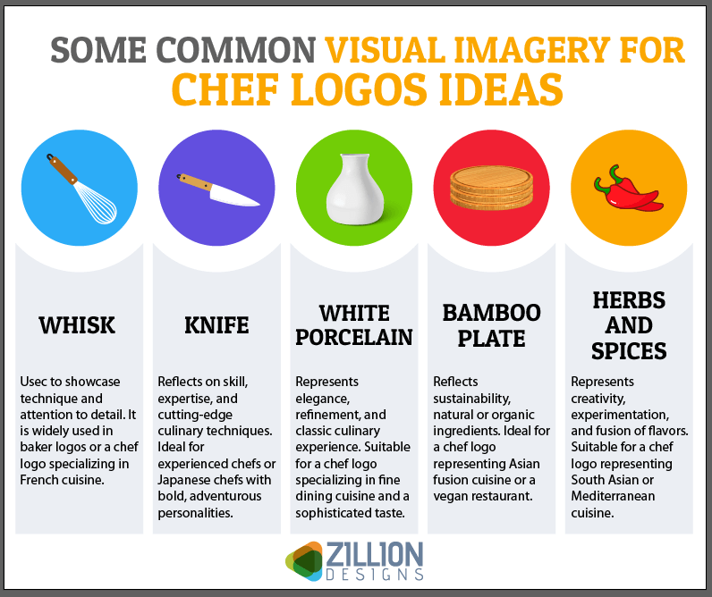
For a modern culinary brand image, create a clean and minimalist design. You can also use detailing and symbolism for a more traditional or artistic style. Some common visual imagery for chef logos ideas:
- Whisk
Usec to showcase technique and attention to detail. It is widely used in baker logos or someone specializing in French cuisine.
- Knife
Reflects on skill, expertise, and cutting-edge culinary techniques. Ideal for experienced chefs or Japanese chefs with bold, adventurous personalities.
- White Porcelain Plate
Represents elegance, refinement, and classic culinary experience. Suitable for chefs specializing in fine dining cuisine and a sophisticated taste.
- Bamboo Plate
Reflects sustainability, natural or organic ingredients. Ideal for a brand image representing Asian fusion cuisine or a vegan restaurant.
- Herbs and Spices
Represents creativity, experimentation, and fusion of flavors. Suitable for designing a chef logo representing South Asian or Mediterranean cuisine.
- Chilli Pepper
Symbolizes boldness, spice, and intense flavors. Great for a Mexican cuisine expert with a fiery, energetic personality.
- Wok
Represents versatility, speed, and dynamic cooking skills. Ideal for a chef logo representing Chinese cuisine who has an energetic, and adventurous personality.
2. Typography
Typography plays a crucial role in expressing the personality of the chef. Font choice can greatly influence the overall design and message of your chef logo.
Different font styles evoke different emotions and you can use this to reflect the chef's unique personality, culinary style, and restaurant brand identity.
- Sans-Serif Font
The logo of celebrity chefs Gordon Ramsay and Jamie Oliver has his name in a bold and modern sans-serif font. The fonts convey a sense of sophistication and professionalism. The sharp edges and clean lines reflect the chef’s professional personality.
- Serif Font
Nigella Lawson's logo uses a Serif font to convey her culinary style and personality. The font name is "Playfair Display," a classic serif font that has an air of sophistication. This font choice reflects Lawson's focus on creating an elegant food experience.
- Script Font
Handwritten Script font is often used by high-end chefs too. This font gives the logo a sophisticated yet approachable feel. Use it to reflect attention to detail and a perfectionist personality. This font is mostly used in fine-dining restaurants. The script font adds a personal touch and a sense of authenticity.
3. Color Palette
Use a color palette to create a chef's brand identity and communicate their unique cuisine, and personality to the customers.
Research on color psychology, and see which colors help the chefs to express style, cuisine, and personality. In a chef's logo, these hues can convey various aspects of the brand's identity. You can also see them in food logos for eateries or organic brands.
| Color Combination | Association |
|---|---|
| Red and White | In private chef logos, red and white represents a bold and confident style, associated with Italian, Mexican, or French cuisine. |
| Green and Brown | Green and brown are the perfect shades to choose if you are creating a logo for organic or vegan food. This color palette is associated with nature and freshness. |
| Yellow and Orange | This a more vibrant color combination that can represent bold flavors like Indian, or Caribbean cuisine. These shades are great options for chefs who are adventurous with different tastes. |
| Blue and Orange | Blue and orange shades give a clean and fresh feel to your chef brand symbol. When used together, these colors work well for your seafood restaurant. |
| Brown and Cream | If your restaurant serves home-cooked meals or comfort food, you can use shades of brown, beige, or cream. These colors evoke a sense of nostalgia and traditional food. |
| Black and Gold | Black and gold add sophistication or luxury to your chef logo. So if you own a high-end or gourmet restaurant, you can play with these colors. |
4. Illustration or Mascots
If you want to make your chef logo even more memorable, you can add visuals like illustrations or mascots. You can also portray your unique style or culinary expertise by adding a particular icon like a knife, or chopping board.
You can add an elaborate mascot that represents your brand closely or go with an abstract design as well. The colors, appearance, and design of the logo could let your customers know what kind of cuisine they can expect from you.
Some illustration and mascot concepts for chef logos ideas include:
- Vegetables or Fruit Pictorials
These logos convey a sense of fresh, healthy, and plant-based food. Used in a vegan or vegetarian brand design to emphasize natural and wholesome cooking.
- Animal Mascot
Animal mascots can be related to a more meaty diet or cuisine. Mascots like cows or bulls could be used by a chef who specializes in grilled meats or steakho use-style cuisine.
- Chef Character
For a personal restaurant logo, you can use an illustrated chef character. This approach is used to highlight the chef’s personality and unique style of cooking.
- Utensil Mascot
Utensil into an illustrated mascot can add a hint of playfulness to a chef's logo. A smiling spatula or a knife and fork combo can represent a chef focused on the skills in the art of cooking. This also conveys a sense of joy.
- Food Element Mascot
An illustrated character of a specific food item can tell which type of cuisine the chef cooks.
- Culinary Tool Mascot
Using a culinary tool as a mascot can represent a chef's craftsmanship and attention to detail. It also removes any doubts about the chef’s expertise or cooking techniques.
Final Words
Chef logos are not just graphic representations of the brand but also express their style, cuisine, and personality.
From personal logos to those of restaurants’, these logos capture our senses and take them on a flavourful journey across different regions. Your design should be inviting and at the same time sleek enough to highlight their skills.
We have discussed all the design elements you can add to your chef’s logo design to make it more personalized to your chef’s brand or restaurant. With these design tips in mind, you can work on creating logos that are more than just a generic icon but reflect your individuality, passion for cooking and expertise, and the chef’s artistry and craftsmanship.


