Selected Logos / Category: Food & Catering / Bakery & Patisserie
Bakery & Patisserie logos
By Staff Writer
Mouthwatering Bakery and Patisserie Logo Design Guide
In today's fast-moving and competitive baked goods industry, having a distinct and attractive logo design can mean the difference between winning audiences or losing them to your competitors. When it comes to the irresistible smell of freshly baked cakes, pies or muffins, there are only a few other things which prove to be as tempting. Fortunately, with the right designers to help you, you too can integrate this very aroma into your bakery and patisserie brand.
It makes perfect sense when businesses incorporate imagery and concepts of their particular niche and revolve their brand identity design around that. However, bakery logos are unique because they aim to directly influence the two rather prominent motivators of taste and smell. If you use just the right descriptive tools and symbols, you'll tapping into your customers' senses and motivate them to choose your brand.
Learn to create a logo that beautifully communicates the taste and texture of your products, one that takes advantage of the power of only a few images and words. This is one of the best ways you can distinguish your brand from your competitors and make yourself heard.
Here are some ways of accomplishing that.
Bringing Effective Design Together
There's often much more to working on a bakery logo than baking itself. Rather than using sugar, flour and yeast, you will be using the power of colors, words and imagery. All of these factors combined will help, you come up with inspirational creative ideas and designs which truly win over consumers in a heartbeat.
Discussed below are some key fundamental elements to consider.
Images to Wet Your Customer's Palate
With bakeries, images of cakes and pastries spring to mind instantly and this is why you often see their images in their logo designs. This isn't true for all bakeries of course because many also use the image of a baker or baking utensils.
You must be careful when choosing images because dull, lifeless or bland images can portray something that's not fresh. Some other images which can be used include utensils and other bakery-specific products, kitchen imagery such as bakery boxes, a chef's hat or apron. The color tones which are used the most are pink, brown, white, light blue and cheery pastels which employ a striped and multi-colored pattern. But you need to use colors sparingly and in a perfect contrast so that the logo is pleasing to the senses.
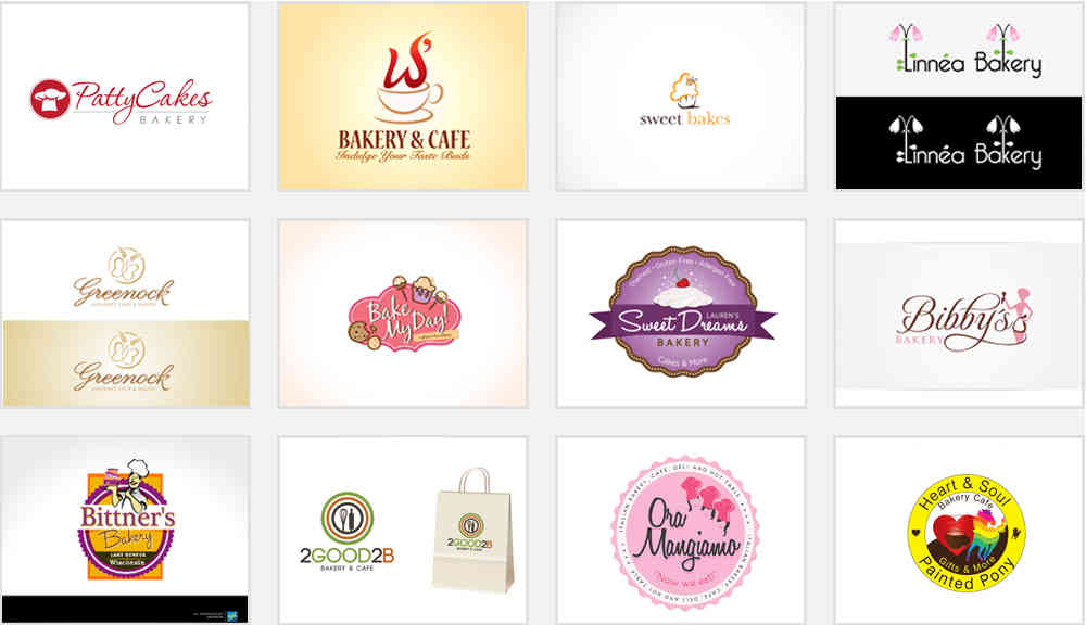
Delicious Bakery Logo Design Samples


Logo Specifics
Baked goods offer a line-up that's as endless as it is delicious. It is absolutely vital to design your logo around specific traits of your bakery. So you have got to ask yourself, 'what's your strong suite?' Is it cupcakes, artisan breads or donuts? Maybe you specialize in a particular bakery style like whole organic ingredients only, if so then your design needs to be firmly planted around these traits. These are subtle attributes that have a major impact on how you select imagery and words that help you in putting your logo out there.
The basic rule of thumb is that the more specialized your bakery products, the more distinct and specific your logo should be. This is essential because your end goal is to reach the intended audience
Patisserie Logo Design Samples


What's in a Color?
Bakery logos ought to look just as good in black or white as they do in color. This gives you access to the broadest range of mediums. Basic elements work best because it helps you avoid overshadowing when you're converting from color to white or black.
Several mainstream bakery logos stick to a balanced layout by arranging their images and words against a neutral background - single color, with the text and art highlighted through framing.
Undoubtedly, among the best methods of uplifting the overall appearance of your logo is simply by adding a color scheme that's both warm and eye catching. You may have noticed how brown and pink are usually the most common color schemes used in bakery and patisserie logos. However, color combinations can always be experimented with so you don't need to restrict yourself.
Font Sensibility
Paying attention to your font is just as essential as any other component of the logo. The image and color scheme aren't of much use if the fonts don't look good with them. So, carefully selecting the font style that works well with your brand medium is paramount to the success of your logo design. These are all good examples of exceptional use of font style:
Typography Based Bakery Logo Badges

Source: engabito/istock.com
Leave it up to the Pros
Finding just the right logo design for your bakery and confectionery business is sometimes easier said than done. But its importance cannot be stressed enough because it is a key component of building your brand. Customers always remember a name and logo that's memorable and easily identifiable.
Leave it up to a quality brand design company to cover the bases for you. Make sure you understand what's included in the quote for the logo design. It's always good to know what you're getting in writing because it will help the logo design process run without any bumps from beginning to end.
Don't be shy to get customer testimonials when looking for a designer, as your pro-active efforts can really help fulfill the vision you have for your business.
