How to Design A Professional Business Card With Modern Layout
Every day, more companies are emerging, branching from industry growth. You have only one opportunity to make your first impression on potential customers — either you or your business card.
The small-sized yet mighty, business card talks about your brand and serves as a good and effective way to impress and keep in touch with your customers.
But if your business card is impersonal or poorly designed, it can only endanger the image of the company and turn that chance of great first impression into a total bust.
Therefore, some basic rules in designing a visiting card must be put to practice to create at least a standard version of the card but if you require something more professional you can hire graphic designers to design a business card for your personal branding or for your business needs.
What is a business card?
A basic business card is a card that contains information about a company or an individual. These are usually exchanged at business meetings, conferences, seminars, trade shows, and so on.
A business card usually contains a company logo, the name of the provider, the position in the company, the address, the telephone, fax number, and sometimes a tagline.
Traditionally, for a very long time, business cards only had black text on white paper, but since technology has advanced, business cards have become increasingly complex and creative in their layout and design. New business card trends have emerged over the years.

Among the many trends, some of the most exciting ones have to do with the different unconventional shapes of business cards, textured materials for printing and new techniques, modern and edgy designs.
These are now the norm for modern and trendy business card designs. You must understand how they can be incorporated into your layout to make an outstanding business card.
Visual Hierarchy of Information
Visual hierarchy is one of the principles of designing an effective business card. It helps designers guide the viewer from one piece of information to another.
If the business card design is for people working for a company, for example, then each card will have the business logo on it. If you’re a company, then you must know that a logo design will amplify the brand’s identity in a number of ways and not only on the visiting card.
A logo is just one kind of information on your business card.

The second piece of information that should be on the business card is the person's name, so receivers know who gave them this card.
Third would be contact information like telephone, address, website, email, etc.
These three pieces of information are sufficient enough for a business card because it is just a small item in the branding stationery.
Social Media
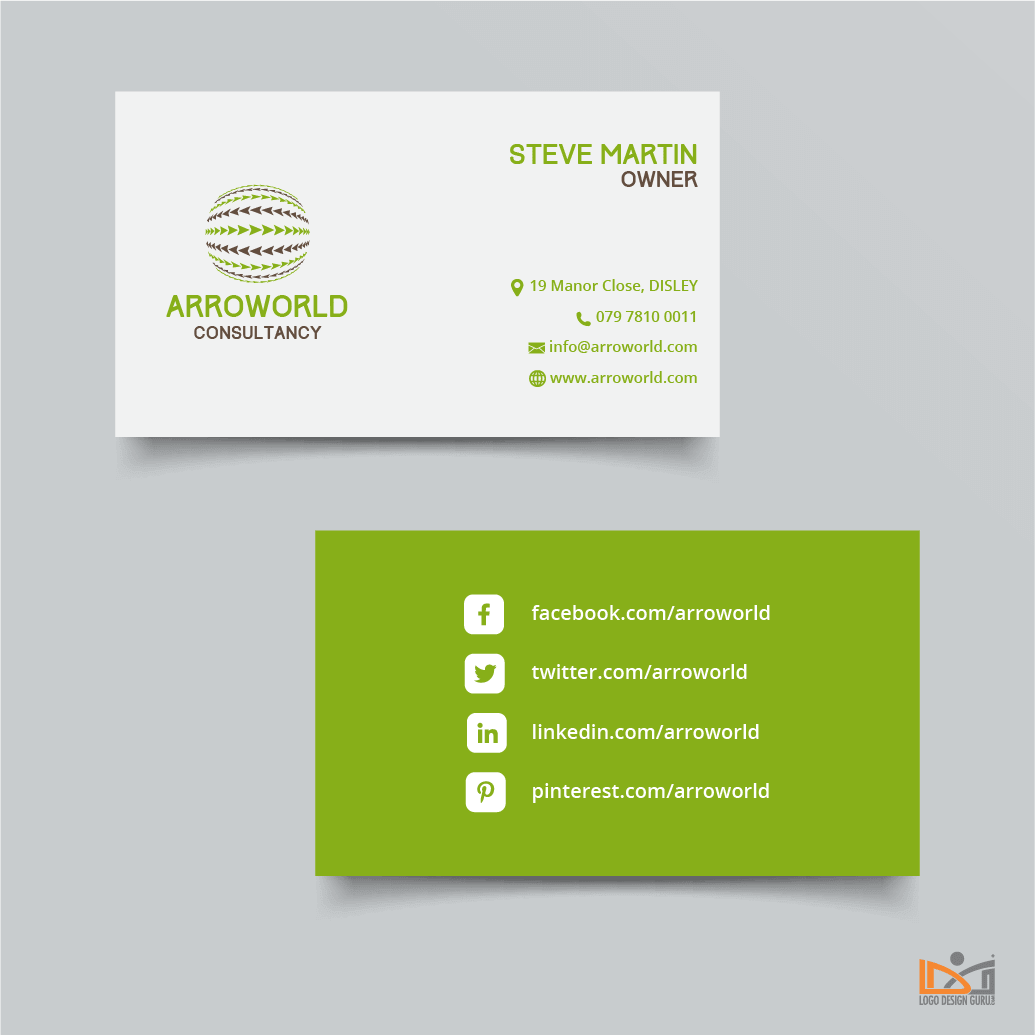
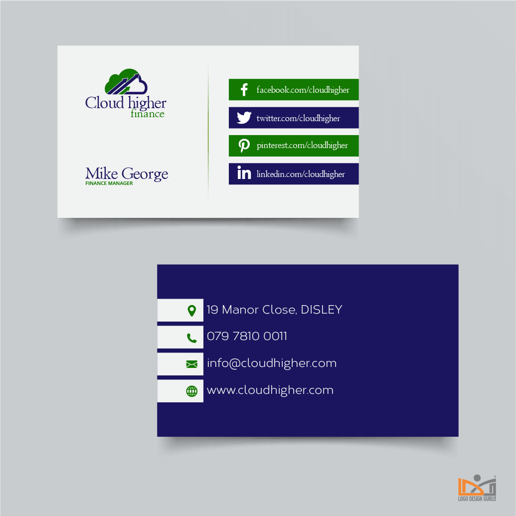
Next in-line within the hierarchy of information and design is social media. In today's digital environment, almost all companies have an online presence. They are on different social networking websites like Facebook, Twitter, Instagram, and YouTube, etc.
These platforms have become a vital means of communication, and so you need to display them in your business card design.
Although, by the standards of clean and minimal design, they are not necessary information for business cards and that business card may look too crowded and not so professional with all this information, but today's way of communication dictates that business cards should contain anything that helps people connect with you.
For designers themselves, promoting skills and business through social media on the web or off it through a visiting card is a good idea.

Putting all these elements of design on a relatively small surface of a business card can be a real challenge for designers, so avoid writing all names of social media platforms in letters and instead use social media icons.
Icon designs come in all shapes, sizes, and colors, so explore your way through a variety of icons available for free and add the most befitting ones.
This job may be efficiently double-sided business cards because then you can put all social media handles and URLs at the back of the business card. However, sometimes a designer doesn’t have this luxury of space because each design varies according to the client’s creative brief.
QR Code
Another recommended element for modern business cards is the Quick Response Code, abbreviated as QR code. It is the trademark for a type of matrix barcode (or two-dimensional barcode) first designed for the automotive industry in Japan." - Wikipedia.
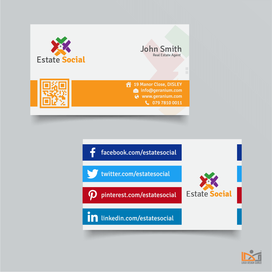
QR code is easy to create and replaces a lot of information, and by doing this, the job of designers becomes easier. Well, instead of adding an assortment of text and icons, they can put a code that leads the people to the details of the business or the person. One can drive viewers to a website, others can make an instant SMS or lead you to a social media profile.
You can use an online tool to create a QR code, such as a proficient QR Code Generator.
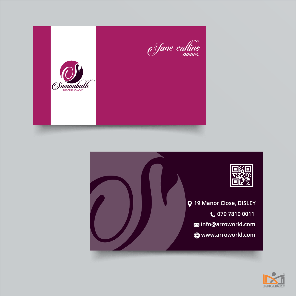
The position of QR code on your business card may vary, but sometimes it's better to put it in the back so it won't draw attention from primary information on your business card.

On one business card, one QR code is sufficient, but some people try to squeeze in two, and although they manage to do it, they jeopardize the look of the card — and appearance is critical when designing a business card.
Fonts
Among all the elements in a business card, choosing the right font is crucial. In many business card designs, the name of the person or the business in plain text is written using any one of the sans serif fonts, such as Roboto. This is because non-serif fonts are easier to read, especially when the font size is smaller than usual.
It largely depends on the brand itself but in some cases, even decorative fonts can be used for some information. It's not recommended because some decorative and festive fonts are hard to read when the font size is less than 12 points and this can annoy the reader, and as a result, your card will end up in the bin instead of landing on someone’s desk. So keep your business card away from trash by using legible techniques.
Also, telephone numbers and addresses should be easily readable and that can be achieved with slightly more kerning. Space between letters can contribute to easier reading because letters don't appear as though they’re stuck together.
Today, there are a number of fonts available for designers to choose from. A business card design can have one typeface or the designer can do creative font pairing for an interesting look. Fonts come in many styles and they are available on several online websites giving typefaces out for free or paid.
With different font styles, you can emphasize important parts of your business card. In some instances, designers bold the text such as for words like “contact/telephone” or “website” for emphasis. In other instances, designers change the color of the text to segregate one information from another.
Rule of thumb: to make a good business card you should never use more than 2 different fonts in your design.

Material
One of the things that can make a business card stand out from a bunch of others is material selection. According to the business type a card represents, various materials can be used. A professional carpenter can have a wooden business card, for example. The possibilities are endless.
Shape
If you want to draw attention but can’t afford an expensive or higher quality material or paper, then play with the shape of the business card.
Basic shape psychology can help you select the right one for your card but you can always experiment with more geometric and organic shapes. Make sure that whatever you do will impact your brand so pick wisely.
Size
Designers and clients should keep one important thing in mind when designing a business card: the size.
Because the purpose of a business card is to remind someone to keep in contact with you or to call you and start a business relationship, it's important that the person keeps your business card.
It's highly unlikely that someone will keep a business card larger than the standard size because it might not fit in their wallets or card-holder.
Some standard business card sizes are listed as under:
US size: 3.5 x 2 inch (88.9 x 50.8 mm)
EU size: 3.346 x2.165 inch (85 x 55 mm or 90 x 50 mm)

These are the recommended sizes for standard business cards. In case, you want to experiment then there is no limit as long as the card doesn’t become a hassle for the person holding it.
Bottom line is that in traditional marketing, a business card is an important commodity and if you follow these simple tips then your business card will fulfill its purpose.
Written by Raquel Addams
