Creative Brief
Wrap for Food Truck
Mars Needs Pizza
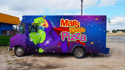
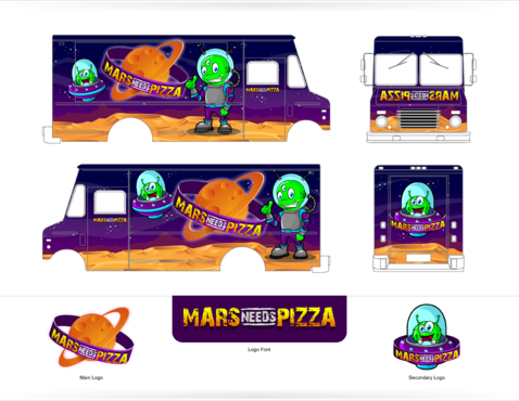
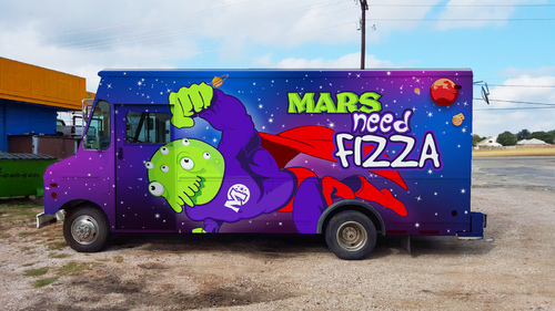
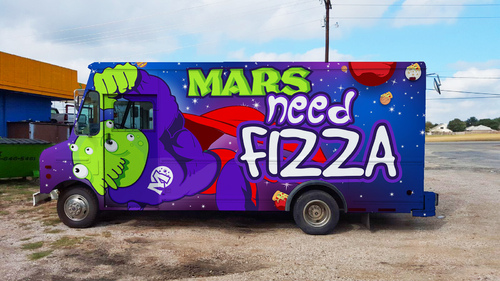
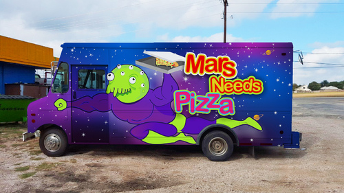
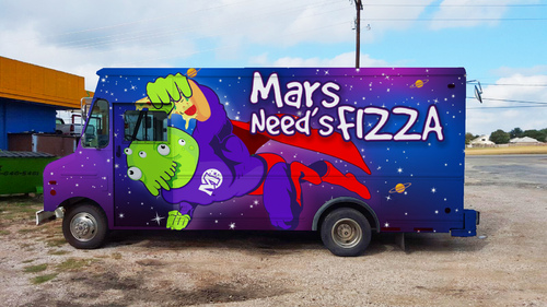
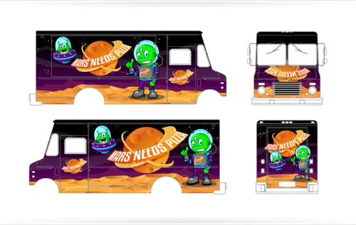
Mars Needs Pizza is a Food Truck... we are looking to create a wrap design for it... Mars Needs Pizza is a play on the 1967 Movie... Mars Needs Women where the Martians were coming down to grab the most beautiful and smart women to repopulate Mars. Below I will give you a dropbox folder link that contains several folders. https://www.dropbox.com/sh/i5yn5e70zmhp3to/AACEWKHua7KajlOFUhUr9iZja?dl=0 There is a folder with Food Truck designs I thought were pretty cool for one reason or another, feel free to ask questions. Background: This food truck park is also part of a food truck park we will be building called Gizmos Landing which is an Outer Space theme.. It will be called Gizmos Landing -,Out of this World Food, Fun and Entertainment. Once that is built we will be adding more food trucks, with a similar outer space theme like Mars Needs Pizza. I've included a folder with the logos we expect to use for Gizmos as well. I've included a folder with what a Food truck Park looks like although you can google them easily. And I've included a folder with the Truck we are redoing. On the passenger side keep in mind where the food window is. I think my favorite truck is the Moonstruck, it just really pops, although I don't care about the head gimmick. I like the lettering of the "Be More Pacific: in that it really appears 3d - great shadowing, carmelas is clean and crisp, chiva torta is bold and simple, edwards drive in reall cool 3d look, LA juice is bold and alive yet simple, little red riding truck is really cool as an animated background and scene, pho junies is really cool with the zombie theme signs and lettering work, pinche tacos went the logo route with a background and it looks clean and classy, slicks big time bbq I like the lettering how it stands out.. the snake bus.. I just like how real it looks like the sake is wrapped around and squeezing.. great effect.. good theme.. good lettering... especially on the passenger food side.... Super Q... love the idea of the character... could have been a little more pop in color... i think.. frying dutchmen... pretty cool little more contrast and I think it would have popped.. and make the letters pop out more... The wacky wing truck... looks really good.. not sure what could make it great like i like moonstruck... but, its really good.. what the fork is probably my second favorite truck... It's simple and the type is perfect for the style they chose... up in smoke... is cool... love the 3d saloon look.... a little too busy... but, on the otherhand... often if the detail is right it keeps looking at the art... one of my favorite artists growing up did painting of landscapes/wildernesses... and you always had to look closely for the animals in the painting...
Food
So, my audience is the folks who want fun and fast casual great pizza... I love Bright and Bold, Contrast and Pop... theres also a personal logo in that folder to give you an example of something I like...
I'll need to vector or PSD when you are finished, and because its going on a truck it will have to be high resolution so it can be blown up.. the truck is 18ft long. The initial images for display can lower resolution, just if you win, I'll need high res.


