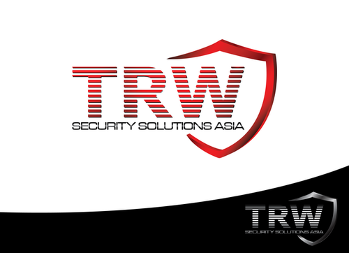
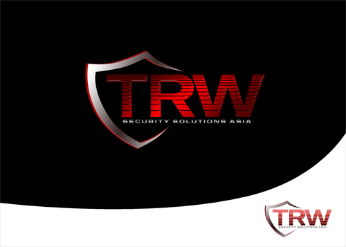
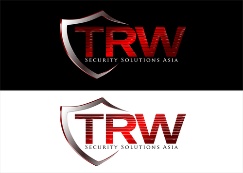
TRW ASIA SECURITY LOGO
TRW Security Solutions Asia
|
Contest Holder
albrechtar
?
Last Logged in : 5035days8mins ago |
Concepts Submitted
96 |
Guaranteed Prize
250 |
Winner(s) | A Logo, Monogram, or Icon |
|
Live Project
Deciding
Project Finalized


Creative Brief
TRW ASIA SECURITY LOGO
TRW Security Solutions Asia
No
TRW Security is a holistic security solutions company that provides VIP protection, site security, and airport security and training to military and government.
Security
Symbolic
![]()
Abstract Mark
![]()
Initials
![]()
Unique/Creative
Corporate
not sure
Would like something that stands out looks professional and will set us apart from other companies within our industry.
Related Contests


Comments
Project Holder
Project Holder
Project Holder
Project Holder
Project Holder
Project Holder
Project Holder
Project Holder
Project Holder