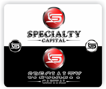
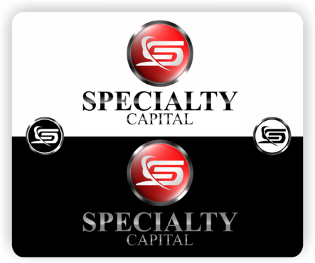
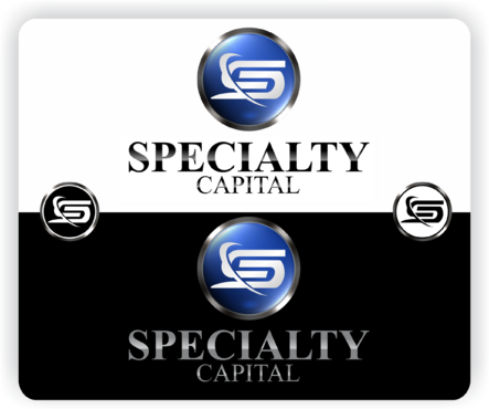
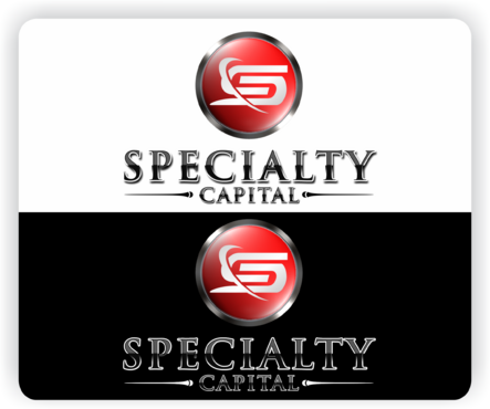
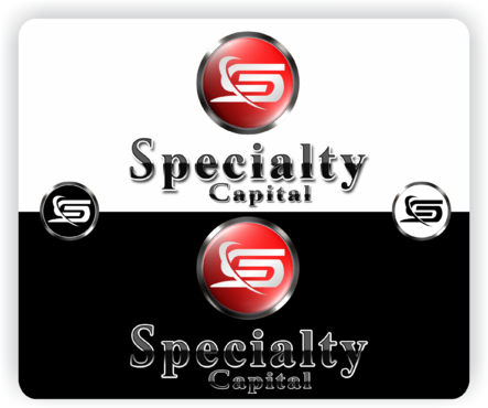
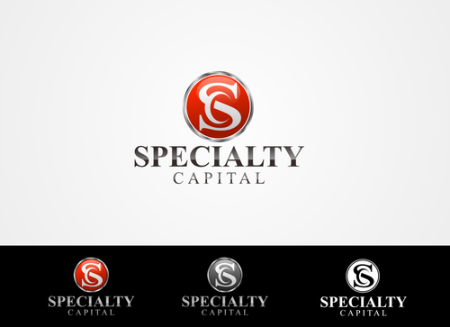
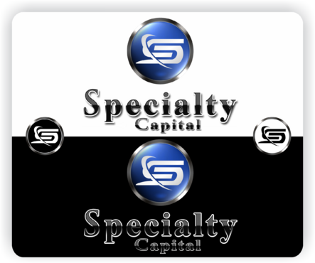
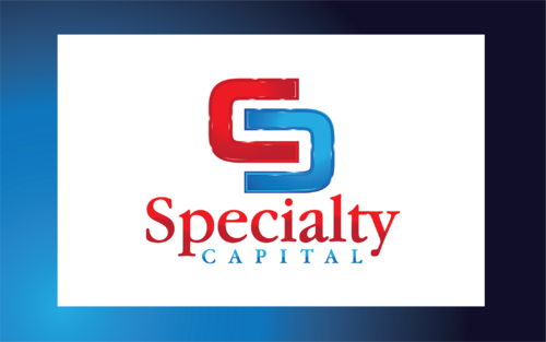
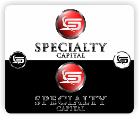
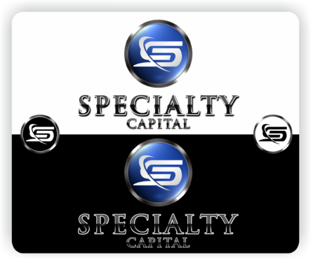
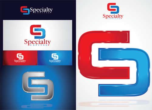
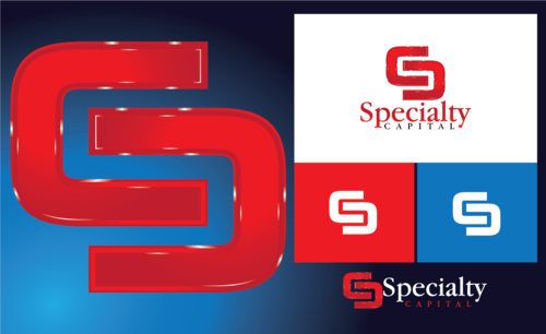
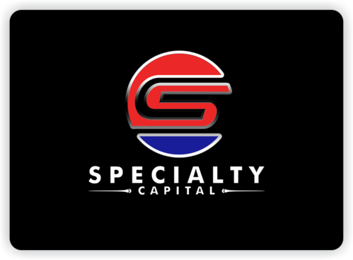
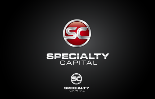
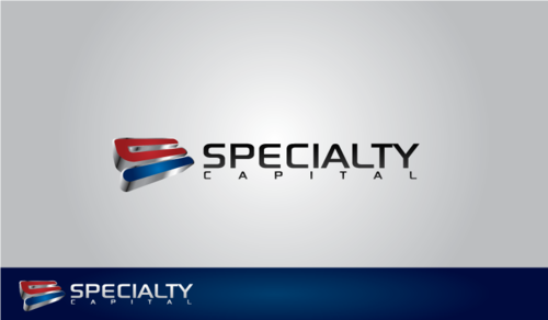
Specialty Capital Logo
Specialty Capital
|
Contest Holder
cdarcene
?
Last Logged in : 5041days12hrs ago |
Concepts Submitted
577 |
Guaranteed Prize
600 |
Winner(s) | A Logo, Monogram, or Icon |
|
Live Project
Deciding
Project Finalized


Creative Brief
Specialty Capital Logo
Specialty Capital
Yes
This company is a leasing/financial company.
Energy
Logo Type
![]()
Symbolic
![]()
Abstract Mark
![]()
Initials
![]()
Illustrative
![]()
Character
![]()
Cutting-Edge
Sophisticated
Corporate
The colors are flexible, but I would lean more toward red or blue.
3
3-D look. Also I would like the logo design, after chosen, to be sent in a .eps and .jpeg format. The more detailed the design the better. Quality is very important.
Related Contests

Comments
Project Holder
Project Holder
Project Holder
Project Holder
Project Holder
Project Holder
Project Holder
Project Holder
Project Holder
Project Holder
Project Holder
Project Holder
Project Holder
Project Holder
Project Holder
Project Holder
Project Holder
Project Holder