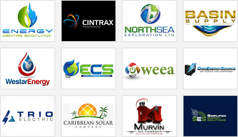
Selected Logos / Category: Production / Oil & Energy Company
Oil & Energy Company logos
By Staff Writer
Oil and Energy Company Logo Essential Elements
The energy sector is intensely focused on increasing ROI and improving customer relationships, but branding strategy usually takes a backseat. However some oil and energy companies are now realizing that a brand identity can help survive the existing competitive market. Indeed, a strong trademark positions your company among your contenders while creating consumer awareness. Hence, the logo of an oil and energy business is the building block on which your company's entire branding relies.
An extra crisp in a simple logo design can work wonders for oil and energy enterprises. From newsletters, packaging material, web appearance to brochures and visiting cards, a professional company logo design brings all elements together to create a face for your brand. An oil and energy company logo lays the foundation of the brand marketing strategy that has been designed to capture consumers' imagination. In some cases, there is no competition in a local market but the company logo design is important for developing customer perception and loyalty.
Why design a logo for oil and energy company?
An oil and energy company logo symbolizes what your business represents - the quality of service, your promise to the customer, your company's unique selling features. So, if you don't have a brand identity, you are certainly missing out on a lot of marketing possibilities. This is a diverse world and the creation of a logotype is the first step to brand positioning and development. The brand symbol of an oil and energy company becomes a unique identity with which customers recognize your existence and have a lasting memory of the trademark you carry. For a further glimpse into logo design and branding elements, reads on!
Basic shapes
Usually in the world of logo design, a simple idea is lost among a cluttered design. Some oil and energy companies have refrained from this mistake and created an interesting pun with basic shapes to produce symbolic logos. Certain basic shapes like triangle, circle and square appeal to us logically and add an extra bit of symbolism. It is a definable element that can turn something simple into legendary and designers use these shapes to create emblematic logos. Sometimes small circles are used to create radiations from the sun or triangles are used to encase company initials, either way the strategy to use basic shapes works.


Font and typography
The typography is usually simple and legible that easily gels with logo imagery. Most energy and oil business logos have used existing fonts and those who created new ones did not go overboard. When the font type is chosen, certain factors are considered including the amount of text to be read, the contrasting colors and the amount of space available. A general rule of thumb for the industry in question is to avoid slant or italics font. You have the freedom to personalize the design but always stick to the basics and step back to reflect if the design impresses. Too many changes in typography can make the design complicated and hence illegible.
Colors and tones
What makes an energy and oil company logo a big success? It is the shades of colors chosen to represent a brand which will eventually help woo your customers. They cannot be too gaudy and should synchronize with the design. An excessive use of green in various energy company logos is not something unheard of. However, full commitment to the green seems more like an empty propaganda. While the color green symbolizes sustainable energy, various other bright colors show power such as orange, red, and yellow. Green is commonly used in renewable energy business logos whereas yellow is hot favorite for oil companies. The colors and shades obviously have significant importance but the first thing that attracts the audience is a good design that looks good in black and white and in colored background. Once the design is finalized, view it in various contrasts and backgrounds. Multiple colors can be used in the symbol but try to restrict the font to one shade.


Image selection
After brainstorming ideas, narrow down the choices for imagery. Any oil and energy company knows the relevance of its trademark, but the way it is depicted in the logo strengthens the message. The size and position of the image matters a great deal. Another factor to be considered here are the target audience. The image has to be selected keeping in mind the intended clientele.
Taglines
In other cases a logo without tagline might suffice, but for an oil and energy company, a catchy tagline completes the brand message. It can be a simple phrase that goes along with the overall design. A tagline stuffed with too many words loses its appeal and the one without a catchphrase will not complement the design. For instance, "Going solar!", "Doing our bit for the environment", "Save the polar, go solar" are perfect examples of taglines from renewable energy companies. Sometimes the tagline defines the business when the logo design cannot do that.
Finally, the Magic..
- Catch interest and intrigue people to know more about the brand
- Create strong memory about your company
- Inspire brand loyalty among customers
It takes a careful balance of all the above mentioned elements and a splash of inspiration to create a great well as brand owner. And do you know what it takes to make a good logo successful? A preplanned marketing strategy coupled with simple design elements can help you create brand loyalty among customers.
