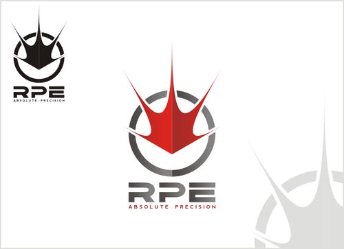
RAY Precision Engineering Logo design
RPE
|
Contest Holder
Jorian
?
Last Logged in : 5468days4hrs ago |
Concepts Submitted
129 |
Guaranteed Prize
299 |
Winner(s) | A Logo, Monogram, or Icon |
|
Live Project
Deciding
Project Finalized


Creative Brief
RAY Precision Engineering Logo design
RPE
absolute precision
Yes
RPE VISION: to become the leading manufacturer of machines in the MENA region
RPE SERVICES: Machine manufacture, Hydraulic, Pneumatic, Industrial parts Supply, Electronic and Automation Services
RPE BACKGROUND: RPE is a start-up precision engineering workshop that specialises in precision engineering and machine manufacture. RPE is based in the middle east and has markets throughout the MENA region (Middle East and North Africa)
TARGET AUDIENCE
Suppliers of industrial parts, Suppliers of Engineering Services,
Customers for CNC services, Industrial Parts and Electronics and Automation Services
both
![]()
not sure
GUIDELINES
Logo should be:
A ray of light
dynamic, bold, memorable
industrial, precise and exacting
cutting edge, high tech
Please see www.rayprecision.com for our current logo - we would like to remain striking and memorable but the ray of light aspect must be present.
Comments
Project Holder
Project Holder
Project Holder