SALES / SUPPORT : +1-877-525-5646   |   Login


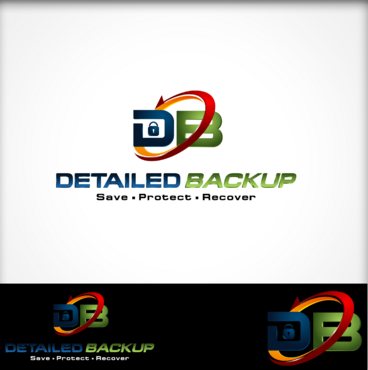
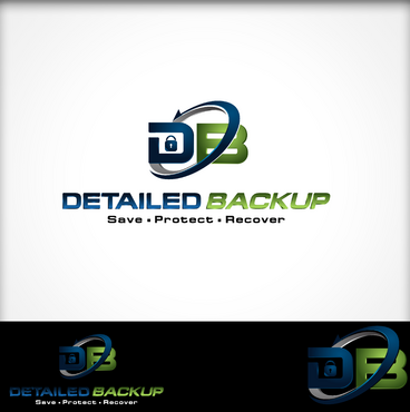
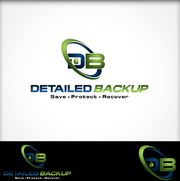
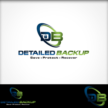
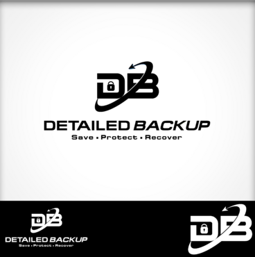
Logo for online backup company/software branding

Detailed Backup

Contest Holder WashingtonCollectors ?

Last Logged in : 2066days20hrs ago

Concepts Submitted

165

Guaranteed Prize
375
Winner(s)

1

A Logo, Monogram, or Icon veildAll design entries are veiled from other designers till the end of the contest.
tick_gray

Live Project

tick_gray

Deciding

tick_blue

Project Finalized


Project: Logo for online backup company/so ...
Industry: Computers Logo
Contest Launched: Mar 19, 2012
Selected: 1 winning design from 165 concepts
Winning Design by: jeanreno
Close Date: Mar 28, 2012


Logo for online backup company/software branding - Computers


Awarded as a winner
Project Report    

Sort by:


#165

#153

#152

#142

#140

#83

#69

#65

#58

#57

#55

#54

#47

#46

#38

#155

#154

#141

#78

#60

#61

#163

#139

#129

#128

#127

#118

#105

#96

#56


Creative Brief


Logo for online backup company/software branding

Detailed Backup

Save. Protect. Recover.

Yes

Detailed Backup is a company that provides affordable and reliable data backup services to small and medium size businesses. We offer safe and secure solutions for easy offsite and onsite backups. Business and industries trust the experts at Detailed Backup for their digital storage, and we have online backup plans that fit our customers’ size and needs.

The logo and graphics will represent our brand for both software and hardware. It will be used on equipment installed in our customers’ offices, in addition to being visible as icons on computer desktops/machines and throughout our software backup programs. Colors schemes and possible subtle nuances from the logo will be in the software in terms of what the end user visually sees on his administration console program on his computer.

Computers

Logo Type
Logo Type

Symbolic
Symbolic

Abstract Mark
Abstract Mark

Initials
Initials

Web 2.0
Web 2.0


Cutting-Edge
Unique/Creative
Clean/Simple
Sophisticated
Modern
Industry Oriented
High Tech
Serious
Illustrative
Abstract

Blue, grey, red or orange, black. Maybe green. Blue for sure though.

not sure

We would like to see what comes out without any specific direction. But perhaps something visual that represents “detailed” and “backup”. One concept I would like to see is an icon or graphic representing the letters of the company- DB. Something interesting or creative using those letters, or merging them together somehow. Another concept would be to see the use of arrows…which often times illustrates automation and/or backing up type of activity. Or maybe the possibility of incorporating a “lock” or “keyhole” type of thing to represent security. Please keep in mind that the icon/symbol logo, whether it is the initials of the company, or some other graphic that is a part of the overall logo….will likely be reduced down to a visual icon in our software program. If it complicated, it will not reduce down well.

Related Contests


Logo design - technical web company
$400
Prize Money
80
Concepts
logo for email hosting platform
$300
Prize Money
19
Concepts
Logo for an IT services business
$260
Prize Money
56
Concepts
Yagna
$400
Prize Money
177
Concepts

Discussion


Comments

  • March 29, 2012 1:55 PM
    jeanreno jeanreno
     
    Tabish: Thank you very much!

    Like Icon 0   DislikeIcon 0
  • March 29, 2012 4:30 AM
    tabish tabish
     
    congrats jeanreno

    Like Icon 0   DislikeIcon 0
  • March 28, 2012 7:29 PM
    WashingtonCollectors WashingtonCollectors
      Project Holder
    Designers- Thank you all very much for participating in this design project. You are all very talented and creative people, and you made this contest very difficult for us to decide. Best of luck to all of you in your endeavors...and we look forward to working with you all again sometime soon.

    Like Icon 0   DislikeIcon 0
  • March 24, 2012 10:24 PM
    WashingtonCollectors WashingtonCollectors
      Project Holder
    Designers- terrific concepts and drafts coming in. We are fine tuning a lot of things...especially with late arrivals. I have extended the contest for a few more days. Thank you!

    Like Icon 0   DislikeIcon 0
  • March 23, 2012 2:24 PM
    WashingtonCollectors WashingtonCollectors
      Project Holder
    Wow...really cool designs coming in! Great job designers...you are really making this hard for us to decide!

    Like Icon 0   DislikeIcon 0
  • March 22, 2012 12:48 AM
    WashingtonCollectors WashingtonCollectors
      Project Holder
    Designers- I would like to clarify my last two comments regarding some idea concepts regarding the galaxy and DC comic book logo type ideas. I meant that if you attempted to do something along those lines...that it should be a completely new design, and not applied to the current logo I am working with you on. The company name and tag line can stay the same, but the logo thing should be completely new and not integrated with the current projects in play. Sorry for the confusion. Thank you!

    Like Icon 0   DislikeIcon 0
  • March 21, 2012 8:39 PM
    WashingtonCollectors WashingtonCollectors
      Project Holder
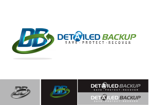
    Designers- Here is another idea. How about a logo that is in the vein of DC Comics? Check wikipedia, and look at the old blue logo that was used 2005-2012. It's the light blue shaded one. Use DB, create spiral/arrow type thing around it. Incorporate lock device/image just like the one star in the DC Comic logo. Give it a 3D look as well. Thank you.
    Like Icon 0   DislikeIcon 0
  • March 21, 2012 7:41 PM
    WashingtonCollectors WashingtonCollectors
      Project Holder
    Designers- Thank you for the terrific concepts coming in. I would like to throw out an idea, just to see where it goes. How about a logo that has a spining spiral galaxy like logo...the inner/middle part has a CD or hardrive looking device...the spiraling arms/swishy thing turn into a few arrow heads going in the same direction...maybe has a 3D look to it...DETAILED BACKUP and tagline is next to it. Maybe there is a lock looking element in the middle of the spiral, or a the letters DB. I can sort of see it in my mind..but can't draw it. Just an idea if someone can create such an image. Thank you.

    Like Icon 0   DislikeIcon 0
  • March 19, 2012 6:19 PM
    WashingtonCollectors WashingtonCollectors
      Project Holder
    Designers- we are off to a great start. Thank you and keep those concepts coming in. I will respond and comment to every draft as quickly as I can!

    Like Icon 0   DislikeIcon 0
  • March 19, 2012 2:29 PM
    WashingtonCollectors WashingtonCollectors
      Project Holder
    #5- What would a lock look like instead of a keyhole?

    Like Icon 0   DislikeIcon 0
  • March 19, 2012 2:27 PM
    WashingtonCollectors WashingtonCollectors
      Project Holder
    #6- I am worried "save protect recover" is just too small, and does not work. Logo element is interesting. I almost feel like Detailed Backup should go off to the right of it, rather than underneath it.

    Like Icon 0   DislikeIcon 0
  • March 19, 2012 2:19 PM
    WashingtonCollectors WashingtonCollectors
      Project Holder
    #5- Great start. Would like to see the keyhole and the tip of the arrow head a little bigger. Take the gray color out, and substitute green. Try a red or orange type color on the "save protect recover" words. Is there a way to make this logo more 3D like? Thank you!

    Like Icon 0   DislikeIcon 0
  • March 19, 2012 2:14 PM
    WashingtonCollectors WashingtonCollectors
      Project Holder
    #3 #4- I would like to see some different colors used in this concept, other than just blue. Try a different font type. Save Protect Recover needs either bullets between the words and/or a period after recover. The key and lock in both letters is a little too much on the security. Perhaps just one or the other. Can arrows be incorporated somewhere? Thank you.

    Like Icon 0   DislikeIcon 0
  • March 19, 2012 2:09 PM
    WashingtonCollectors WashingtonCollectors
      Project Holder
    Designers- I forgot to mention in the creative brief that we will ultimately need two versions of the logo. One with the tag line, the other without. Thanks.

    Like Icon 0   DislikeIcon 0