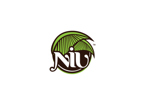
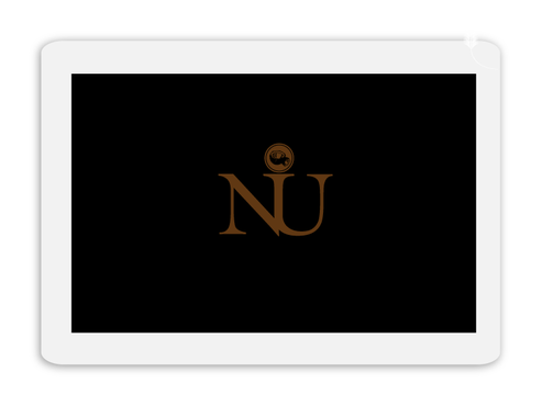
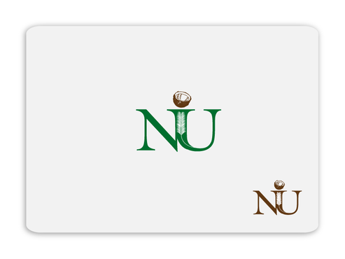
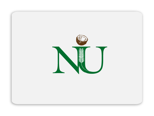
SALES / SUPPORT : +1-877-525-5646   |  


Logo for NIU

NIU, niu, Niu

Contest Holder jsmith000 ?

Last Logged in : 4548days14hrs ago

Concepts Submitted

124

Guaranteed Prize
250
Winner(s)

1

A Logo, Monogram, or Icon veildAll design entries are veiled from other designers till the end of the contest. Featured Featured Contest
tick_gray

Live Project

tick_gray

Deciding

tick_blue

Project Finalized


Project: Logo for NIU
Industry: Food Logo
Contest Launched: Feb 19, 2012
Selected: 1 winning design from 124 concepts
Winning Design by: BDesign
Close Date: Mar 07, 2012


Logo for NIU - Food


Awarded as a winner
Project Report    

Sort by:


#102

#101

#85

#84

#30

#28

#106

#51

#50

#18

#107

#103

#100

#99

#91

#60

#59

#58

#57

#56

#55

#54

#53

#52

#49

#48


Creative Brief


Logo for NIU

NIU, niu, Niu

No

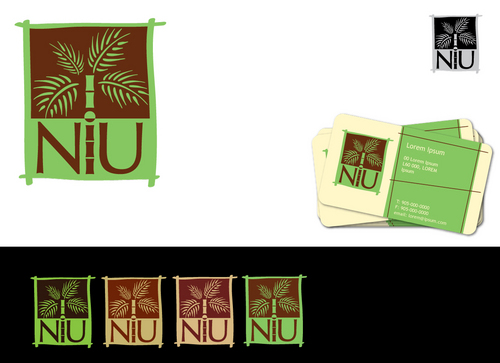
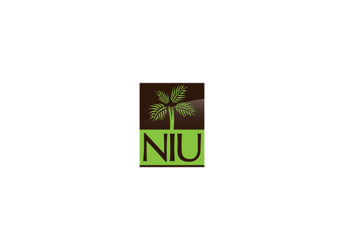
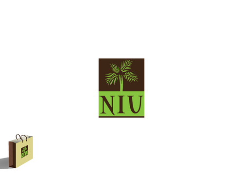
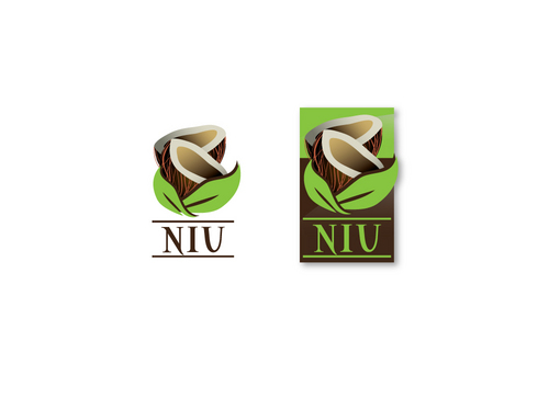
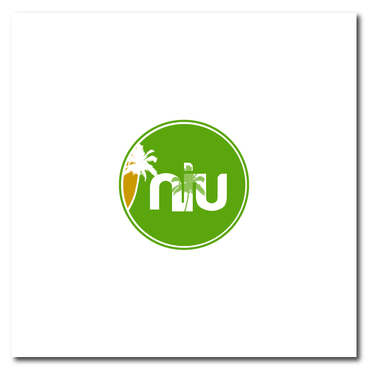
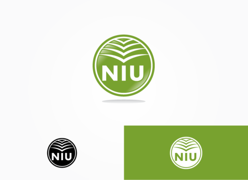
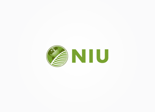
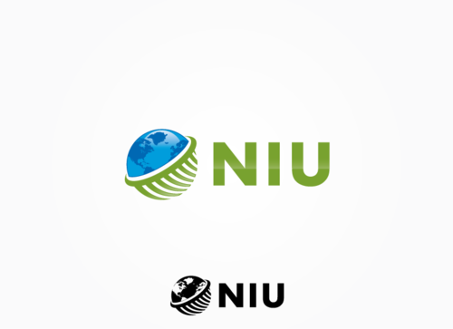
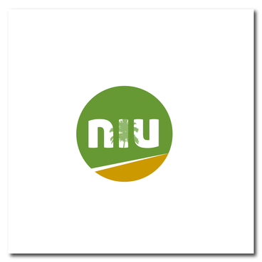
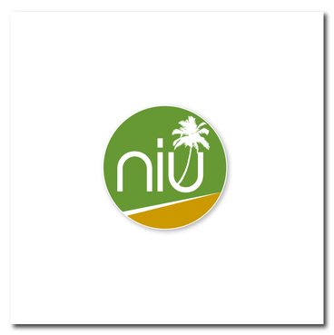
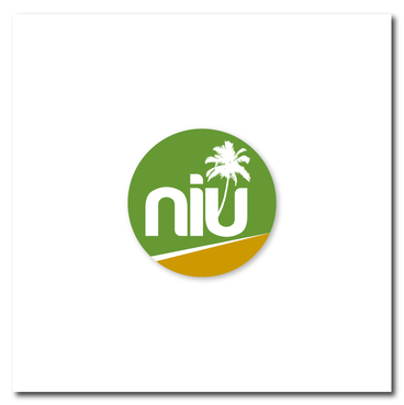
This design is for a company that sells and distributes coconut based products. The logo should illustate an organic yet market tranferable product. Our company is founded to not only sell coconut products but to provide a better life to our consumers, employees and communities in which we do business .

Food

Symbolic
Symbolic

Abstract Mark
Abstract Mark

Illustrative
Illustrative


Unique/Creative
Clean/Simple
Outdoors/Natural

We prefer two color options (greens and browns) but if it is limiting we would consider more.

not sure

Integrate the texture of a palm leaf? or any other creative coconut symbols

Related Contests


Logo for steaks and fish Restaurant
$300
Prize Money
55
Concepts
Logo for a bakery company
$300
Prize Money
139
Concepts
Logo for a bakery
$350
Prize Money
137
Concepts
Unique logo design for a bakery and patisserie business that also offers top end coffees
$200
Prize Money
130
Concepts

Discussion


Comments

  • March 07, 2012 11:24 AM
    jsmith000 jsmith000
      Project Holder
    Designers, Thanks so much for your input, there were a lot of really great deisgns! We've started another project for business cards and stationary. http://www.mycroburst.com/contests/business-card-design-for-niu Please feel free to submit your designs. We may pick two winners, one for stationary and one for business cards. So the chances of winning is greater! Thanks, Niu

    Like Icon 0   DislikeIcon 0
  • February 28, 2012 4:58 PM
    jsmith000 jsmith000
      Project Holder
    Also, we're not opposed to throwing a little extra "donation" out for those that go above and beyond. We'd like to find someone we can work with on other projects as well. So, those who really make their work stand out can get rewarded. More notes: #44 and #49 - Can we get some font variation as well. #38, #40 and #41 - Can we also try some font variation? Thanks!

    Like Icon 0   DislikeIcon 0
  • February 28, 2012 4:52 PM
    jsmith000 jsmith000
      Project Holder
    Designers, We've got less than 24 hours left until the project closes, after which time we will select the winner of the project. Here are our top 10 selections: #51, #49, #44, #41, #40, #38, #30, #24, #15, #11. We'd like to continue to see some variations in color and font. You guys are awesome! These designs are amazing and we look forward to seeing the last push of designs prior to the end. It's a close game so far. A few notes: #11 - Can we see this is all green and give a few color variations. Also, modify the "leaf" half of the design a little. #44 - We like the design, can we get some color variations? #38, #40 and #41 - Can me make the font a little larger / bolder? Great design, though. #24 - Can we make the palm tree a little bigger and move it to the right a bit? We'd like to see more of the other color. #30 - Can we get a few font variations? Like the design, would just like a better font. #51 - Cool design. Can we try to get a two-color version? Also, did you incorporate the "TM" yourself, or has this design been used previously? #49 - Love the colors. Can we remove the white "stripe" at the bottom and just use the "orange/brown"? Maybe make it a crescent shape curling up the right of the logo? #15 - Can we get a few more variations i.e. color, font, style? Keep up the good work! Anyone could win at this point!

    Like Icon 0   DislikeIcon 0
  • February 23, 2012 5:08 PM
    jsmith000 jsmith000
      Project Holder
    We really like #4 and #5. Particularly we like the color and "raised" look of #4. Let's vary the styles up and the color a little bit. Use those as templates because it's "earthy" with the leaf design, but it's not an "in your face" palm tree. Don't be afriad to use an actual leaf style, either. This is an organic company and there is nothing greener than nature and tree leaves. Continue to think out of the box with those designs in mind. Thanks for all the submissions so far, keep them coming!

    Like Icon 0   DislikeIcon 0
  • February 21, 2012 2:39 PM
    jsmith000 jsmith000
      Project Holder
    Sacril - Here are a few comments for you. 1. I looked at your portfolio and I really liked the feel and style of the Ocean Focus and Rumah Kubu logos. 2. See if you can do something with the same feel. Alzam - Here are a few comments for you. 1. I liked the Oberman logo. The rounded swuare with the negative space is nice next to the name of the company. Perhaps something with the texture of the palm leaf in the negative space, etc. Or the name in the square with a negative space design. 2. Sme comments for the Qualis Group logo as above. Thanks!

    Like Icon 0   DislikeIcon 0
  • February 21, 2012 2:18 PM
    jsmith000 jsmith000
      Project Holder
    Designers, Thanks for your submissions! Just a few things: 1. Let's try making green the primary color and perhaps a little bit lighter, more organic green. 2. The brown should be a richer, darker brown. 3. It's not necessary to include the entire palm tree, a leaf or the texture of the palf frond is acceptable in concept as well. 4. Let's try using different font. 5. I'm afraid the tree in the middle may confuse people with what the name of the company is. We'd like to see some letter only (with accents, shapes and stylized) submissions. 6. This logo will also be used for business cards. Draft #1 - I liked the use of texture for the tree. Draft #2 - I like the simplicity of the design. Looking forward to more submissions! Thanks!

    Like Icon 0   DislikeIcon 0