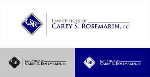
Logo for Environmental Law Firm
Law Offices of Carey S. Rosemarin, P.C.
|
Contest Holder
csrlaw
?
Last Logged in : 4370days12hrs ago |
Concepts Submitted
120 |
Guaranteed Prize
200
|
Winner(s) | A Logo, Monogram, or Icon |
|
Live Project
Deciding
Project Finalized


Creative Brief
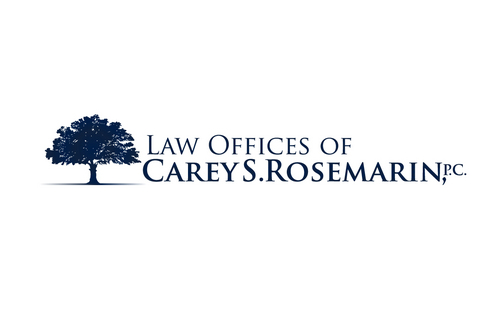
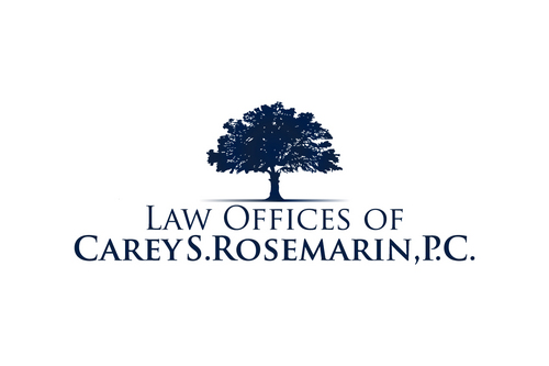
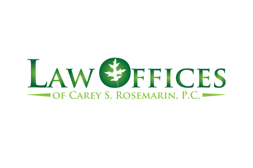
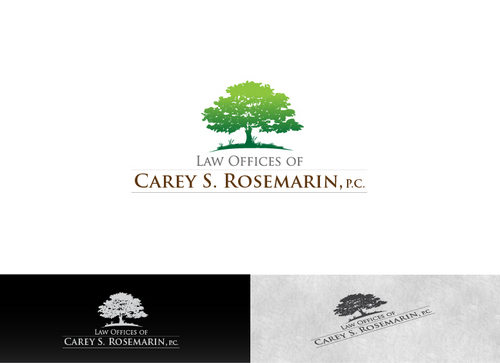
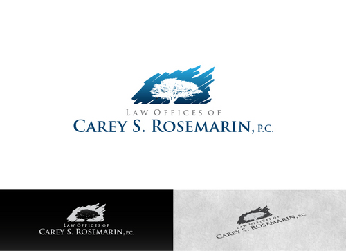
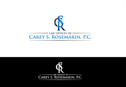
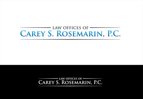
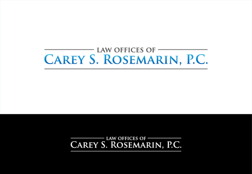
Logo for Environmental Law Firm
Law Offices of Carey S. Rosemarin, P.C.
No
Firm practices environmental law exclusively. Convey clarity and strength in a very complex area of the law.
Law
Logo Type
![]()
Masculine
Sophisticated
Simple
Professional
2
midwest - oak tree (possible) or perhaps oak leaf
Related Contests


Comments
Project Holder