SALES / SUPPORT : +1-877-525-5646   |   Login


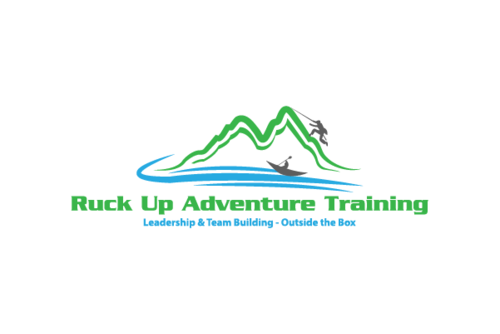
Logo for an outdoor leadership and team building training company

Ruck Up (could also add "outdoor adventure training") or ("adventure training")

Contest Holder scaldwell63 ?

Last Logged in : 3763days11hrs ago

Concepts Submitted

76

Guaranteed Prize
200
Winner(s)

1

A Logo, Monogram, or Icon veildAll design entries are veiled from other designers till the end of the contest. Featured Featured Contest
tick_gray

Live Project

tick_gray

Deciding

tick_blue

Project Finalized


Project: Logo for an outdoor leadership an ...
Industry: Outdoors Logo
Contest Launched: Jul 24, 2014
Selected: 1 winning design from 76 concepts
Winning Design by: KenArrok
Close Date: Jul 31, 2014


Logo for an outdoor leadership and team building training company - Outdoors


Awarded as a winner
Project Report    

Sort by:


#65

#58

#64

#49

#44

#42

#41

#30

#27

#24

#21

#20

#19

#16

#13

#10

#63

#62

#61

#52

#50

#47

#12


Creative Brief


Logo for an outdoor leadership and team building training company

Ruck Up (could also add "outdoor adventure training") or ("adventure training")

Leadership & Team Building - Outside the Box (or just) Outside the Box

Yes

This company will teach military-style personality driven leadership principles and techniques through hardcore outdoor teambuilding activities such as rappelling, military obstacle courses, kayaking, rafting, leadership reaction obstacle courses, mountain biking, kayaking etc.

Instructors for this company are all retired Army personnel.

Should convey masculinity, strength, confidence

Logo does not have to be in a military-type style but could be. Interested in something "modern" looking and "active"

We want to also see a seperate logo without text for brand recognition purposes.

Outdoors

Logo Type
Logo Type

Symbolic
Symbolic

Illustrative
Illustrative

Character
Character


Masculine
Modern
Cutting-edge

No pink lol

not sure

Will provide feedback once the initial designs start rolling in.

Related Contests


New logo For Sandusky County Sportsmen's Club Gun Range
$400
Prize Money
128
Concepts
Gulf Barbecue
$200
Prize Money
64
Concepts
Hunting Outfitter Logo Design
$300
Prize Money
140
Concepts
Logo for Lost Prairie Ranch
$200
Prize Money
42
Concepts

Discussion


Comments

  • July 31, 2014 3:13 PM
    scaldwell63 scaldwell63
      Project Holder
    # 74 & 75 - awesome thanks for the revisions!

    Like Icon 0   DislikeIcon 0
  • July 31, 2014 10:37 AM
    scaldwell63 scaldwell63
      Project Holder
    # 69 - nice! business will be based in florida, so not too many mountains there but perhaps you can replace it with a ladder obstacle, zipliner or remove it and put a mountain bike, kayak or zodiac boat/raft? These are other activities we will offer. Tx!

    Like Icon 0   DislikeIcon 0
  • July 31, 2014 10:35 AM
    scaldwell63 scaldwell63
      Project Holder
    # 68 - can you use some earth tones for the font colors - browns, blacks, tans, olive drab etc. Tx!

    Like Icon 0   DislikeIcon 0
  • July 31, 2014 10:34 AM
    scaldwell63 scaldwell63
      Project Holder
    #70 - very nice, do you happen to have a more military looking figure with the rucksack? Or if you can remove the walking stick and have the hiker look less like an old man and show more "strength" if that makes sense. Can you also use some earth tones, browns, blacks, olive drabs, khaki colors on the fonts? Tx!

    Like Icon 0   DislikeIcon 0
  • July 30, 2014 9:55 PM
    scaldwell63 scaldwell63
      Project Holder
    #67 & 68 - excellent, tx for making those changes!

    Like Icon 0   DislikeIcon 0
  • July 30, 2014 8:42 PM
    scaldwell63 scaldwell63
      Project Holder
    #66 - can you try some earth tone colors in the design and get rid of the "leadership..." text. Tx!

    Like Icon 0   DislikeIcon 0
  • July 30, 2014 12:31 PM
    scaldwell63 scaldwell63
      Project Holder
    # 64 - Excellent! Can you remove the brown coloring in the bold black horizontal lines so that they appear the same as # 58. Tx ken!

    Like Icon 0   DislikeIcon 0
  • July 30, 2014 9:49 AM
    scaldwell63 scaldwell63
      Project Holder
    #44-This one is growin on me but do you have a rucked up hiker that doesn't look like an old grandpa? Somethin without the walking stick, more military looking would be good! TX

    Like Icon 0   DislikeIcon 0
  • July 30, 2014 9:46 AM
    scaldwell63 scaldwell63
      Project Holder
    #61 - clever thanks!

    Like Icon 0   DislikeIcon 0
  • July 29, 2014 9:17 PM
    scaldwell63 scaldwell63
      Project Holder
    # 57- can u take the figures in the R U and put them in the actual R and U in the word ruck up. Remove the big R and U to simplify the design. Make the tagline smaller. Amazing creativity! Tx for your energy!

    Like Icon 0   DislikeIcon 0
  • July 29, 2014 7:42 PM
    scaldwell63 scaldwell63
      Project Holder
    # 54 - can you simplify this design using the "ruck up" without the design inside of it, remove the "leadership..." text and perhaps play with the positioning of the logo, "ruck up" and the "adventure..." tag line please. The action figures are a bit hard to see, i think due to the color combos...any other color combos you might try? Tx for putting this one up!

    Like Icon 0   DislikeIcon 0
  • July 29, 2014 7:40 PM
    scaldwell63 scaldwell63
      Project Holder
    #49 - can you try the subtext in this one like it is in # 44 pls, tx!

    Like Icon 0   DislikeIcon 0
  • July 29, 2014 12:11 PM
    scaldwell63 scaldwell63
      Project Holder
    # 47 & 50 Clever, Tx!

    Like Icon 0   DislikeIcon 0
  • July 28, 2014 4:39 PM
    scaldwell63 scaldwell63
      Project Holder
    #47 - can you work some kind of action figure into the design to help convey visually what the business is about?

    Like Icon 0   DislikeIcon 0
  • July 28, 2014 4:38 PM
    scaldwell63 scaldwell63
      Project Holder
    # 46 - a little too busy, can you simplify it somewhat?

    Like Icon 0   DislikeIcon 0
  • July 27, 2014 6:24 PM
    scaldwell63 scaldwell63
      Project Holder
    # 21 - can you try the "outdoor adventure training" text in a more simple font instead of the cursive...really like this logo. Tx ken!

    Like Icon 0   DislikeIcon 0
  • July 27, 2014 6:09 PM
    scaldwell63 scaldwell63
      Project Holder
    #42 - nice ken thanks!

    Like Icon 0   DislikeIcon 0
  • July 27, 2014 1:18 PM
    scaldwell63 scaldwell63
      Project Holder
    Krik - Tx, looks good!

    Like Icon 0   DislikeIcon 0
  • July 27, 2014 10:53 AM
    scaldwell63 scaldwell63
      Project Holder
    # 34 - Great!

    Like Icon 0   DislikeIcon 0
  • July 27, 2014 9:24 AM
    scaldwell63 scaldwell63
      Project Holder
    # 31 - can you add "outdoor" to the adventure training? Tx

    Like Icon 0   DislikeIcon 0
  • July 27, 2014 9:22 AM
    scaldwell63 scaldwell63
      Project Holder
    #22 - nice symbol for brand recognition! - can you replace "leadership and teambuilding" with "outdoor adventure training"? Tx

    Like Icon 0   DislikeIcon 0
  • July 27, 2014 9:20 AM
    scaldwell63 scaldwell63
      Project Holder
    #31 - excellent! can you put that one up again without the "leadership and team building"? Tx

    Like Icon 0   DislikeIcon 0
  • July 27, 2014 9:19 AM
    scaldwell63 scaldwell63
      Project Holder
    #26 - looking for something a bit more edgy, "hardcore", manly and active...anything else in your kitbag?

    Like Icon 0   DislikeIcon 0
  • July 27, 2014 9:16 AM
    scaldwell63 scaldwell63
      Project Holder
    #20 - do you have a silhouette / outline of a figure from the waist up with a large army rucksack on his back (side view) that could go in place of the footprint?

    Like Icon 0   DislikeIcon 0
  • July 27, 2014 9:13 AM
    scaldwell63 scaldwell63
      Project Holder
    #28 - can you try this design with some different fonts and maybe a couple different shapes besides the circle. very nice!

    Like Icon 0   DislikeIcon 0