SALES / SUPPORT : +1-877-525-5646   |   Login


LOGO DESIGN - Hydraulics Company

Viking Hydraulics

Contest Holder VIKINGHYDRAULICS ?

Last Logged in : 3471days18hrs ago

Concepts Submitted

283

Guaranteed Prize
650
Winner(s)

1

A Logo, Monogram, or Icon veildAll design entries can be viewed by other designers. Featured Featured Contest
tick_gray

Live Project

tick_gray

Deciding

tick_blue

Project Finalized


Project: LOGO DESIGN - Hydraulics Company
Industry: Manufacturing Logo
Contest Launched: Jan 21, 2011
Selected: 1 winning design from 283 concepts
Winning Design by: aurelizza
Close Date: Jan 28, 2011


LOGO DESIGN - Hydraulics Company - Manufacturing


Awarded as a winner
Project Report    

Sort by:


#33

#32

#30

#29

#26

#24

#19

#17

#15

#8

#7

#2

#1


Creative Brief


LOGO DESIGN - Hydraulics Company

Viking Hydraulics

No

I have a completely new and very innovative product in the hydraulics industry. It’s a completely self-contained hydraulic cylinder, or rather know as a hydraulic actuator. Basically it’s a unit that pushes, pulls, and lifts very heavy things...

Manufacturing

Symbolic
Symbolic

Abstract Mark
Abstract Mark

Illustrative
Illustrative

Character
Character


Cutting-Edge
Unique/Creative
Clean/Simple
Sophisticated
Corporate
Modern
Industry Oriented
High Tech
Retro
Serious
Masculine
Youthful

The product will be have a brushed aluminum finish to it. I would like colors which go well with that, and have a very modern and clean/cool feel to them. For my website, I was thinking of using colors like an ice white, brushed aluminum, a grayish-blue, and/or perhaps a darker charcoal black...but I really think the logo design will determine allot of that..?

3

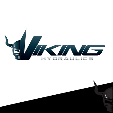
This is not totally set in stone, but I think it would be very cool to have an abstract/contemporary Viking face; either front or side profile, to the left of “VIKING Hydraulics” or “VIKING Hydraulics.com”. I would like “VIKING” to be more emphasized than the “Hydraulics/Hydraulics.com”.

Since this is a product that moves things…or has to deal with motion, I think it would be cool if you could kind of capture that in the logo design, if that makes any sense..?

Here are a few links which I hope will help better explain…

Logo Style(s)…?
http://lovewellfence.com/images/logos/viking_access_systems.jpg

http://www.logodesignworks.com/blog/images/Thor-logo-design.jpg

http://www.ecsu.edu/administration/ia/urm/ecsubrand/downloads/VikingLogo/bw/VikingBW.png

http://www.plas-tique-products.com/Logo%20Images/Viking%20Head.jpg

Font style(s)…?:
http://www.dafont.com/search.php?text=VIKING+HYDRAULICS&psize=m&q=quadrangle

http://www.dafont.com/search.php?text=VIKING+HYDRAULICS&psize=m&q=plain+o+matic

http://www.dafont.com/search.php?q=locust+resistance&text=VIKING+HYDRAULICS

Related Contests


logo for a new line of Sofa produced by a furniture manufacturing company
$550
Prize Money
435
Concepts
Phazemeister Rotary Phase Converters
$200
Prize Money
72
Concepts
Quality Logo
$350
Prize Money
370
Concepts
Logo for a forest products company
$600
Prize Money
178
Concepts

Discussion


Comments

  • November 06, 2011 11:17 AM
    RichardB RichardB
     
    Check out www.DesignCage.net its pretty awesome,you can win more contests.

    Like Icon 0   DislikeIcon 0
  • January 29, 2011 6:44 PM
    wadz91 wadz91
     
    Sorry to say but, is there any proof/ evidence can you show please. I took the information from http://www.classicrockmagazine.com/news/%E2%80%A6and-talking-about-van-halen%E2%80%A6/ However it takes me few days to create the "VH" logo. Anyway nothing to do, thanks for your coments.

    Like Icon 0   DislikeIcon 0
  • January 29, 2011 10:56 AM
    SiteAdmin SiteAdmin
     
    Raster-based submissions by wadz91 have been taken down.

    Like Icon 0   DislikeIcon 0
  • January 27, 2011 12:08 AM
    SiteAdmin SiteAdmin
     
    Source: http://www.thormx.com/ Draft #72 and variation by Juayusta have been taken down.

    Like Icon 0   DislikeIcon 0
  • January 26, 2011 11:32 PM
    SiteAdmin SiteAdmin
     
    Draft #168 (idea of Viking Ship) by pgdesign is derived from #161 by Lungfishdesign, therefore has been taken down.

    Like Icon 0   DislikeIcon 0
  • January 22, 2011 8:13 AM
    VIKINGHYDRAULICS VIKINGHYDRAULICS
      Project Holder
    Everyone, Thank you so much for your submissions so far, we’re really excited to see all the interesting concepts that are starting to evolve. Please try to keep the design in more of a “corporate/clean” look…rather than getting too cartoonish/gamey. Our logo will not only be used on our business cards, website, mailing flyers, etc…but also laser-etched into our products, so working with 3D effects & various colors is cool, but it would also be great if the design profile would still be recognizable when burned into a steel or aluminum plate. Feel free to use “.com” in the design as well and being creative with the font(s), as long as it still has that structural/mechanical/corporate/clean look. Thanks again for all your help!

    Like Icon 0   DislikeIcon 0
  • January 21, 2011 9:15 PM
    nyberg1283 nyberg1283
     
    Yea I def. see a copyrighted logo in some of these...

    Like Icon 0   DislikeIcon 0