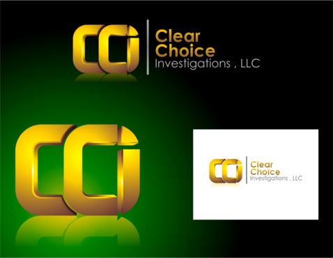
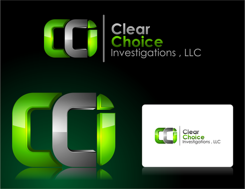
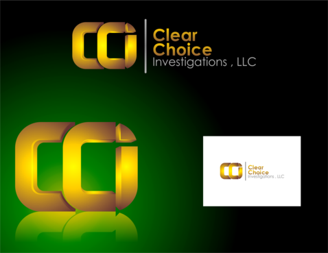
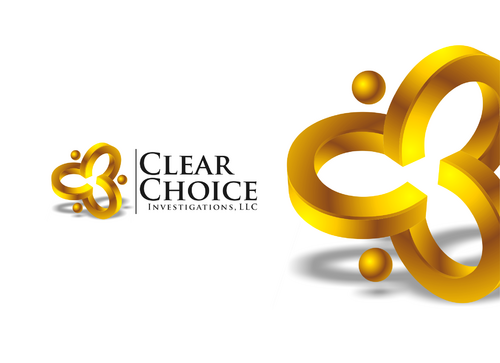
logo - Clear Choice Investigations, LLC
Clear Choice Investigations, LLC
|
Contest Holder
clearchoice
?
Last Logged in : 4933days17hrs ago |
Concepts Submitted
68 |
Guaranteed Prize
300 |
Winner(s) | A Logo, Monogram, or Icon |
|
Live Project
Deciding
Project Finalized

Creative Brief
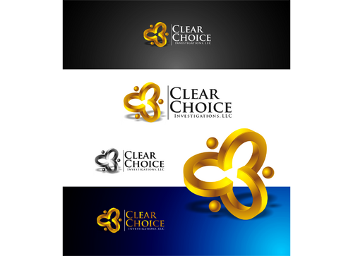
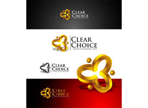
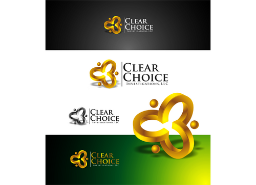
logo - Clear Choice Investigations, LLC
Clear Choice Investigations, LLC
No
This is for a private investigation firm. We work mainly with insurance companies and corporations, so I need the design to convey a professional, serious, tone that conveys a feeling of confidence.
Security
Symbolic
![]()
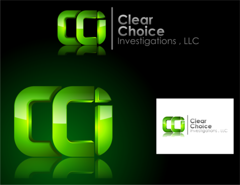
Initials
![]()
Illustrative
![]()
Cutting-Edge
Sophisticated
Corporate
Serious
Geometric
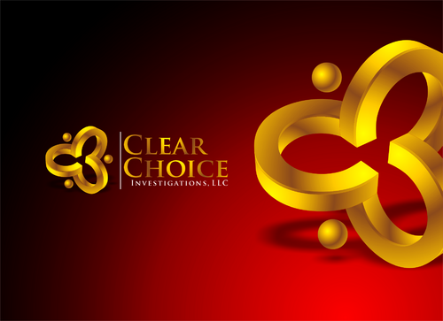
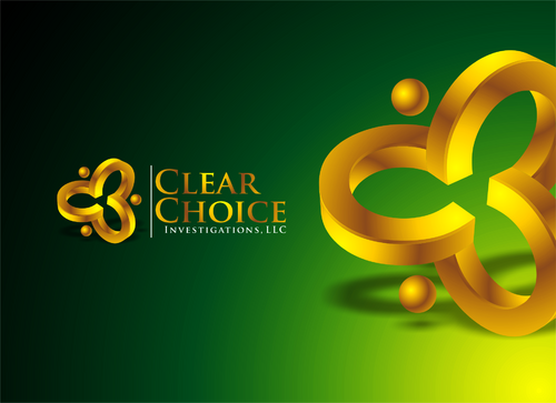
I like the color combinations of Green( like nightvision green) & black. I also like Gold & black. I am open to new suggestions.
2
I want to avoid the typical swoosh type of graphic that is overused.
Related Contests