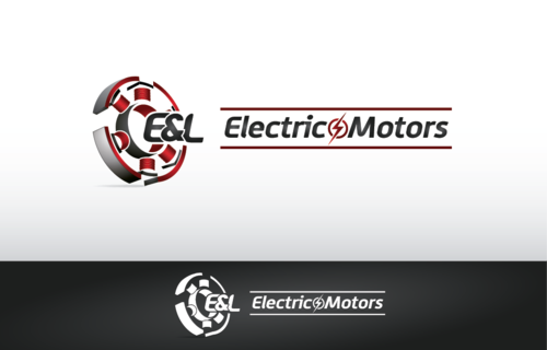
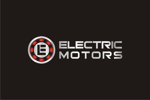
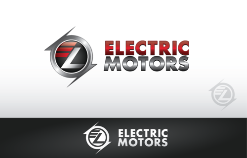
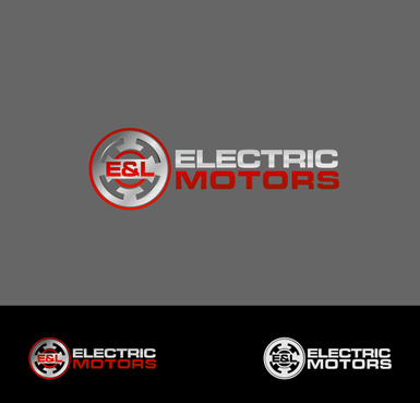
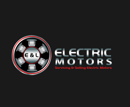
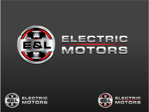
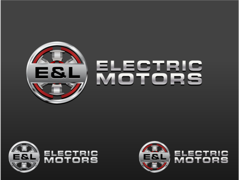
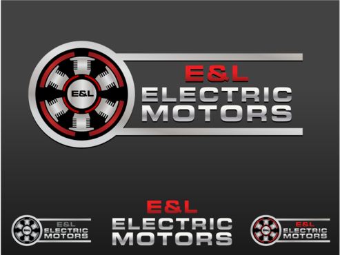
E & L Electric Motor Logo
E & L Electric Motors
|
Contest Holder
MIKEFITCH
?
Last Logged in : 4259days17hrs ago |
Concepts Submitted
441 |
Guaranteed Prize
600
|
Winner(s) | A Logo, Monogram, or Icon |
|
Live Project
Deciding
Project Finalized


Creative Brief
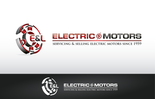
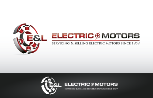
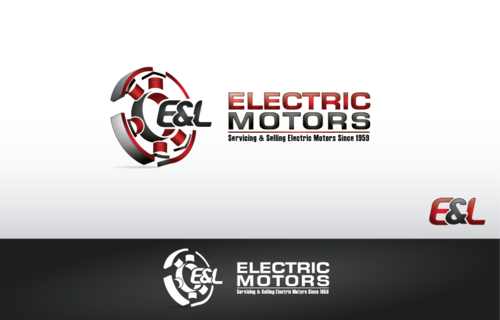
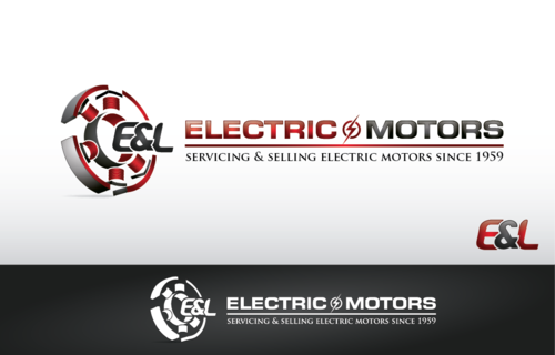
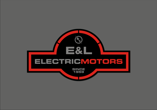
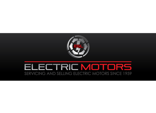
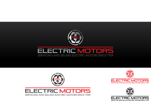
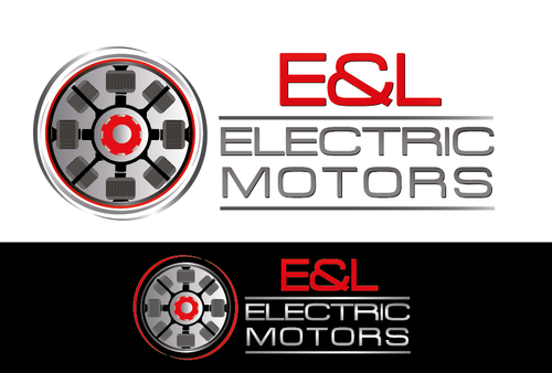
E & L Electric Motor Logo
E & L Electric Motors
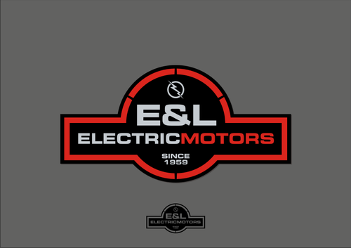
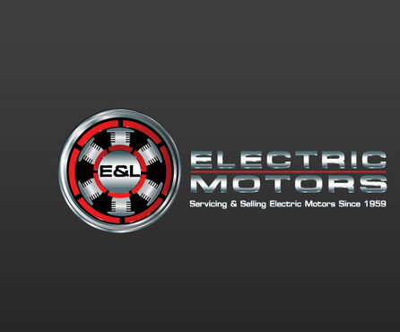
Servicing & Selling Electric Motors Since 1959
No
We repair electric motors for large manufacturers of anything from plastic to steel, power plants, and aerospace. We have been around since 1959 and are based in the middle of Orange County and Los Angeles County.
http://redstickarmature.com/ I like this look
http://www.tawinc.com/ this one has promise but something is missing
http://www.vincentelectric.com/ DONT like this one, boring
http://www.ronselectricmotorrepair.com/ I'm sure Ron is a great guy but this is guy you want to come to your house and fix your pool motor, thats what I see. The Redstick web sire looks tougher, industrial.
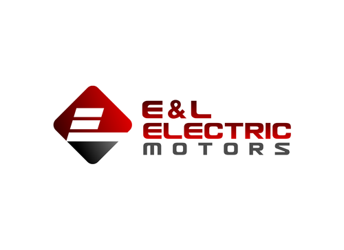
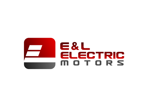
http://www.evolvecreate.com/projects/eandlelectric/ This is our site and our colors - Black - Grey - Red
Manufacturing
Initials
![]()
Illustrative
![]()
Clean/Simple
Industry Oriented
Serious
I can go with two or three. Red - Silver - Black Our web site is NOT done so the color there is a little more Orange in the left side but that is the overall picture.
not sure
Related Contests


Comments
Project Holder
Project Holder
Project Holder
Project Holder
Project Holder
Project Holder
Project Holder
Project Holder
Project Holder
Project Holder
Project Holder