SALES / SUPPORT : +1-877-525-5646   |   Login


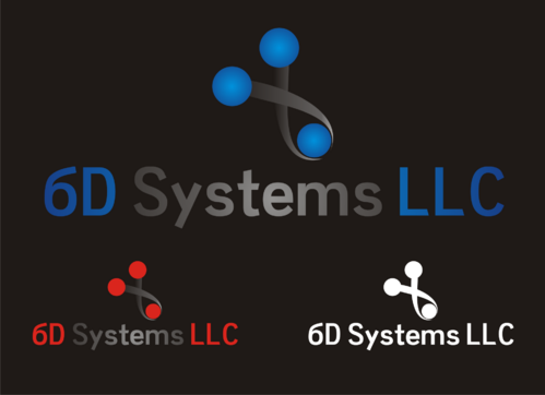
Business / Stationary Logo for 6D Systems LLC

6D Systems LLC

Contest Holder 6dsystems ?

Last Logged in : 4858days19mins ago

Concepts Submitted

68

Guaranteed Prize
250
Winner(s)

1

A Logo, Monogram, or Icon veildAll design entries can be viewed by other designers.
tick_gray

Live Project

tick_gray

Deciding

tick_blue

Project Finalized


Project: Business / Stationary Logo for 6D ...
Industry: Software Logo
Contest Launched: Jul 12, 2011
Selected: 1 winning design from 68 concepts
Winning Design by: mvillamin
Close Date: Jul 19, 2011


Business / Stationary Logo for 6D Systems LLC - Software


Awarded as a winner
Project Report    

Sort by:


#3

#2

#1


Creative Brief


Business / Stationary Logo for 6D Systems LLC

6D Systems LLC

Innovative Solutions

No

Our target customers are generally 35-55 years old and purchasing agents or engineers in industrial or marine environments. We are looking for a serious logo that conveys our focus on high technology and cutting edge solutions for our customers. The 6D in our name refers to 6 dimensional physics (multiverse theory) where every option of every decision exists simultaneously.

My website is http://www.6dsystems.com but I am not fond of that logo, so please don't use it as inspiration.

Software

Initials
Initials

Web 2.0
Web 2.0


Cutting-Edge
Clean/Simple
Sophisticated
Modern
High Tech
Serious

Dark Greys, Deep Reds, Navy / Deep Blues, colors should be very rich, no pastels or bright colors.

3

Logo should be able to have either a clear (transparent) background or a black background.

Related Contests


Logo for a Tablet POS System/Software
$300
Prize Money
90
Concepts
Ademero logo
$700
Prize Money
1229
Concepts
Logo for note taking like web application
$200
Prize Money
85
Concepts
Logo design for the name OPTYMA
$200
Prize Money
50
Concepts

Discussion


Comments

  • July 22, 2011 3:41 PM
    6dsystems 6dsystems
      Project Holder
    Thank you again everybody for participating. It was a lot harder to decide than we thought it would be, they are all incredible. Thank you for sharing your time and your talent. Congratulations to mvillamin for the winning design #19! -Ron B.

    Like Icon 0   DislikeIcon 0
  • July 19, 2011 12:36 PM
    6dsystems 6dsystems
      Project Holder
    Thank you everybody for your submissions, we now have the tough job of picking a winner, we will review the submitted designs closely and get back in a day or so. Thank you again for everything! -Ron B.

    Like Icon 0   DislikeIcon 0
  • July 18, 2011 9:06 AM
    6dsystems 6dsystems
      Project Holder
    Thanks for the submissions so far, here's some feedback on the designs: #1: Simplistic and geometric, I do like the black and white version but the Systems in the other two get lost in the darkness. #2: This one is a little too busy and playful for the business model we are aiming for. #3: Very nice, an air of sophistication. It seems very familiar to me though and I can't put my finger on it... #4: Not a bad design, works on both black and white backgrounds. #5 & #6: I like the simplicity with these and the colors in the design. The first one's reflection is a little too subtle and makes it look like a fuzzy underline unless the logo is very large. #7: This is a high contender at the moment, I like the subtle 3-D view of the shapes and the rounded font is pleasing to the eye. #8: A nice design, simple with a shape that represents what we are. #9 & #10: I do like how these look in large scale, but I'm not sure how the 3-D text would scale down to fit on letter head. We are also not looking to have our tag line in the logo. #11-#13: The first two are nice, I like the depth of the red without the fade in #11, and the smaller company name in #12. #13 is a little too stencil font for my taste though. #14: I like the design but the colors are off, the pink and blues are almost pastel, which we aren't looking for. #15 & #16: I like how the 6DS is like a bold stamp in an anodized metal. We aren't looking to have our tag line in the logo though. #17 & #18: These are not bad, but as you can see on the preview screen when the logo is small the design is difficult to make out with the shine, and the text becomes fuzzy with the reflection. #19 & #20: Definitely high on the list, the colored logo doesn't fare well with the black background, but I like how the white logo looks with black. Very high tech but sophisticated, nicely done. #21 & #22: I like how these look from first glance but the bottom of the "S" looks mishaped and doesn't flow, if it had rounded edges instead it might flow better from the 6 to the S. Thanks again everybody, keep them coming! -Ron B.

    Like Icon 0   DislikeIcon 0
  • July 12, 2011 7:25 PM
    6dsystems 6dsystems
      Project Holder
    You may also use the abbreviation 6DS as the "main" part of the logo, as long as the full name of our company also appears. Thanks and good luck! -Ron B.

    Like Icon 0   DislikeIcon 0