SALES / SUPPORT : +1-877-525-5646   |   Login


Business Restaurant/Bar Logo Tap House Grill

Tap House Grill

Contest Holder taphouse ?

Last Logged in : 4716days18hrs ago

Concepts Submitted

156

Guaranteed Prize
300
Winner(s)

1

A Logo, Monogram, or Icon veildAll design entries can be viewed by other designers.
tick_gray

Live Project

tick_gray

Deciding

tick_blue

Project Finalized


Project: Business Restaurant/Bar Logo Tap ...
Industry: Food Logo
Contest Launched: Aug 28, 2011
Selected: 1 winning design from 156 concepts
Winning Design by: validesign
Close Date: Sep 14, 2011


Business Restaurant/Bar Logo Tap House Grill - Food


Awarded as a winner
Project Report    

Sort by:


#156

#148

#144

#138

#124

#120

#102

#76

#75

#53

#52

#16

#15

#23

#155

#154

#153

#152

#151


Creative Brief


Business Restaurant/Bar Logo Tap House Grill

Tap House Grill

No

This design is for a rebrand of a current sports bar/restaurant. We are increasing the food quality, adding a custom meal option, where the guest can configure their food just how they like it. We are making the restaurant more family friendly with healthier options and more options for kids. The last big thing we are doing is adding a new beer cooler where up to 36 beers will be on tap. We are going to feature more local brews, which will be unique to our surrounding area.

The restaurant will remain a sports restaurant and bar, seating 250 people with over 30 high definition tv's throughout the restaurant, with a circle of tv's above a large bar. We have a very open floor plan and an all updated eating area.

Food

Logo Type
Logo Type

Illustrative
Illustrative


Clean/Simple
Modern
Traditional
Local/Neighborhood
Fun

We are open to options.

not sure

We like logos with just the name as well as logos that are illustrative. We thought about having a beer tap pouring into the name, but don't want anything that looks too cartoonish. It needs to appeal to both adults and kids. We are located in a shared business building and will have a lit sign above our restaurant. We haven't discussed a tag line yet, but are open to suggestions.

Related Contests


Logo for a bakery
$350
Prize Money
137
Concepts
Logo for a bakery company
$300
Prize Money
139
Concepts
Unique logo design for a bakery and patisserie business that also offers top end coffees
$200
Prize Money
130
Concepts
Logo for innovative cookie made of only two ingredients
$300
Prize Money
77
Concepts

Discussion


Comments

  • September 20, 2011 8:28 AM
    taphouse taphouse
      Project Holder
    Thank you to everyone who submitted entries. We appreciate all the work you put into these designs. Seeing different options really helped us come to a decision.

    Like Icon 0   DislikeIcon 0
  • September 08, 2011 12:23 PM
    taphouse taphouse
      Project Holder
    Thanks for the new entries. The circle logos are a hit even though most don't even have the beer in it. We are glad to see such variety. Draft #72,#73, #74 the tap font is too asian looking. Could that be changed with the #73 into a pilsner shape? Colors are good though. Draft #75 has been a hit.

    Like Icon 0   DislikeIcon 0
  • September 07, 2011 1:54 PM
    taphouse taphouse
      Project Holder
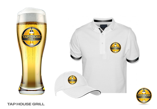
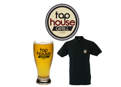
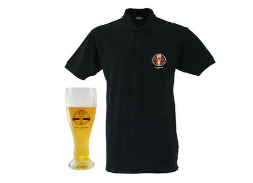
    The project is getting extended by 3 days. There are some really good ideas and revisions going on. Thank you and keep them coming! Seeing the ideas in a different way (on a glass, shirt, etc.) is helping us see how versitile the logo really is.

    Like Icon 0   DislikeIcon 0
  • September 06, 2011 8:24 PM
    taphouse taphouse
      Project Holder
    Seeing the logos in different ways (on a beer glass, tshirt, etc.) really helps.

    Like Icon 0   DislikeIcon 0
  • September 05, 2011 1:27 PM
    taphouse taphouse
      Project Holder
    Very exciting to see these designs evolve!! Very creative and I feel they are getting to where we need to be. Just a quick comment, we like the design of a pilsner or pint glass - no beer bottle. We like the look but we are pushing the tapped beer in the logo. Putting the word tap with a bottle beer doesn't flow. But the new submissions that have the bottles - we are liking the coloring and dimensionality. Designs #34 onward really have that lit from within feel which is so inviting. It really draws the eye in. I will try to upload some pictures of what we mean by the shape of the glass - I just don't know if I can upload anything. Draft #7/#29/#30 has a good shape for a pilsner.

    Like Icon 0   DislikeIcon 0
  • September 04, 2011 1:48 PM
    monictm monictm
     
    Thank you for your comments...I will be working on the changes

    Like Icon 0   DislikeIcon 0
  • September 04, 2011 1:05 PM
    taphouse taphouse
      Project Holder
    Great new designs! I like how things are progressing. General feedback thus far is to go with a pilsner or pint glass instead of a mug. A mug seems to represent more of a pub or strictly bar. We like to incorporate the yellow in the design. This will work well with future marketing and spotlighting beers. We have a concensus on Draft #4 - it is modern and clean and can be easily integrated with other marketing. Would love to see this continually worked. Draft #16 - Could we try this with colors similar to #4 and #15? Draft #14 - could we try all block letters (like the "Tap" is now and then "Grill" being the color of the block (like "house" is now) Draft #28 - I have to get new feedback but I think this will go over well. We've wanted to see a tap pouring in. Not crazy about the font though. Something a little cleaner and modern would be good. Great job!

    Like Icon 0   DislikeIcon 0
  • September 03, 2011 6:22 AM
    taphouse taphouse
      Project Holder
    I gave 3 stars to the designs I am liking. Would like to see more entries though. I will give more feedback when I get to talk with my partners. I will give more feedback within a few hours.

    Like Icon 0   DislikeIcon 0
  • September 01, 2011 8:24 PM
    taphouse taphouse
      Project Holder
    I wanted to post some logos that we liked from the portfolio Sapore - Image with Initials, clean Grill Two 74 - like the simple look, modern, clean, sophisticated and a little edgy. Like the reflection of light. Compact. Ben's Pub - not crazy about the color but it caught our attention. Like the oval shape, has traditional bar look Outside logos on websites: http://www.steelheadbrewery.com/index.html Like the logo with oval shape, it has sort of a throwback look searching for beer labels produce a lot of options too.

    Like Icon 0   DislikeIcon 0
  • September 01, 2011 1:13 PM
    SiteAdmin SiteAdmin
     
    Contest is extended for 3 more days.

    Like Icon 0   DislikeIcon 0
  • August 31, 2011 11:58 AM
    taphouse taphouse
      Project Holder
    In #3 -I am not sure what the arrow represents. I think the large beer mug is a little much. I am liking number 4 and 5. Very clean, looks classy yet contemporary. I also like the use of an image in an understated way, and yellow (the color of beer) is good too. I am excited to see what is yet to come.

    Like Icon 0   DislikeIcon 0
  • August 29, 2011 2:56 PM
    scwalker04 scwalker04
     
    Thanks for feedback will try again

    Like Icon 0   DislikeIcon 0
  • August 29, 2011 9:14 AM
    taphouse taphouse
      Project Holder
    These are very generic. #2 has way too much going on.

    Like Icon 0   DislikeIcon 0