SALES / SUPPORT : +1-877-525-5646   |   Login


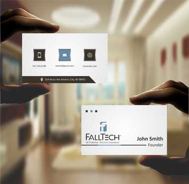
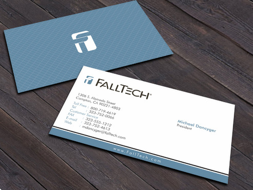
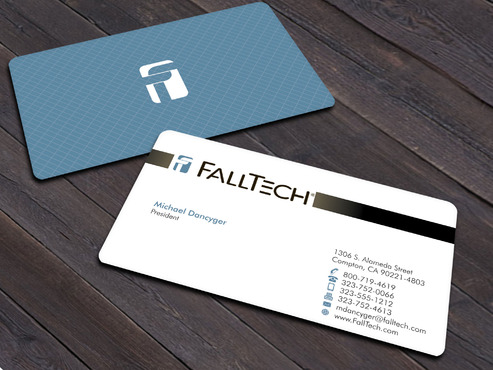
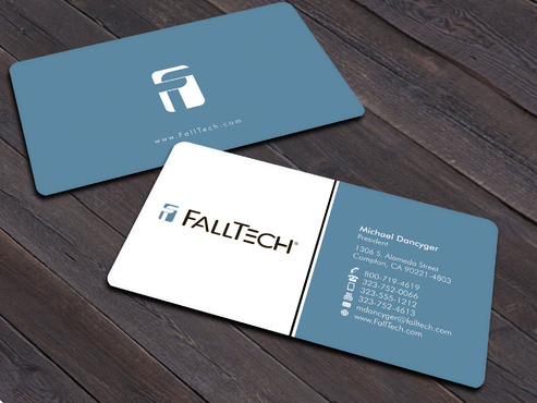
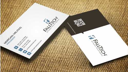
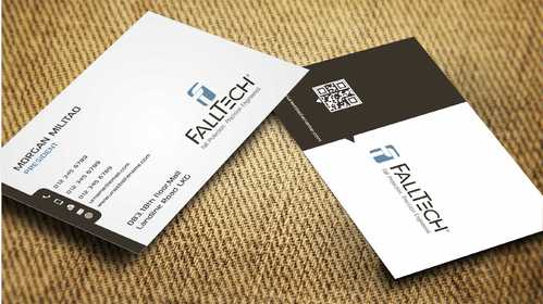
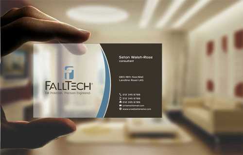
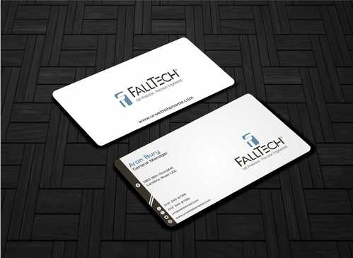
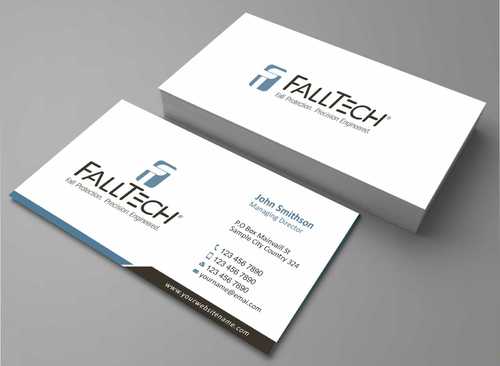
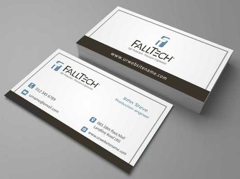
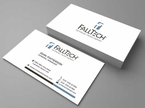
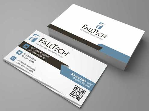
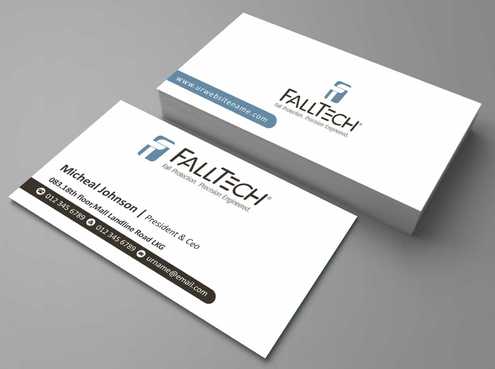
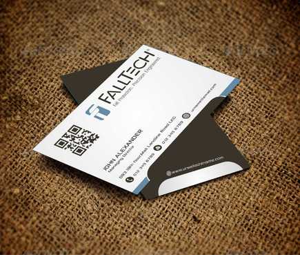
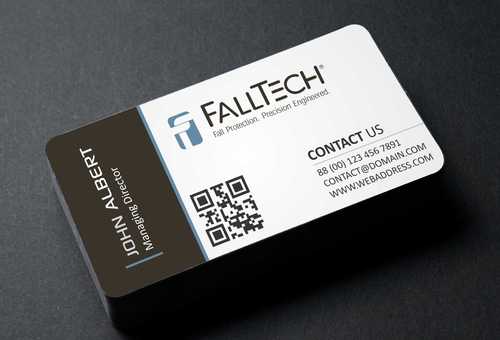
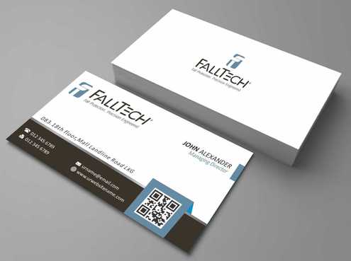
business cards and stationary for Fall Protection Company

For construction and Industrial Safety

Contest Holder kmayfalltech ?

Last Logged in : 3298days39mins ago

Concepts Submitted

401

Guaranteed Prize
225
Winner(s)

1

Business Cards and Stationery veildAll design entries are veiled from other designers till the end of the contest.
tick_gray

Live Project

tick_gray

Deciding

tick_blue

Project Finalized


Project: business cards and stationary for ...
Contest Launched: Jul 09, 2014
Selected: 1 winning design from 401 concepts
Winning Design by: Xpert
Close Date: Jul 28, 2014


business cards and stationary for Fall Protection Company - Industrial Supplies


Awarded as a winner
Project Report    

Sort by:


#115

#26

#21

#15

#7

#19

#3

#2

#17

#1

#173

#172

#170

#168

#161

#136

#130

#129

#128

#127

#126

#125

#124

#122

#121

#120

#119

#118

#117


Creative Brief


business cards and stationary for Fall Protection Company

For construction and Industrial Safety

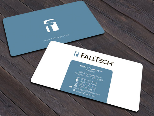
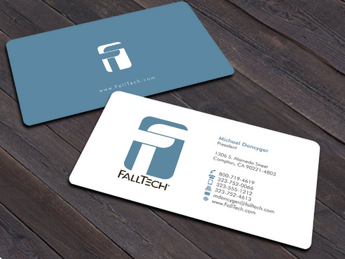
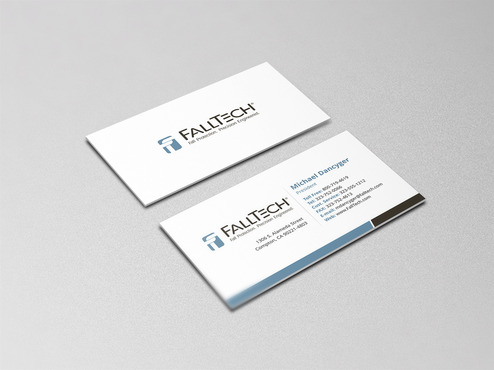
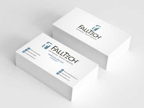
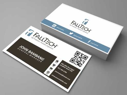
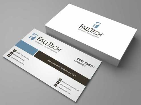
I need double sided standard sized Business Card [3.5" x 2"]

Use standard fonts

Cutting-Edge

Modern

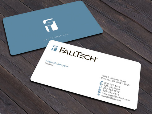
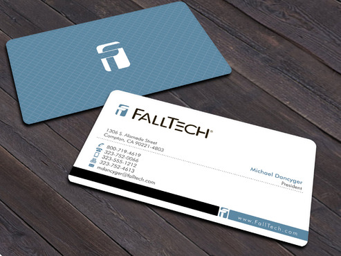
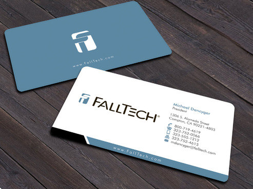
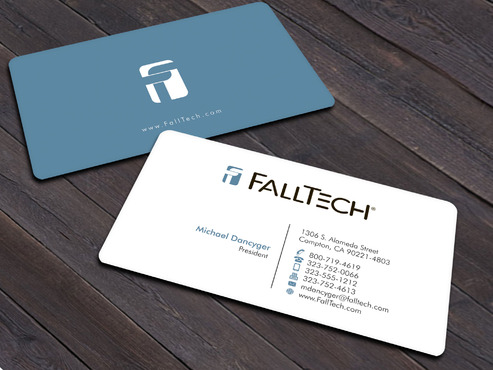
Michael Dancyger

President

1306 S. Alameda Street Compton, CA 90221-4803

800-719-4619

323-752-0066

323-555-1212

323-752-4613

mdancyger@falltech.com

FallTech.com

Want a very clean, crisp look that's a little edgy, too. See www.falltech.com and catalog (http://cdn.falltech.com/catalogbook_2013/HTML/FT_CatalogBook_2013.html) for current look/feel We are currently using the following fonts: Helvetica Eurostile Lt Std Neuropolitical However, you may use others as long as they compliment our current look/feel You may, but are not required to include our Tag line: "Fall Protection. Precision Engineered."

Industrial Supplies

Related Contests


Logo for drilling company
$75
Prize Money
79
Concepts
business cards and stationary for a motors and pumps
$75
Prize Money
222
Concepts

Discussion


Comments

  • July 09, 2014 8:10 PM
    kmayfalltech kmayfalltech
      Project Holder
    Would like to see some variations in the way contact information is called out - So far, there are a lot of icons. Would also like to see with just a letter, spelled out or abbreviations - Toll Free: Tel: Customer Service FAX: E-mail: Web:

    Like Icon 0   DislikeIcon 0
  • July 09, 2014 4:17 PM
    kmayfalltech kmayfalltech
      Project Holder
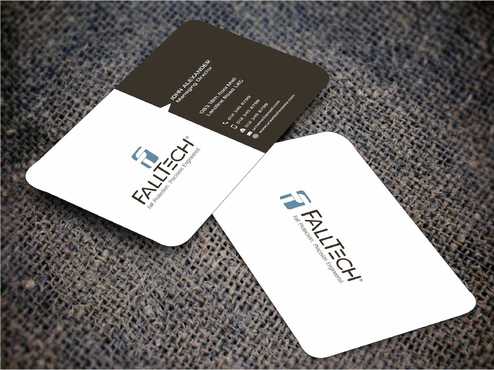
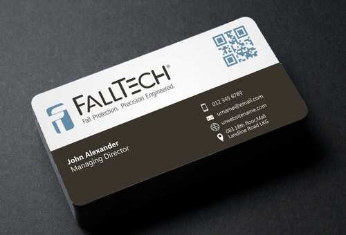
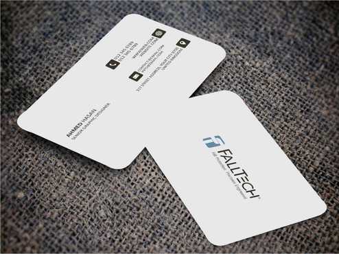
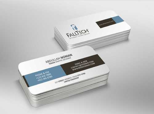
    Also, we prefer square corners rather than die cut.

    Like Icon 0   DislikeIcon 0
  • July 09, 2014 4:15 PM
    kmayfalltech kmayfalltech
      Project Holder
    Also, we prefer square corners rather than die cut.

    Like Icon 0   DislikeIcon 0
  • July 09, 2014 2:58 PM
    Xpert Xpert
     
    Can you give some star rating please... Thanks

    Like Icon 0   DislikeIcon 0
  • July 09, 2014 2:56 PM
    kmayfalltech kmayfalltech
      Project Holder
    See the website and catalog for certain accents that we have been using - the squares with arrows, or just the arrows, background grids - we're more straight lines than swooshes

    Like Icon 0   DislikeIcon 0