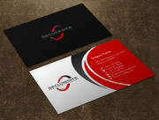
Business Cards and Stationary for a Security Company
On the Job Security
|
Contest Holder
cmccray0326
?
Last Logged in : 3636days10hrs ago |
Concepts Submitted
63 |
Guaranteed Prize
100 |
Winner(s) | Business Cards and Stationery |
|
Live Project
Deciding
Project Finalized

Creative Brief
Business Cards and Stationary for a Security Company
On the Job Security
I need double sided standard sized Business Card [3.5" x 2"]
Use specific fonts
Noted in instructions...
Professional
Craig McCray
Chief Operating Officer
3606 Enterprise Avenue, Suite 311 Naples, FL 34104
(732) 754-5045
(239) 228-4826
mccraycr@otjsecurity.com
www.otjsecurity.com
Good Afternoon Designers, For this project I would like developed a two-sided business card for my security company. I already have a design that I would like to use for the cards; however, there are a few small changes that I would like made to it. I have uploaded the .ai files of the FRONT and BACK of the current design to make it easier for you to work to with. First, I will tell you what small changes I would like made to the back of the card: (1) If you look at the very top of the back side of the card there is a little space in between where the flap of the envelope begins and the top of the card. This space should not be there. The flap of the envelope should start at the top of the card. Next, I will tell you what small changes I would like made to the front of the card: (1) The front of the card is not proportioned correctly. There is too much space in between the bottom, top and sides of the card and my information, shield, and company name. Please fix this. (2) All of the text that has my information [Phone Number, Address, and Website] I want colored in a black font so it stands out more. Also change the font type of all this information to the same font type of the "VI ET ANIMO" on the gold plate of the shield in my logo. (3) Please change the font and color of the text On the Job Security at the top of the card to the same font type of the "VI ET ANIMO" on the gold plate of the shield in my logo. [I want to have a consistent font throughout the card]. (4) Please make the end of the Shield the same distance from the middle line as my information. (5) Center the company name On the Job Security in between the shield and my information. *I’ve attached a link to an image on DropBox that shows exactly what I would like [the only difference is that I would like all the font changed to the same font used in the "VI ET ANIMO" text on the gold plate of the shield in my logo: https://www.dropbox.com/s/30typksbrpvce1a/RECENT%20DRAFT%20%281%29.jpg?dl=0 The red box in this image is the cutoff for the content that will be printed in the card. Thank you, kindly. Craig McCray
See above instructions...
Security


