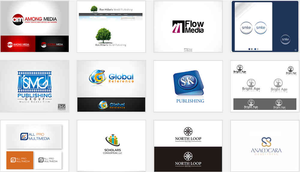
Selected Logos / Category: Printing & Publishing / Book Publishing Company
Book Publishing Company logos
By Staff Writer
PUBLISHING COMPANY LOGO STYLES GUARANTEED TO REEL IN WRITERS
Publishing businesses operate in a niche where every player must prove their worth to stay in the marketplace. The logo of your company is an image that identifies you in the competitive world and it's how audiences relate to your business. A logo doesn't just displays itself proudly in a crowd but also helps customers and prospects everywhere distinguish your business from your competitors.
The publishing sector has several types of businesses in operation. Among them are book publishers. Book publishing can range from specially hired agents assisting hopeful writers in getting a book printed successfully, to distribution companies which buy and distribute these published works. A successful publishing company is one which not only reels in writers but also distribute their works.
Let's bring to light how a winning logo style attracts writers by the numbers.
The Logo - A Shining Beacon
The goal of getting a brand image for your company is to allow customers to easily identify it as a business. To best represent your identity, certain color schemes, typography and images play supporting roles which shape up your publishing brand identity.
Book publishers in particular have the freedom to experiment with more images and colors to clearly represent what they do, unlike others in the publishing industry such as the magazine publishers.
Your company image is like a shining beacon that lets audiences identify you easily in a densely populated niche. It helps readers find your products quickly instead of making them scan the shelves for several minutes.
A properly designed brand image sets the bar high and gives your competitors a good run for their money.

Projecting the Right Mix
Creativity is the gateway that can win the hearts and minds of your customers. Brand identities in this industry tend to abundantly use rather obvious images like pens, pages or typically books. While some of these may work for certain companies, they will not give you an edge over the competition. Such images don't just lack zeal and creativity but will inevitably give you an identity that may be too similar to your competitors.
As a book publisher, you must be a good storyteller for your brand. Newspapers sell fact-based events that have occurred recently while fashion magazines speak of the latest in clothing and, makeup. Similarly, a book publishing logo should let readers know what you're all about. Avoid using a generic image related to publishing.
For example, try a vintage spoon for a cookbook or perhaps an image of a rocking horse if you're publishing children's books.
How Typography Ties in
Being the owner of a publishing company, you may be familiar with the importance of selecting the right fonts. In this case, image typography will go well beyond just Sans Serif or Serif. In this industry, you can fully utilize fun and decorative typography, but this isn't the best choice when it comes to copy print.
You have a nearly limitless array of choices. Pick from several existing options such as having your custom designed typography by professionals for the company logo or try mixing it up in a three-word name for the business.
Here's a general rule of thumb: avoid mixing sans-serif and serif typography within the same publishing logo design because both of the styles will lose their effect. However, even though this is not a hard and fast rule. You may want to experiment at your own discretion, but make sure it's simple and easy to read. If you're looking to opt for an elegant script, you should keep the accents and swirls to a minimum as readers should be able to easily make out the design from a distance.


Making Good Use of Color Psychology
The colors you choose have a significant and almost immediate impact on your audience. The colors you want to go with, much like other elements of the logo need to agree with the story you're telling. Are you a publisher getting ready to launch romance novels? A mysterious black tone or passionate red is ideal. On the other hand, yellow or orange works really well for children's novels green.
In a nutshell, here's what the language of colors speak:
- Red is for intensity and passion
- Blue is associated with success and security
- Green relates to confidence and calmness
- Orange is ideal for youthfulness and lightheartedness
- Brown speaks of simplicity and natural elements
- Black resonates well with boldness and mystery
- Purple is tied to luxury and royalty
- Grey goes along well with stability and authoritativeness


Some Special Considerations
Take a minute and think about all the places your publishing brand image is going to be used. If you're an e-publisher, for instance, you need to take into account how all e-readers may not be using a color display. In such a situation, your design should look crisp and pristine in color as well as black and white.
Try not to rely on complex color schemes because your design may fall flat when viewed in plain grays, blacks and whites. Staying ahead of your competitors is tough work. Keep your brand identity unique and fresh by hiring the help of a professionally trained logo designer, who knows how to strike the right chords with your target audiences.
