Selected Logos / Category: Games & Recreation / Arts and Crafts
arts and crafts logos
By Staff Writer


Winning Arts And Crafts Brand Logo
Let's face it: launching a business successfully and then continuing to move it higher in this industry is tough work! You sit down with your team and discuss aspects related to the name of the business, its range of products and scope etc. During this process, you also visualize a brand design that does justice to your arts and crafts business.
The logo or graphic representation of your business is in fact, a potent marketing tool. Right from the planning phase, this is something that must be given the highest priority. Several accomplished businesses even rebrand their brand image every few years just to stay ahead.
A memorable brand identity doesn't just raise awareness but also makes your products stand out from competing businesses.
Getting it Right from the Get Go
Businesses in the arts and crafts trade have their work cut out for them when it comes to getting a decent logo design. Though most non-creative businesses see the logo process as simply selecting a symbol, font and some accompanying colors, this is not the case with arts and crafts companies. The reason for this is because the customers of arts and crafts business will often tap into their subconscious aesthetic preferences to identify the business.
As you're busy brainstorming ideas, keep in mind that an arts and crafts logo is not simply a symbol that's going to be imprinted on your website or business card. It is something that sets the tone for your entire business and how it will be perceived for years to come. It is quite literally the first thing audiences identify with when they see or hear of you. It may very well be the last thing they remember about your business as well.
Leaving a lasting impression is what brings customers to your doorstep.
Here are some examples of well-crafted designs:
Let's discuss some vital elements that go into shaping up your brand logo.

Source: davinciartistsupply.com

Source: artandcraftfactory.co.uk

Source: norwegiancrafts.no
Colors Are at the Center of Your Design
Color psychology lets you communicate your company's personality right away. People always have a certain reaction when they interact with a specific color or set of colors. Design choices become easy and effortless once you understand how color psychology influences your customers' mindsets.
Take the "Michaels" logo for instance. The sample above is only one of the versions. Among their designs, is a version that incorporates white script against a jet black background and then there's one that has black script on a white background.

Source: underconsideration.com
Color psychologists will tell you how white sparks positive connotations and is seen as a color of cleanliness, efficiency, clarity and sophistication. Customers are looking for these positive qualities even if they don't realize it consciously.
Black for instance, boasts qualities like efficiency and sophistication and is a color associated with security and glamour.
People who are into crafting materials are always looking for these positive and uplifting qualities in an arts and crafts brand image. They enjoy the emotional appeal a logo has because they want traits like sophistication and glamour reflected in their very own crafts.
One business,customers fondly relate to in this trade is Joann Fabric and Craft Stores. This well- established company has employed a unique approach. The logo sports a dark green color which communicates balance, harmony and nature.

Source: Forbes.com

Source: Forbes.com
Making use of the color of natural harmony is a very clever choice indeed. The design itself offers a gateway to a creative outlet which allows customers to restore balance in their lives and they get to make something that may contribute positively to the environment.
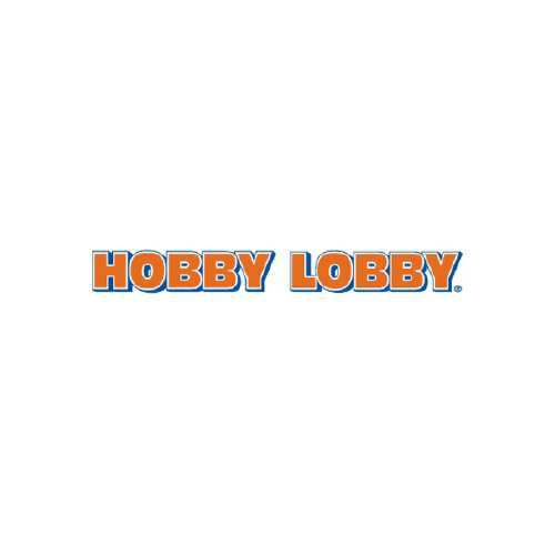
Another great example is Hobby Lobby; this orange design communicates nothing but passion and fun. The text is wrapped in a blue tone adding an element of trust and intelligence. So if you're looking to tap into your audience's desire for fun and intelligent activities, you'd be wise to make use of this approach.
Other color combinations you should consider are yellow-violet, green-magenta and red-cyan. Pair up the right colors and you can create a contrast that makes the logo pop out. Sending the Right Message - Typeface
Logos make use of a typeface to communicate brand messages. Going back to the Michaels design;this is a script type, something people find creative and elegant. The font has a clean look, with a fun yet creative edge.
Hobby Lobby and Joann Fabric by contrast, use bold typefaces which communicates a sense of stability.
Unlike the Michaels graphic representation which has a light and airy script, these two have heavy and bold typefaces. Let's take a more detailed look at them.
Joan Fabrics has a serif typeface, which communicates respectability and reliability. Hobby Lobby on the other hand, uses sans serif, which is a more modern and cleaner typeface. Whether you choose serif or sans serif, each sends out an underlying message.
While the former aims to attract audiences that prefer sticking to a tradition of hand-made home items,the latter design is geared more towards people who simply want to pursue crafts as a hobby, or perhaps a healthy source of distraction that keeps their kids busy for hours.
When you go through top designer portfolios, make sure the professional art and graphics designer you choose understands the importance of projecting a positive arts and crafts brand identity of your business. Explain how you want the design to be perceived, and take a breather as your designer zeroes in on all the intricate details.
