How To Learn Web Design When You're A Web Developer
Are you a web developer?
Web development is a specialized skill that requires ample knowledge of coding. You work with web designers, take their ideas, and figure out how to make them real.
But if you've ever thought about adding design skills to your web development portfolio, learning the basics of web design is the right way to start.
What differentiates these areas from each other? How can you pick up the skills needed to do both, and why might you want to do that?
To know the answers, read on — this article is going to discuss all of that and more.
Development Vs. Design

If you have skills in the area of web development, you probably know a lot about the ins and outs of creating and coding content for the internet
Web developers have their aspects of design, mostly centered around the actual execution of the initial design. A web developer's role involves taking an idea and making it a reality — or, at least, as much of a reality using all the available tools and strategies.
With the advent of responsive design, a developer's skills have gotten complicated. Coding and programming are challenging even without the things designers have asked to be included.
After all, as developer N. J. Rubenking says,
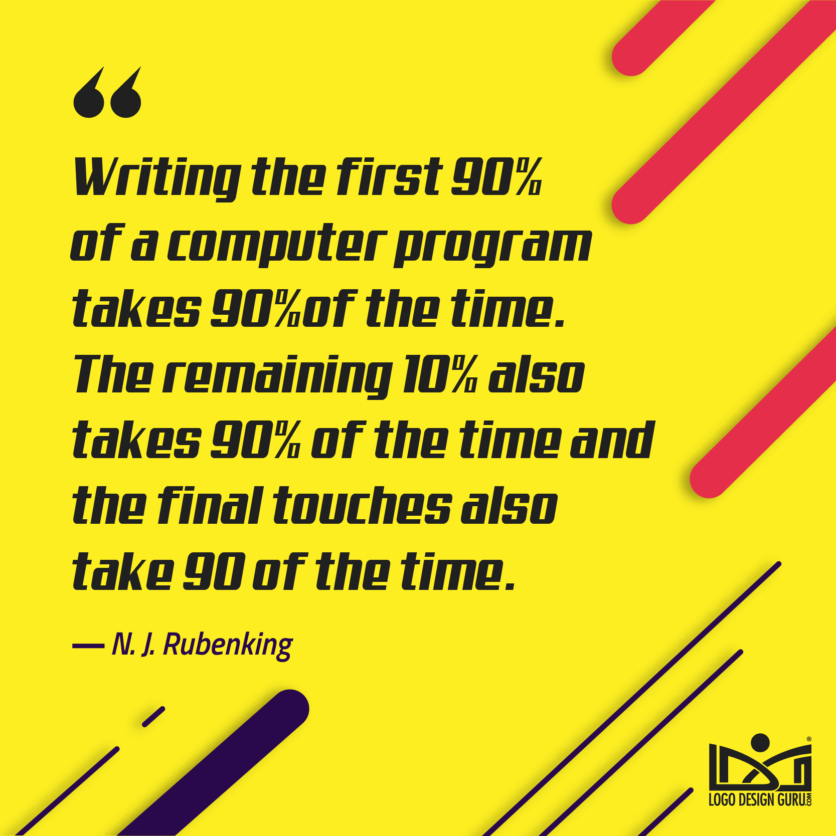
A developer follows an outline and makes things happen in reality, but the designer is in charge of making sure that the design speaks to the audience.
So, where do web development and design come together?
The goal for each is the same: to create a user-friendly website design experience that accomplishes the goal it sets out to accomplish.
With time and a strong interest, both designers and developers can learn each other's skills to excel at what they do. We're going to take a look at one particular difference in design versus development that may have scared more than a few developers off over the years.
Mindset
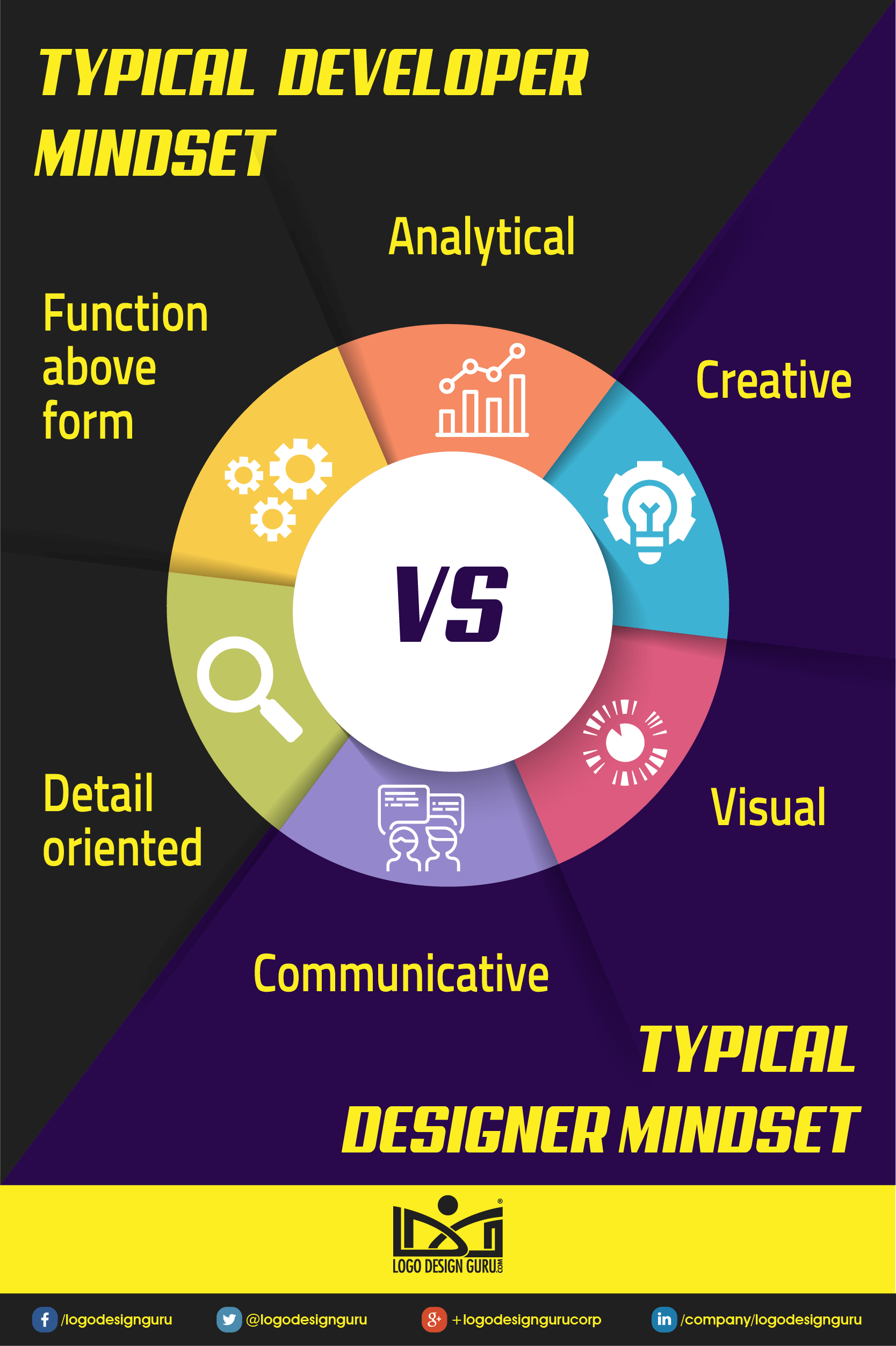
Maybe you've been holding back on jumping in and learning web design. There could be a few reasons for this, but one of the big ones is that design is all about the creative.
If you're comfortable with setting code and you don't necessarily have a lot of experience with palettes, shapes, or font choices, this may be a big jump for you.
The article Creativity and the Design Process notes,
Creativity is a quality that is highly valued, but not always well understood. Those who have studied and written about it stress the importance of a kind of flexibility of mind.
You may not naturally have a super-flexible mind, and that's okay!
People are different in many ways, and what motivates one may not work for someone else, and vice versa. But if you want to learn new skills, then getting out of your comfort zone is vital.
It can be challenging and a little uncomfortable to begin with, but thinking outside the box is what it's all about! Rest assured, even if your inclination is not toward graphic design or the creative side of things, these are skills you can learn, and there are plenty of tutorials and tools out there to help you along as you dip your toes in the deep waters of web design.

istock.com/exdez
Good design is all about effective communication.
What is “good communication” when it comes to websites? Creating a web design that not only incorporates the aesthetics of design but also successfully resonates with the target audience.
Designer Victor Papanek, in his book Design For The Real World, said,
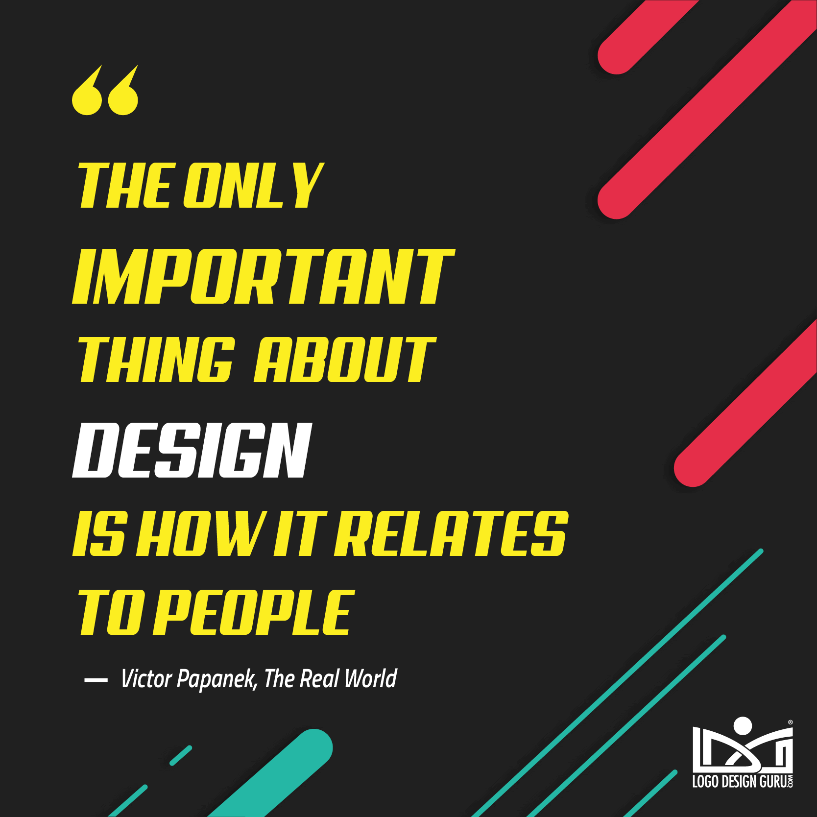
Designers need to be aware of what they are presenting to their audience, be they clients, customers, or consumers of another sort.
This comes through in the creative choices that you make, and your awareness of how your audience will relate.
A good starting point is to notice the different aspects you appreciate about different designs. If you work with clients as a developer already, think about what you've coded or programmed that works well — and what doesn't work so well. Consider the aesthetics and what appeals to you, and why that might be so.
Each piece of coding always has a reason for existing: to make the final result complete and clear.
Each piece of design also has a reason for existing but sometimes the reasons are a bit more complicated to pin down. For example, the reason why a particular icon works better in blue than in brown may seem like it's up to chance, or at least the whim of the designer.
But that's only partially true.
istock.com/DrAfter123
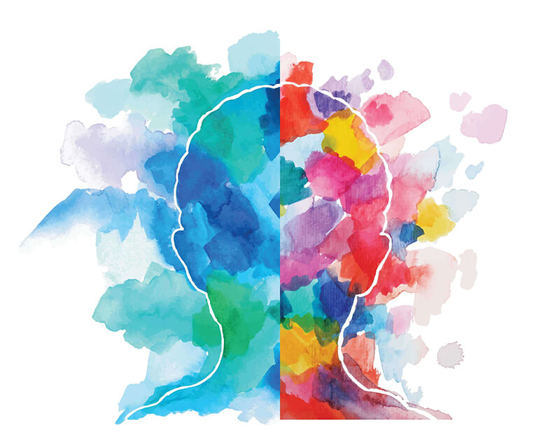
The psychology of color plays an imminent role in choosing a befitting color palette for a website, as do aesthetics and connotations.
For similar reasons, if you're designing a company website, you probably wouldn't choose to have all your content show up in comic sans. (At least — you shouldn't.)
There is such a thing as being tone-deaf in design, and that may be a concern for you. But, again, that's where all the resources, tools, and tutorials come in: teaching you to be a true designer, no matter your level of skill.
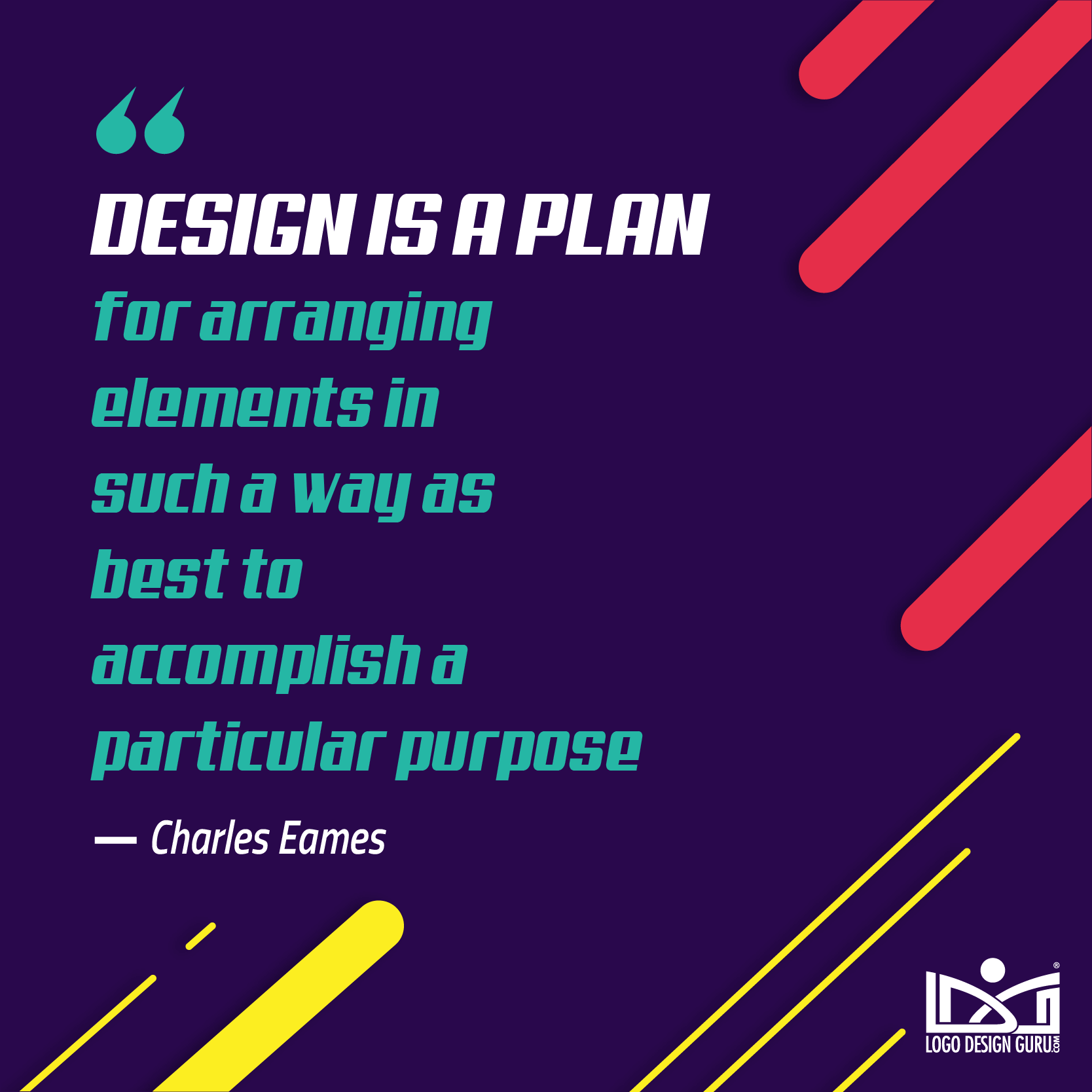
The famous furniture designer, Charles Eames once said, "Design is a plan for arranging elements in such a way as best to accomplish a particular purpose."
Though he wasn't exactly an expert in web development or design, the inspirational aspect of the quote holds for whatever area of design you get involved in.
Skillcrush.com says,
Eames knew what kind of physical and aesthetic experience he wanted his users to have, and then created it. In the digital design world of today, the same tenets still hold true.
So let's get down to the nitty gritty, shall we?
Tools And Tricks For Learning Design
Web designers turn to a plethora of paid and free design tools to get their job done.
The best place to start? With a pencil and paper.
As designer Jonathan Barnbrook said in his book Typography,
You have to have the idea before you can go to the computer or your work will lack authority. The way I do that is with a pencil, paper and stupid little drawings.
So don't be afraid to sketch out your ideas on a piece of paper before you jump on the tools. It will go a long way to helping you discover what works and what doesn't.
Here are a few sites, articles, and user-experience design quotes that can help you with the needs and wants of any design: the things that need to be a part of any successful web design.
- The Most Important Aspects of Website Design
- The 8 Elements of Modern Web Design (And Web Design Trends to Watch
- The 10 Top Principles of Effective Web Design
Once you've got your basic layout in place, and you're ready to get started on the execution part of it — making it a little more real, and getting a little closer to the development aspect that you're already familiar with — it may be time to turn to some of the programs and tools that designers frequently use. You may already have some experience with one or two — or all — of these in other aspects, but we've included some links to tutorials that are website specific.
- How to Use Photoshop for Web Design
- How to Use Sketch 3
- How to Use Adobe X D
- How to Use Affinity Designer
And when it comes to the creative part of it, it might take a little retraining of your brain before you can reach your full potential. Here are a few different blog articles that cover developing creativity for those who may not come by it naturally. The tips don't all necessarily apply to design, but if you're planning on starting to live a more creative life in general and you're not sure how to start, they can come in handy.
- How to be creative when you're not naturally creative
- Four not so difficult ways of becoming creative
- Creativity and the design process
- How To Get Your Creative Mojo Back
And while we're at it, if you're still in the process of figuring out whether design or development is right for you, here are a few resources for designers who want to check out web development and learn some new skills in that area.
- Avocode was created to help designers and developers put together the code just as it was originally designed, using the designs in Photoshop or Sketch.
- Pattern Lab is a pattern driven design tool that uses atomic design principles.
- Lynda.com has courses for all stages of skill, covering a huge range of design and development aspects, including coding.
Tutorials
So far we've covered why you might want to learn design if you're already a developer, what the differences between design and development are, why it might be intimidating for you, some basic things to remember to include in your design, and some tools to help you start putting things together.
Feeling overwhelmed yet?
Don't despair! Focusing on one thing at a time can help you put your continuing education all in the requisite slots inside your brain. The great news is, there are tons of easy to follow tutorials on any given aspect of design.
Below are a few more design aspect specific tutorials.
They cover the following
- Making color palettes
- Choosing the right font
- Logos, graphics, and branding
- How to shape content
- Business model-specific design
Color
Color is going to — well — color a lot of how people process and react to your design. There are several reasons and ways to game the system, so to speak, by learning what appeals to your audience and what will attract the eye and demand attention.
There are entire courses centered around the psychology of color, so don't expect to learn it all in one afternoon. For learning about the psychology of color and the importance of palettes in design:
- How to create a good color palette
- Color palette management tutorial
- Unified color palette tutorial
- Color psychology in web design
Font
Figuring out your perfect font can take a while, simply because there are so many out there. There are a lot of hidden details that play into your decision: certain fonts give certain feelings and tones to content. (As mentioned previously, Comic Sans is generally a no-no.)
Here are a few tutorials on font choices, why they're important, what they evoke, and how to make sure they're legible:
- How to design awesome text effects in Photoshop
- Graphic design tutorial: choosing fonts
- Ten rules of typography in web design
- Web design tutorial: planning for type faces
Logos, Graphics, and Branding
Graphics are a basic piece of your overall design, and you might be surprised at what goes into designing and choosing them.
Logos are a good place to start, since they provide a "face" for the company (or service or website or organization) that you are designing for. Most logo designers start with a handful of scribbles, trying to figure out what works, before they move onto putting it into digital format.
Logo designs also relate to the overall branding of your design. Especially when creating a website for a business, it's important to make sure that the design flows with the aesthetic of the business. The logo will likely be repeated several times, and aspects of it may need to be incorporated in different areas to ensure that it gets noticed and remembered.
It's more than just the logo, of course.,
There are going to be numerous pieces of graphic design that will demand your attention as you're putting your web design together, including everything from linking buttons to the basic shapes that make up the aspects of your layout.
Some tutorials covering the importance of logos and graphics, how to develop them, and working with them solo or in layers and groups:
- How to make a modern logo in Illustrator vs Corel Draw for beginners
- Graphic design tutorial for beginners
- Sweet graphic design in Adobe Illustrator
- Web design basics: graphic design
- Graphic design tutorial: web design, creative side
- Creative tutorial: Branding basics
Content
I don't know if you realized this, but your writing skills are going to need a few tweaks, too.
When creating your overall design, you should have a goal in mind. Well, writing the content for the site gives you your best chance to put that goal into actual words. Yes, the design is all about communication, with words or without — but when you try to start writing the actual content, it can suddenly get very overwhelming. There's nothing quite like the pressure of an entirely blank page.
Well, don't despair! Just like any of the other skills you've been reading about, content writing has tutorials and how-tos too.
Some looks at conveying your message to the audience by choosing the right words for your content:
- How to write content for the web
- Web design tutorial: understanding content strategy
- Web content writing made easy
Industry specific design
You probably want to branch out, since you're taking the time to learn new skills — but having a few specialized areas of design is never a bad idea.
Industry-specific design involves knowing the standards within that industry, knowing what you're going to be working with, what your client is going to be looking for, and how best to go about designing it.
Think something along the lines of working with doctor's offices or health clinics: many of those sites have many design aspects in common because they are there for the same basic purpose. So specializing in that industry gives you a shorthand, so to speak, for what needs to be done.
In this case, the best place to start looking for what you need to develop your specialized knowledge is, again, taking a look at what the standards are.
Check out the sites for your local doctors (or lawyers, or cool sock developers, or whatever you're interested in) and analyze what they involve, or what they have in common. How they have designed their landing pages for conversion; find out their e-commerce vantage point.
You can also do Google searches (YouTube has a lot of industry specific tutorials) for the certain industry you're interested in.
Putting It All Together
There are a lot of different aspects to consider when designing a website. With all the tutorials listed above, you should be well on the way to developing your design skills.
As you explore your creative side, there are a few more aspects to keep in mind.
Here are a few basic tutorials for each of them.
Aesthetics - This video talks about the overall look of the website and how it flows. Lynda.com's Web Design Aesthetics Tutorial series covers a lot of need-to-know basics.
Usability - Paul Boag's tutorial on website usability tells it like it is
Functionality and User Interface - This tutorial about UI Web Design for Beginners helps you to learn how not to frustrate your audience with a poorly-designed UI
User Experience - Helping you to keep in mind what you want your audience to take away from the entire website, focusing on the overall user experience can help you reach your goal for the design and execution.
Designing Your Own Development
As we have covered in this article, web design and web development have a great deal in common.
The very purpose of both of them — to reach out to the intended audience and convey the intended message in a way that is clear and easy to understand — proves that design and development can, and should, work well together.
Having an awareness of both aspects can be very helpful to the smoothness of a contest's completion. Designers do well to have some development and coding training to showcase their designs to potential clients, and to see if the real-world application of their design can be executed.
On top of that, to be able to take a piece of internet content all the way from the conception to the finished product is an admirable goal.
So if your goal is to see a web design contest from start to finish — from the initial, hand scribbled beginning of a layout design to the final unveiling of a fully responsively designed website — then these are skills that you should know. It may be a little intimidating to think about switching your brain over to a creative side, especially if you haven't explored it much — but by the same token, it can be incredibly rewarding as well.
Here's hoping that some of the resources listed in this article can fuel your own development in your career bringing web content to the world — from conception to completion.
*This post was originally published on Logo Design Guru.
Written by Raquel Addams

