How To Design Website Landing Pages That Generate Leads For Your Business
Online marketing is serious business. The odds are, if you're trying to grow your company and expand your client base, you've got a website up and running already.
Websites are great for telling people who you are and what you can offer them, and you likely have done some marketing to try to funnel your potential clients to your site.
But maybe your numbers haven't been as high as you would like, and you're looking for more ideas. Something simple, something that will stand out, and something that will draw your clients in and make them want to invest more time in your site and ultimately your business.
If you weren't already thinking, "I want to design a new landing page!" this is probably the time to start.

A Wordstream article says, "An effective landing page is the cornerstone of successful online marketing."
And everybody wants to be successful with their marketing, right? Right.
So what exactly is a landing page, what can it do for your business, and how can you design one effectively to maximize your online marketing?
What is a Landing Page?
If you're like me, you probably thought, "Gosh, what exactly is a landing page?" and then, on googling it, realized that you already knew what it was.
To break it down as simply as possible, let's use the bestselling guide book Landing Page Optimization: The Definitive Guide to Testing and Tuning, which lays it out for the uninitiated.
"Any web page on which an internet visitor first arrives on their way to an important action that you want them to take on your site. The landing page can be a part of your main website or a stand-alone page designed specifically to receive traffic from an online marketing campaign."
You can probably already think of a few examples off the top of your head, but here's one to get you started.

Source: tumblr.com
A landing page can also be known as a lander, a destination page, or a lead capture page. The lead capture part is something we're going to be focused on; after all, the whole point of the landing page is so you can generate more business for your business.

Source: muckrack.com
So how does that work?
What Should A Good Landing Page Do?
Landing pages are all about optimizing your marketing for your business and contributing to a higher conversion rate. In this case, “conversion” is talking about turning a casual browser into an actual customer.
So it isn't just about optimizing the landing page, of course, because you don't want your clients or customers to just stop there. You have a goal in mind for them. To shop, to order, to buy, to sign up, to read, to think. The landing page should lead on into the rest of the site, moving them and motivating them to want to continue in this budding relationship that they've started with you as the business owner or offer of services. The landing page is a path, not a destination.
What does the path lead to? That depends on you and your business. The path could lead your potential customers to browsing, purchasing, filling in forms, or downloading. Ultimately the landing page is there to convert web surfers into clients.

Source: lyft.com
So what's the point of the landing page? The point is to draw people in.
Landing Page Optimization invokes the 80/20 rule in discussing the landing page. This is also known as the Pareto principle, the principle of factor sparsity, or the law of the vital few. In marketing terms, it breaks down to the fact that 80% of results come from 20% of the action.
An article on landing pages, the 80/20 rule as applied to marketing states that "20 percent of marketing messages produce 80 percent of your campaign results." So, in other words, your landing page may be a small percentage of your overall website, but it can potentially yield a lot of the desired result.
So what, specifically, are some of the possibilities for landing pages?
Types of Landing Pages
The example already listed, the page that comes up when you go to Tumblr's site (unless you're already a user and logged in, in which case it will be your dashboard) is a fairly classic example of its type. Tumblr's ultimate goal is to get the casual visitor to sign up and start a blog, and the landing page reflects the basic details that the visitor needs to do this.
Depending on the purpose of the website, the landing page can include everything from more information on the business to simply a form for signing up for services. It could also be something that will excite the casual visitor, making them want to learn more, do more, or buy more.

Source: inspirock.com
Landing pages may be created specifically to be used with special advertising campaigns, as well. Take, for example, an advertising campaign started on social media, or through a YouTube video.
This article also has several suggestions for campaign-based landing pages, including setting up a reward for new visitors. "Giving something valuable away for free," it says, "can be a powerful motivator, especially when used on a landing page."
No matter who you are, you only have the attention of your potential customer for a fleeting moment. You need to make the most of it. Landing pages can help you with that.
But how?
Benefits of Landing Pages
Let's talk again for a moment about the conversion rate. Conversion refers to taking a casual viewer and getting them invested. You want your potential customer to stick with you, to be drawn in by your landing page, and then to move on to the things you want them to do, depending on what your goal is. There are some ways to do this that are better than others.
Optimizing your landing page is a great start.
Of course, there are a lot of things to consider when doing this. Here are some potential factors to keep in mind:
- Who your customer is
- What they're there for
- How they found your landing page/site
- What their motivation is
- What you need to do to push them to continue
- The usability of your landing page/site
- The aesthetics of your landing page/site
- Clarity of your message
- Potential rewards for continuing
You don't know all these things automatically, of course, since these are probably new potential clients. But this is where doing your research beforehand on who you have been marketing to and who your potential audience might be will come in handy.
With these factors in mind, what exactly do you want on a landing page?
Anatomy of an Effective Landing Page
This article on designing landing pages with a high conversion rate includes a lot of things to include in the design. A few of the elements and principles of website designing are:
Alignment:
Making sure what you're offering adds up to what the audience wants or needs. You should immediately notice what this landing page is offering.
Hierarchy of Headings:
While it is necessary to add interesting written content to your website, it is important to make sure the text is structured and distributed well into headings, sub-headings, footnotes, and copy. The size and style of the font matters. Font pairing techniques also help with creating a balance that takes us to our next point.
Balance of Visuals and Texts:
There's a fine line between too much and too little, especially when it comes to content. With excitement, there is always the possibility of going overboard with the visuals and the text.
You have to be able to communicate effectively what you want your audience to know, without overloading them and scaring them off because of all the reading and viewing.
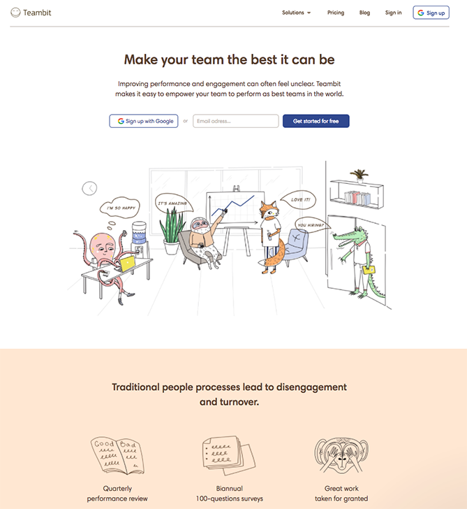
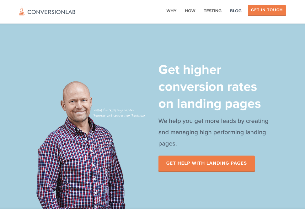
This, of course, depends on who your audience is and what you're offering, so make sure you know your stuff like this page does.
Simplicity in Distribution of Elements on Page:
The point of the landing page is to then move somewhere else, not to spend a lot of time checking out the possibilities of your landing page. Keep it simple and don't distract from the main message.
New text: Real estate professionals can further maximize their conversions by adapting CRM strategies. Incorporating systems for tracking customer interactions allows them to tailor client journeys more effectively. For insightful real estate CRM reviews, exploring comprehensive options can provide the best solutions for your agency.
Responsive Design:
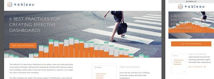
Websites with responsive design will adapt to the avenue the viewer is using, whether a tablet, a phone, or a laptop. Check this site out on your tablet and phone, and observe the difference.
Testimonials:
A few verified online reviews or comments from users can be very helpful in making your potential customer feel more confident in moving forward with your site or service.
You don't want the testimonials to be the only thing on the landing page, but they can add a lot of motivational appeals when they are included.
Call to Action:
Also known as a CTA, these are fundamental in pretty much any kind of marketing. If you stop and analyze how many times you've signed up for something on a website, it was likely due to an effective call to action.
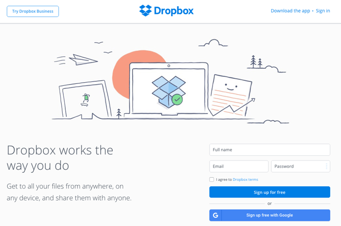
There are ineffective ones, of course; those that don't show the benefits of signing up/signing in/pursuing the goal of the website, or that make it look too complicated, or like too much of an investment of your time. Dropbox is a good example of an effective one, however.
Lead Capture Forms:
These can help a great deal with your conversion rate and make the most of your web traffic. Lead capture forms exist to facilitate a closer relationship between your business and your site visitor.
Again, these are not things that you want to make too complicated. Additionally, putting in an incentive, such as a 10% coupon for signing up with your email, can be a useful tool. Or using the word "free." Everyone likes the word "free."
Options:
Don't overwhelm your audience. If your goal is to get them to fill out a form or sign up for a service, keep it short and sweet. If you're funneling them to your site, don't give them all the possible pages, but send them to the front page or the directory.
All of those are principles that should be considered when putting together the general layout and design. And then, of course, you have the classic basics that are involved in pretty much every design for everything, ever. (Or, as I call it, "the fun stuff.")
Colors:
Your color scheme is no less important on your landing page than it is elsewhere. Keeping in mind the psychology of colors is important as well.
Font size:
Once you choose the right font for the website, the next step is to work on how you will use it. Font size helps with not only the layout of a web page but it also helps to emphasize or highlight certain texts.
Since you likely won't have a ton of information on your landing page, you may choose to use a larger size than you might for the majority of your site.
Font type:
Easy to read. Remember, you don't want your potential clients to feel like they have to invest too much time into this. There are many fonts for digital, so have a look around the resources to find a typeface that is perfect for your website.
Whitespace:
Keeping your landing page open and easy to use is a good idea. It gives visitors the necessary information without hurting their eyes.
Images:
Background images or a company logo design need to be included in your website’s landing page because this helps to create personalization and recognition.
Contrast
You can add an attractive and balanced contrast using different elements of design. On a retail website, for example, contrast is a great help on the product page where all items are listed in a catalog form.
Remember, your landing page should make people want to investigate your site more and invest time and interest in your business products, services, and offers.
Connecting the Page to your site
Since your landing page is likely there to direct people onwards to your overall website, you'll probably want to keep in mind your website's aesthetics as well, so you can have a confluence of design.
The last thing you want is to have a sudden, unexpected disconnect between the landing pages and the home page. You don't want your potential clients to think that they got lost somewhere between clicking and arriving.
Another thing to consider is the fluidity of movement between your landing page and your other web pages. Are your mechanics clunky? Is the link to your entire site obscured or hard to find?
Finally, remember to keep your landing page on-message for the rest of your site. Another way to put this is to keep any promises you make. "Adding a promise to your landing page can be highly persuasive, says the Wordstream article Just make sure that you follow through from landing page to site proper.
Now, Your Ideal Landing Page
It's time to put your awesome landing page together and generate some serious leads for your business. How do you plan on doing that?
Well, borrowing some of these ideas is a good start. Remember that simplicity is an important factor. You don't want your customers to feel like they have to invest too much time on your landing page. The point is to motivate them to move forward with your site or service. So pick through these suggestions, then pare them down to a handful.
Testing your landing site out is also a great idea. You may need to develop a few different variations along the way, but that's okay!
As your business grows and you come up with new marketing campaigns, you will likely want to adapt or avail a service to redesign your landing page to meet your needs. The great thing is, these tips will be useful for any landing page you want to put together.
**This post was originally published on Logo Design Guru.
Written by Raquel Addams



)
