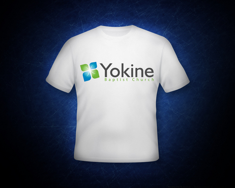
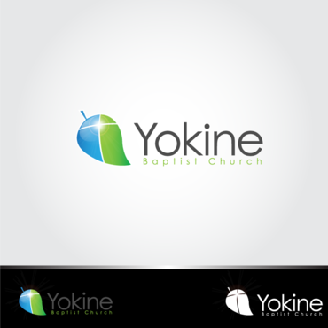
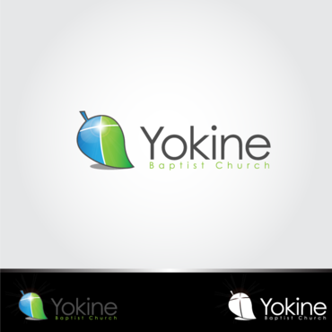
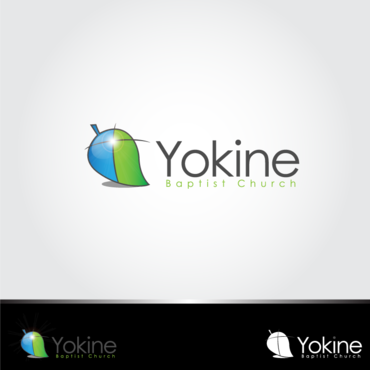
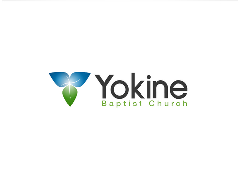
Yokine Baptist Church Logo
Yokine Baptist Church
|
Contest Holder
shandor887
?
Last Logged in : 4961days5hrs ago |
Concepts Submitted
97 |
Guaranteed Prize
300
|
Winner(s) | A Logo, Monogram, or Icon |
|
Live Project
Deciding
Project Finalized


Creative Brief
Yokine Baptist Church Logo
Yokine Baptist Church
Share, Care, Dare.
Yes
This is for our local church. We want a fresh, young vibrant new image to revive our church congregation and our vision for the future. We are a relatively small church, in a suburban area. We are focussed on reaching out to our community, and building close relationships with those around us.
Religion and Spirituality
Symbolic
![]()
Initials
![]()
Web 2.0
![]()
Unique/Creative
Clean/Simple
Modern
Local/Neighborhood
Illustrative
not sure
The three letters YBC (from Yokine Baptist Church) may work well somehow in the design.
Please stay away from Traditional Catholic 'religious' images - they contradict 'young', 'vibrant' and 'fresh' ideas.
Related Contests

Comments
Project Holder
Project Holder
Project Holder
Project Holder
Project Holder
Project Holder
Project Holder
Project Holder
Project Holder
Project Holder
Project Holder
Project Holder
Project Holder
Project Holder
Project Holder
Project Holder
Project Holder
Project Holder
Project Holder
Project Holder