SALES / SUPPORT : +1-877-525-5646   |  


VST Logo

VST

Contest Holder Vantage ?

Last Logged in : 5002days10hrs ago

Concepts Submitted

70

Guaranteed Prize
150
Winner(s)

1

A Logo, Monogram, or Icon veildAll design entries can be viewed by other designers.
tick_gray

Live Project

tick_gray

Deciding

tick_blue

Project Finalized


Project: VST Logo
Industry: Engineering Logo
Contest Launched: Jan 03, 2011
Selected: 1 winning design from 70 concepts
Winning Design by: dweedeku
Close Date: Jan 10, 2011


VST Logo - Engineering


Awarded as a winner
Project Report    

Sort by:


#29

#25

#69

#66

#46


Creative Brief


VST Logo

VST

No

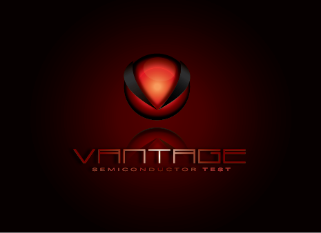
VST engineers and manufactures ruggedized hardware for semiconductor test and military electronics applications; VST specializes in microelectromechanical systems (MEMS), advanced thermodynamics, and signal integrity requirements.

Engineering

Logo Type
Logo Type

Abstract Mark
Abstract Mark

Initials
Initials

Web 2.0
Web 2.0


Cutting-Edge
Clean/Simple
Modern
High Tech
Masculine

Dark Carbon Gray scheme with rich color contrast(s).

not sure

Our official corporate name is Vantage Semiconductor Test and we're not entirely sure we want to brand as VST - we are also considering Vantage without the Semiconductor Test, as well as VanSem; logos submitted based on Vantage or VanSem instead of VST will be considered.

Related Contests


logo for an engineering consulting company
$400
Prize Money
537
Concepts
Logo for Electrical/Mechanical Engineering Co.
$300
Prize Money
300
Concepts
logo design for NE Indiana Engineering Firm
$350
Prize Money
176
Concepts
Modern logo for engineering company.
$300
Prize Money
181
Concepts

Discussion


Comments

  • January 11, 2011 5:18 PM
    adolfmazmaz adolfmazmaz
     
    Free Vectors, Psd, Graphics, Icons & more at : http://graphichive.net

    Like Icon 0   DislikeIcon 0
  • January 10, 2011 3:01 PM
    markaltamero markaltamero
     
    thank you for the feedback!

    Like Icon 0   DislikeIcon 0
  • January 10, 2011 2:56 PM
    Vantage Vantage
      Project Holder
    #44: Along the lines of what we're looking for, however you would have to be more creative with the font for this design to be in the running. #45: This is a nice submission - we're not thrilled with the color scheme, but generally like the concept - the font leveraged is quite favorable and would probably work well in a VST logo (don't get me wrong, it works as is with Vantage too). #41: Also on the right track - perhaps you could take a crack at a VST design...

    Like Icon 0   DislikeIcon 0
  • January 09, 2011 9:55 PM
    Vantage Vantage
      Project Holder
    #39: This one's nice too - can you make the element look less like a check mark though? Have you taken a crack at a VST logo yet; probably not necessary, but given we like several of your submissions we're most curious what you could come-up with for VST.

    Like Icon 0   DislikeIcon 0
  • January 09, 2011 11:41 AM
    Vantage Vantage
      Project Holder
    vanilla: May we see these with the element a full circle (i.e., extend the v all the way to the diameter of the circle); we would also like to see #35 with a white back ground (after making the above said change). dweed: Thanks for posting lighter gray version of the chevron design! everyone: We still hope to see a strong VST concept...

    Like Icon 0   DislikeIcon 0
  • January 06, 2011 9:40 PM
    Vantage Vantage
      Project Holder
    #25: With dark carbon gray instead of black - thanks for accommodating our requests.

    Like Icon 0   DislikeIcon 0
  • January 06, 2011 9:28 PM
    Vantage Vantage
      Project Holder
    #25: May we also see this with the ta in Vantage colored red?

    Like Icon 0   DislikeIcon 0
  • January 06, 2011 8:57 PM
    Vantage Vantage
      Project Holder
    #25: May we see with dark gray only; also, may we see white with a black background?

    Like Icon 0   DislikeIcon 0
  • January 06, 2011 10:28 AM
    Vantage Vantage
      Project Holder
    #20: Can you use less glare, and perhaps focalize toward the tip of the chevron on v in vantage (so a radiating effect). Can we also see this without any glare, and with additional colors? HisEye: Unfortunately we didn't like any of the graphic elements, but still like the font.

    Like Icon 0   DislikeIcon 0
  • January 06, 2011 1:55 AM
    Vantage Vantage
      Project Holder
    #16 & #18: We like the addition of color. Please slightly close the gap between the graphic element and vantage, and perhaps make the graphic and text more uniform, i.e., the graphic has a shiny appearance, but test is flat - the graphic also appears more bold than the text.

    Like Icon 0   DislikeIcon 0
  • January 06, 2011 1:44 AM
    Vantage Vantage
      Project Holder
    #2 & #13: in general we like this concept and look forward to seeing your element. #16: we like this one - you're on the right track. We imagine that subjecting your creativity to the scrutiny of strangers must be taxing, and sincerely appreciate your efforts.

    Like Icon 0   DislikeIcon 0
  • January 05, 2011 8:37 PM
    Vantage Vantage
      Project Holder
    #12: We like the font but not the icon; in terms of icons I think we like contemporary types of concepts along the lines of abstract modernism - perhaps geometric vector patterns or creative use of larger geometries. What we're looking for is a bit hard to convey, so hopefully I don't lead anyone astray here. The problem we face is that we manufacture ruggedized products for both Military and Semiconductor markets; if we were Military only we would be all in with an aggressive Terminator type of image, however if Semiconductor only we would want a more contemporary type of logo typical of web based or medical device industries. How to come-up with a logo that's both bold, aggressive, and trendy modernist is the challenge... Hopefully this makes sense...

    Like Icon 0   DislikeIcon 0
  • January 05, 2011 6:54 PM
    Vantage Vantage
      Project Holder
    VST does not yet have a website (perhaps a future contest), however if helpful you can see the types of products we manufacture by visiting the following competitor websites: www.dbdesign.com www.mmspec.com www.winway.com.tw/en/home.php www.multitest.com www.essai.com www.modustest.com Some of our target customers are NVIDIA, AMD, Raytheon, General Dynamics, FormFactor, Microprobe, etc...

    Like Icon 0   DislikeIcon 0
  • January 05, 2011 6:38 PM
    Vantage Vantage
      Project Holder
    lakshmiks: for a point of reference, we like the work you did for NPHOS, Tenacity, and Versatalis.

    Like Icon 0   DislikeIcon 0
  • January 05, 2011 6:33 PM
    Vantage Vantage
      Project Holder
    #11: Not really what we're looking for - we do like the K18 design within your portfolio if you want to come-up with something more along those lines.

    Like Icon 0   DislikeIcon 0
  • January 05, 2011 5:50 PM
    Vantage Vantage
      Project Holder
    neonlight: for a point of reference, we like your TechStore and IDO work.

    Like Icon 0   DislikeIcon 0
  • January 05, 2011 5:34 PM
    Vantage Vantage
      Project Holder
    #2: Can we see this without the fade (dark gray only), and also see VST versions? #9: Can we see this type of design in a VST concept? Also, can you show us some other flavors, i.e., not so much like your winning Link2B design, but rather the ones that didn't win; we also like some of the K2 work - again not so much the winner, but rather some of those submitted during the contest. Thanks to all for the effort thus far!

    Like Icon 0   DislikeIcon 0
  • January 05, 2011 10:16 AM
    Vantage Vantage
      Project Holder
    #1 - I like the concepts submitted during the Link2B contest, not only the winning design, but also several of the designs throughout the contest; if you can come-up with something more along those lines it would be appreciated. Also, because we play in both Semiconductor Test and DoD markets we hope to avoid typecasting, i.e., please drop direct references to semiconductor or test. #2 - We like this one and if had to choose today would go with it - we like the modernity and cleanliness it conveys; that said, we're still hoping to see something with abstract elements and perhaps an additional color. #3 - This one's OK on on the right track, but not unique enough for our image. #5 - We have nothing to do with green technologies...

    Like Icon 0   DislikeIcon 0