SALES / SUPPORT : +1-877-525-5646   |  


Vision Construction Company

Vision Construction

Contest Holder getbroadsided ?

Last Logged in : 3085days19hrs ago

Concepts Submitted

141

Prize Money
250
Winner(s)

1

A Logo, Monogram, or Icon veildAll design entries can be viewed by other designers.
tick_gray

Live Project

tick_gray

Deciding

tick_blue

Project Finalized


Project: Vision Construction Company
Industry: Construction Logo
Contest Launched: Jul 24, 2012
Selected: 1 winning design from 141 concepts
Winning Design by: traceygl
Close Date: Sep 18, 2012


Vision Construction Company - Construction


Awarded as a winner
Project Report    

Sort by:


#128

#121

#120

#119

#116

#110

#109

#102

#101


Creative Brief


Vision Construction Company

Vision Construction

No

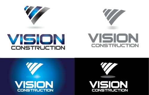
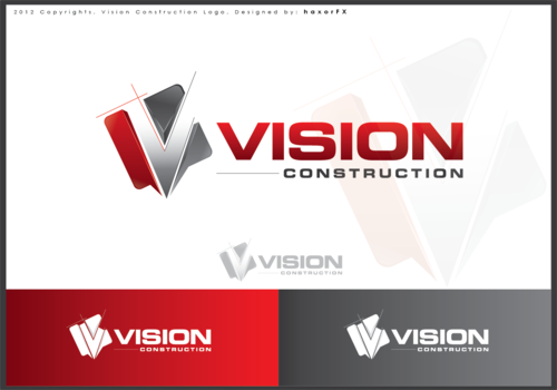
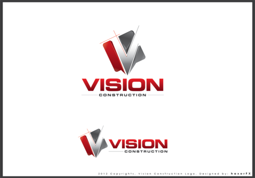
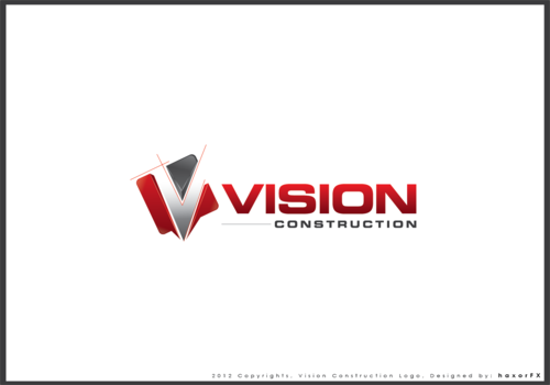
We are a contracting/construction company in Florida. Looking for a nice clean and professional design.

Construction

Symbolic
Symbolic

Abstract Mark
Abstract Mark

Illustrative
Illustrative


Modern
Professional
High Tech

We like Red, blue, white, gray....you don't have to use them all together. Be creative.

not sure

Nice clean design. We like the idea of having a "blueprint" or "drafting" style of font or logo, but we don't have our heart set on it. We would like to see this style incorporated and then go from there. Use your imagination, you designers are a lot more creative than we are.

Related Contests


Trinity Exteriors
$200
Prize Money
63
Concepts
Mendocino Glove and Safety
$200
Prize Money
39
Concepts
Secondary Logo For Flooring Refinishing Company
$199
Prize Money
62
Concepts
Logo for established Plumbing and HVAC company
$200
Prize Money
119
Concepts

Discussion


Comments

  • August 08, 2012 8:55 AM
    barquin barquin
     
    Hello PH, please check your private message , on the upper right hand corner. Thanks

    Like Icon 0   DislikeIcon 0
  • July 31, 2012 9:54 AM
    getbroadsided getbroadsided
      Project Holder
    I have extended this project for 3 more days. Please keep submitting your ideas. Thanks. Alonecho, wouldn't mind seeing you incorporate the "blueprint/drafting" look into your graphic logos. Thanks.

    Like Icon 0   DislikeIcon 0
  • July 30, 2012 12:48 PM
    getbroadsided getbroadsided
      Project Holder
    would like to see variation of #49 if possible. I like the direction you are going with the blueprint/drafting style in the graphic logo

    Like Icon 0   DislikeIcon 0
  • July 30, 2012 10:44 AM
    getbroadsided getbroadsided
      Project Holder
    ASgDesign, No houses in the graphic. Thanks.

    Like Icon 0   DislikeIcon 0
  • July 30, 2012 8:40 AM
    getbroadsided getbroadsided
      Project Holder
    I am not terribly thrilled about any of the graphic designs on these, I like the more abstract designs better than the ones with buildings or cityscapes. Please keep submitting new ideas. Thanks.

    Like Icon 0   DislikeIcon 0
  • July 28, 2012 7:31 AM
    getbroadsided getbroadsided
      Project Holder
    Alonecho, I would love it if you showed some color variations, all your designs are using the same color scheme. Thanks.

    Like Icon 0   DislikeIcon 0
  • July 27, 2012 10:07 AM
    getbroadsided getbroadsided
      Project Holder
    #38, I like your ideas on the design, however, please steer away from houses in the graphic. Thanks.

    Like Icon 0   DislikeIcon 0
  • July 26, 2012 10:08 AM
    getbroadsided getbroadsided
      Project Holder
    I dont see how 31 is different from 17?? Also, I the font is cool, but the graphic isnt what we are looking for on those two.

    Like Icon 0   DislikeIcon 0
  • July 25, 2012 12:28 PM
    getbroadsided getbroadsided
      Project Holder
    15, 16, 17- cool font! Thanks.

    Like Icon 0   DislikeIcon 0
  • July 25, 2012 11:37 AM
    SiteAdmin SiteAdmin
     
    Attention Designers!! MycroBurst permits you to submit unlimited designs with unlimited variations. However, if you are providing 2 or 3 different color versions of the same logo in one draft, please make sure that if the particular draft gets finalized, each color version should be separated before you will send the final files. Thanks, MB/LDG/LS Team

    Like Icon 0   DislikeIcon 0
  • July 25, 2012 10:46 AM
    getbroadsided getbroadsided
      Project Holder
    # 11 and 12; not bad but portions of your logo disappear with a dark background.

    Like Icon 0   DislikeIcon 0
  • July 25, 2012 10:09 AM
    getbroadsided getbroadsided
      Project Holder
    #9, I like the font, hate the graphic.

    Like Icon 0   DislikeIcon 0
  • July 25, 2012 10:07 AM
    getbroadsided getbroadsided
      Project Holder
    Thanks for the submissions. Let's stay away from eyeballs or shapes of an eye. We like the idea of a more abstract logo. as for the font, we are really looking to see a blueprint type of font. Check out http://www.fonts101.com/search/draft "handwriting draft" "rough draft outlines" are where the idea came from. Would like to see something along those lines, but maybe improved upon. stay away from houses and cityscapes. Again, looking for something more abstract, clean and professional. Thanks to you all.

    Like Icon 0   DislikeIcon 0