Vela Diagnostics

Vela Diagnostics

Contest Holder atago22 ?

Last Logged in : 4206days22hrs ago

Concepts Submitted

42

Prize Money
250
Winner(s)

1

A Logo, Monogram, or Icon veildAll design entries can be viewed by other designers. Featured Featured Contest Expedite Expedite Contest
tick_gray

Live Project

tick_gray

Deciding

tick_blue

Project Finalized


Project: Vela Diagnostics
Industry: Biomedicine Logo
Contest Launched: Mar 10, 2011
Selected: 1 winning design from 42 concepts
Winning Design by: cromox
Close Date: Mar 17, 2011


Vela Diagnostics - Biomedicine


Awarded as a winner
Project Report    

Sort by:


#37

#36

#42

#41

#40

#39

#38

#35

#34

#33

#32

#31

#30

#29

#28

#27

#26

#25

#22

#21

#20

#18

#7


Creative Brief


Vela Diagnostics

Vela Diagnostics

No

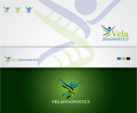
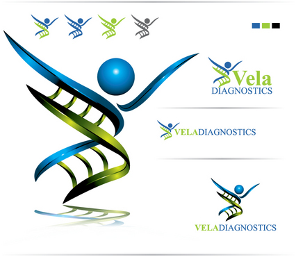
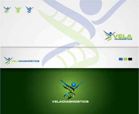
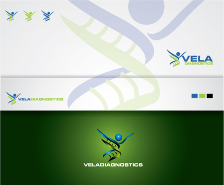
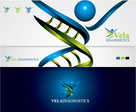
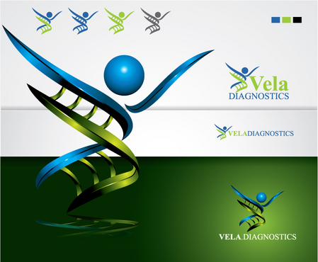
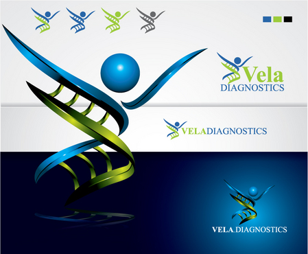
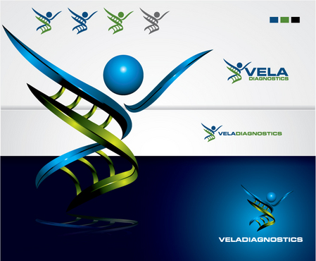
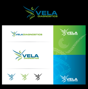
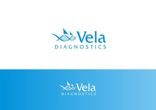
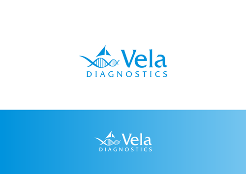
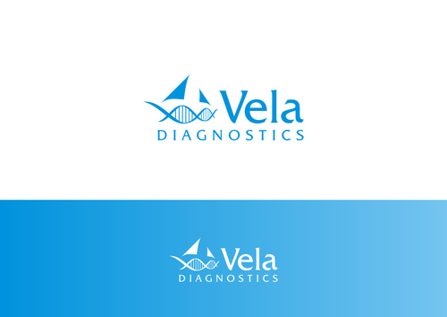
Vela Diagnostics is a worldwide developer, manufacturer, and marketer of integrated diagnostic systems for the monitoring, screening and diagnosis of disease. The systems being developed are enabling laboratories to Innovate, integrate, consolidate, communicate, participate.
Our products serve the needs of hospitals, reference laboratories, academia and clinical research wishing to more effectively manage their workflow and cost without compromising quality or service excellence

Biomedicine

Symbolic
Symbolic

Abstract Mark
Abstract Mark

Character
Character


Cutting-Edge
Unique/Creative
Clean/Simple
Sophisticated
Corporate
Industry Oriented
High Tech
Serious
Illustrative

Blues to Greens but no luminous or primary colors

not sure

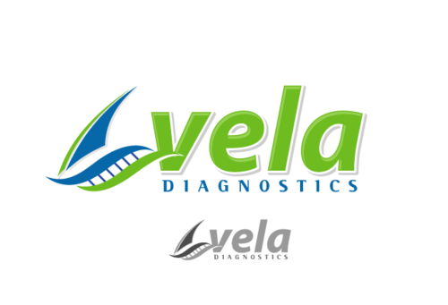
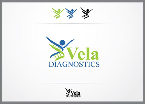
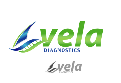
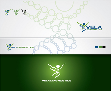
Vela is latin for sail so we would like to have a sail in the logo but should in some way incorporate a DNA strand e.g. see here: http://www.labworksfla.com/dnapaternity.htm

Related Contests


logo for lifestyle product
$199
Prize Money
297
Concepts
Expedite order "Capturing logo for a biotech company"
$300
Prize Money
267
Concepts
Logo for a leading edge rare disease therapeutic product company
$750
Prize Money
504
Concepts
Logo for a cutting-edge cell therapy medical c
$200
Prize Money
81
Concepts

Discussion


Comments

  • March 14, 2011 5:00 PM
    atago22 atago22
      Project Holder
    Design #36 and #37 look great however please again with the same text font and layout (only text) as in #35 but with the colors of #36 and #37 Sorry for misunderstanding

    Like Icon 0   DislikeIcon 0
  • March 14, 2011 4:39 PM
    atago22 atago22
      Project Holder
    Cromox: Design #36 and #37 look great however please again with the same test layout as in #35 but with the colors of #36 and #37

    Like Icon 0   DislikeIcon 0
  • March 14, 2011 4:03 PM
    atago22 atago22
      Project Holder
    Cromox: We like the blue and greens used in design #35. Please could you redo #35 with these colors on a white background. Also, could you show the 3D image in #35 on plain white background in both sizes shown (large and small) Please keep everything on a white background. Could you also show us these changes on a design with these elements like in Design #7 We are very close to finishing this....

    Like Icon 0   DislikeIcon 0
  • March 14, 2011 1:27 PM
    atago22 atago22
      Project Holder
    Cromox Design #33 Getting there but we like the smooth lines of Design #25 and #26 but would like this as in Design # 7.

    Like Icon 0   DislikeIcon 0
  • March 14, 2011 7:16 AM
    atago22 atago22
      Project Holder
    Cromox Design #25 Looks good however lost elements of design #7 we really liked. White background with faded DNA strand logo.... Logos to be presented in Blue, Green and combination thereof. Cromox Design #26 Good alternatives but refer to above.

    Like Icon 0   DislikeIcon 0
  • March 13, 2011 5:43 PM
    atago22 atago22
      Project Holder
    Great work...we are surprised and impressed at the quality of designs Cromox Design #7: Great concept but we would like you to smoothen out the DNA strand to something like in #8 / # 1 Also we would like to see this without the green background and the logo in single green / blue and then also as you had it in two colors. Blue can be made a deeper Royal Blue. Please play with fonts like in #1 fixdesign #1: Good design but the sails make it too busy. Could you play around with the sails - single color will also be acceptable. Neonlite #18 Great out the box thinking on this one however colors are a little complex. Please use single colors and change fonts similar to those used in design #1

    Like Icon 0   DislikeIcon 0
  • March 12, 2011 7:17 AM
    atago22 atago22
      Project Holder
    Logo needed for our start up company.... Feel free to explore your creative side....

    Like Icon 0   DislikeIcon 0