SALES / SUPPORT : +1-877-525-5646   |  


Vehicle Wrap Design Required - Insurance Brokerage

Your Friend With Benefits

Contest Holder YourFWB ?

Last Logged in : 3157days12hrs ago

Concepts Submitted

30

Guaranteed Prize
150
Winner(s)

1

Other veildAll design entries are veiled from other designers till the end of the contest. Featured Featured Contest
tick_gray

Live Project

tick_gray

Deciding

tick_blue

Project Finalized


Project: Vehicle Wrap Design Required - In ...
Contest Launched: Feb 03, 2016
Selected: 1 winning design from 30 concepts
Winning Design by: Scarl8
Close Date: Mar 02, 2016


Vehicle Wrap Design Required - Insurance Brokerage - Financial Services


Awarded as a winner
Project Report    

Sort by:


#30

#26

#13


Creative Brief


Vehicle Wrap Design Required - Insurance Brokerage

Your Friend With Benefits

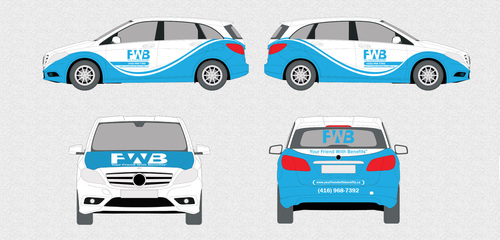
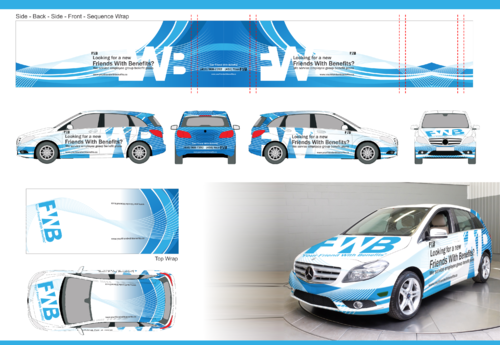
I have a Mercedes Benz B250 year 2013. I would like to wrap this car with an advertisement of my company. My company name: Your Friend With Benefits Inc. My company tagline: Looking for a new Friend With Benefits? My company website: www.yourfriendwithbenefits.ca. My company, what we do: We service employee group benefit plans. My company phone number: (416) 968-7392 / (416) Your-FWB. My company logo will be attached. My company colors are primarily a baby blue on a white background. I need something very stylish that captures attention. I require an eye-catching design to be completed. And equally importantly, I require the exact measurements so I can cut it and paste it to my car. I have attached my vehicle template which may help.

Financial Services

My target audience is mostly fun. I want people to enjoy the sight of this car and I want it to grab their attention. My actual target market is corporate. Specifically owners or companies or the head of Human Resources. Although I want this to be fun and stylish, I also need it to be professional. I believe my tagline is what will capture the most attention: Looking for a new Friend With Benefits? So try and make this stand out. And then obviously make my contact details stick out as well.

I absolutely need a stylish, attractive and professional design. I must have my tagline in the image. I must have my website in the image. I must have what we do in the image. Maybe my logo somewhere, but my logo is not an attention grabber. Maybe my phone number. I also need the exact measurements created. This way I can print your work and paste it onto my car without the need to resize any images.

Related Contests


Financial Services company logo
$300
Prize Money
174
Concepts
Branded t-shirt for insurance agency
$150
Prize Money
23
Concepts
ATA Financial Services, Inc
$200
Prize Money
35
Concepts
Restricted Project for Achiever
$100
Prize Money
1
Concepts

Discussion


Comments

  • February 29, 2016 12:34 AM
    YourFWB YourFWB
      Project Holder
    Design – background: 1) See attachment “Car Example 1” I love this car for two reasons. The design is very nice and attractive. And the text is very eligible. It’s a great color combination. I need you to help me find the correct background design. See “Car Example 2”. This has a resemblance to water. My company is not about water. I only suggested water close-up because I think it has a different shades of blue and white text on blue would be nice. My company colors are white and blue. I do not want people to look at my car and think I am water company. This is why I don’t like your wave in the design. Actually, my company colors are generally blue text on a white background. But I need a really cool background. Design – Text: 2) Your text is too small. But I do like the shadow effect. I think the shadow effect makes the text stand out. This is important. Maybe make the text stretch out across both doors – just like in the “Car Example 1” 3) Notice in the “Car Example 1”. Do you see how the text is slightly on an angle and then below the text is straight. I like this. “Looking for a new Friend With Benefits?” Should be two lines like this. Maybe make this part on an angle. And then below it: “We service employee benefit plans” and make this one line below. 4) “Looking for a new Friend With Benefits” Here the FWB should be blue. (Like in my signature). 5) “(416) Your-FWB” Here the FWB in my phone number should also be blue (Like in my signature). Text – Sides of the car: 6) The side of my car should be “Looking for a new Friend With Benefits” (using two lines and the FWB blue). Make this text on an angle, similar to “Car Example 1” 7) Below is, write “We service employee benefit plans”. Make this text normal, horizontal no angle and below it. Make sure you stretch it across both doors like “Car Example 1” 8) Look at “Car Example 1”. Notice the text above both wheels and how it is on an angle like that? I like it. Above one wheel, put my phone number. “(416) 968-7392”. And above the second wheel put “(416) Your-FWB”. Make sure the FWB here is blue. Text – back of the car: 9) On the back of the car below the window above the black hole, write “Your Friend With Benefits®” Using an (R). Also make the FWB here blue. 10) Directly below the license plate, write my website www.yourFriendWithBenefits.ca. Please make the FWB here also blue. 11) And then underneath that write again “We service employee benefit plans” Text – front of the car: 12) Here you can use my FWB logo on the hood. I hope this makes it pretty clear. Please spend one hour trying to find the write design for the car. This is the part I am having trouble with. I need your expertise. I love the design on Car Example 1. I also like the design on Car example 2 but not as much. Please ask me anything if you have any questions.

    Like Icon 0   DislikeIcon 0
  • February 06, 2016 10:41 AM
    YourFWB YourFWB
      Project Holder
    IMPORTANT: I don't want it to be flooded with text on the sides. It looks like it's too much to read and it's too tight together.

    Like Icon 0   DislikeIcon 0
  • February 05, 2016 1:42 PM
    YourFWB YourFWB
      Project Holder
    I have now uploaded an image of a car that I like. I like the concept of it. I like this way this example blends the colors together. It looks very nice. I am thinking of something similar - a nice blend of white and blue colors I also love the way this text is very easy to read on this example. I would like my text to stick out as well. Just some of my thoughts. But I am also open to difference ideas. example of the car I am referring to: look for the pure autographics car.

    Like Icon 0   DislikeIcon 0