ULearn Network Logo

ULearn Network

Contest Holder ULearn ?

Last Logged in : 4358days2hrs ago

Concepts Submitted

140

Guaranteed Prize
200
Winner(s)

1

A Logo, Monogram, or Icon veildAll design entries can be viewed by other designers.
tick_gray

Live Project

tick_gray

Deciding

tick_blue

Project Finalized


Project: ULearn Network Logo
Industry: Education Logo
Contest Launched: Dec 07, 2011
Selected: 1 winning design from 140 concepts
Winning Design by: Adithya
Close Date: Dec 30, 2011


ULearn Network Logo  - Education


Awarded as a winner
Project Report    

Sort by:


#73

#139

#124

#121

#120


Creative Brief


ULearn Network Logo

ULearn Network

No

ULearn Network aims to be the primary platform for holistic K-12 education in the world. We encourage parents and educators to take an active approach in education by choosing curricula and classes that fit the individual needs and interests of the student. Our on-line educational articles, classes, downloads and curricula will be effective in educating happy, productive, critical thinking leaders of tomorrow, regardless of class, race, religion, and socio-economic background. It’s on-line community of parents and educators are developing and using child-centered curricula that connect with a child’s innate love of learning, life-skills, and academic skills. Teachers and school administrators are also welcome to use our resources and participate in our community. Our resources range from prepackaged curriculum plans to tools for inventing your own curriculum.

Education

Symbolic
Symbolic

Abstract Mark
Abstract Mark


Unique/Creative
Clean/Simple
Outdoors/Natural
Fun
Masculine
Feminine
Youthful
Abstract
Geometric

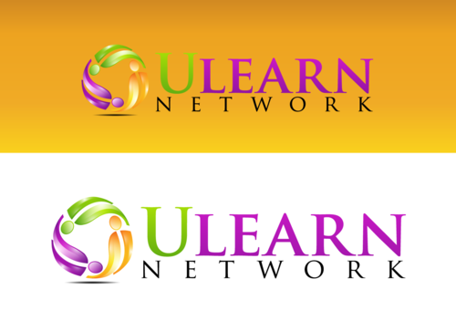
our website colors are brown, yellow, purple, and green. You can use any combination of these colors and or shades of these colors to come up with a design. Go to www.ulearnnetwork.org to view colors.

3

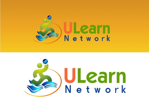
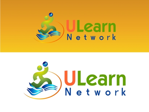
Please show designs that include the entire business name ULearn Network, use of ULearn by itself and some that don't have the business name as part of the logo.

Related Contests


Vallejo District Logos
$700
Prize Money
68
Concepts
STEAMd - Logo for non-profit
$200
Prize Money
86
Concepts
365 SPORTS MIND PERFORMANCE
$300
Prize Money
110
Concepts
Logo for Foundation
$350
Prize Money
48
Concepts

Discussion


Comments

  • January 04, 2012 4:04 AM
    Adithya Adithya
     
    thanks :)

    Like Icon 0   DislikeIcon 0
  • December 26, 2011 1:13 PM
    ULearn ULearn
      Project Holder
    Dear Designers, this is a repeat of a previous request. Please do not send in any designs for entry into the contest. We have a chosen winner we are working with. Thank you!

    Like Icon 0   DislikeIcon 0
  • December 22, 2011 9:48 AM
    ULearn ULearn
      Project Holder
    Adithya, please read the email I sent to you personally. Thank you.

    Like Icon 0   DislikeIcon 0
  • December 21, 2011 10:04 AM
    ULearn ULearn
      Project Holder
    Hello Designers, We have chosen a winning logo and are working with the designer to fine tune some things on the design. Please DO NOT send in any submissions except for the designer who we've chosen. Thanks to you all!

    Like Icon 0   DislikeIcon 0
  • December 17, 2011 2:41 PM
    ULearn ULearn
      Project Holder
    RE: Drafts #67-70. I prefer the design (#67) that does not have the green touching the purple. I like seeing the design on both backgrounds (#67) But, please change the hats. I don't like the grad hats or the hats (or books on their heads) you had before.

    Like Icon 0   DislikeIcon 0
  • December 17, 2011 2:36 PM
    ULearn ULearn
      Project Holder
    All designers: please do not put grad hats in the logo.

    Like Icon 0   DislikeIcon 0
  • December 17, 2011 8:52 AM
    ULearn ULearn
      Project Holder
    RE: Drafts #55, #60, #42. Please show the design against a brown-yellow background as seen on the site www.ulearnnetwork.org as well as the white background.

    Like Icon 0   DislikeIcon 0
  • December 17, 2011 8:38 AM
    ULearn ULearn
      Project Holder
    RE: Draft #55 looks nice with the colors and triple symmetry, but I don't like the grad hats. Is there something else that could be put in place of the black grad hats? In #60, you removed the grad hats, but it looks like it needs some other color added.

    Like Icon 0   DislikeIcon 0
  • December 16, 2011 1:28 PM
    ULearn ULearn
      Project Holder
    RE: Draft #30. Nice dynamics between the two figures, but they shouldn't be wearing grad hats. Will they still look like people without hats? or can you replace the hats with something else.

    Like Icon 0   DislikeIcon 0
  • December 16, 2011 1:25 PM
    ULearn ULearn
      Project Holder
    RE: Drafts #49 and #44. Nice changes. Thank you. RE: Draft #39. Improved. the person looks happy and I like the changed circle. It still has has shiny letters, which look too slick. The blue ball doesn't quite look like a globe.

    Like Icon 0   DislikeIcon 0
  • December 16, 2011 1:21 PM
    ULearn ULearn
      Project Holder
    RE: Draft #42. Design has nice dynamics and symmetry. Please change the three "hats" to something else or maybe use a variety of different hats. Also, please display on the brown-yellow background as well as the white background.

    Like Icon 0   DislikeIcon 0
  • December 15, 2011 4:49 PM
    ULearn ULearn
      Project Holder
    RE: Draft #37, #27-#34, and #15. Please keep the blue for the book to match the globe and work on colors for the font that will stand out on the brown-yellow background. Maybe use the font color in #26 in which "Learn" stands out more.

    Like Icon 0   DislikeIcon 0
  • December 15, 2011 4:39 PM
    ULearn ULearn
      Project Holder
    RE: Drafts #21, #22, #23 all have purple chevrons which indicates an oil company to many people. This is not what we want. RE: Draft #13. The person could be holding a globe rather than a star. Maybe take out the hula hoop at the waist or move it?

    Like Icon 0   DislikeIcon 0
  • December 15, 2011 4:38 PM
    ULearn ULearn
      Project Holder
    RE: Drafts #25 -#29. I decided that the blue globe and purple book don't go together. I'd rather work on #16 or #17. RE: Drafts #16 and #17. Please experiment with the font colors to make the logo stand out more against the brown-yellow background. I would like to see what each of these look like without the book underneath. Also, I'd like to see what it looks like when 'U' in "ULearn" is replaced with the picture.

    Like Icon 0   DislikeIcon 0
  • December 15, 2011 4:38 PM
    ULearn ULearn
      Project Holder
    RE: Drafts #31-#36. These look too shiny. The font looks too technical. I like the happy, active figure in #31-#34.

    Like Icon 0   DislikeIcon 0
  • December 15, 2011 9:43 AM
    ULearn ULearn
      Project Holder
    #22, Your use of the colors look awesome! Make the lowercase ''l'' upppercase and make the word ''network'' in the same shade of green as the letter ''U.'' Thank you!

    Like Icon 0   DislikeIcon 0
  • December 14, 2011 8:26 PM
    ULearn ULearn
      Project Holder
    Please send in drafts with the brown to yellow background. And show versatility with the colors because we want to see which of our colors really complement and ''pop'' out well against that background. Since we have four colors i.e. purple, green, brown and yellow, and two neutrals black and white, we need to narrow it down to only three colors with the neutrals. Thank you!

    Like Icon 0   DislikeIcon 0
  • December 14, 2011 8:18 PM
    ULearn ULearn
      Project Holder
    #20, Please change the graduate to a child image.

    Like Icon 0   DislikeIcon 0
  • December 14, 2011 8:16 PM
    ULearn ULearn
      Project Holder
    #16, I like the globe but I don't know what the image is. It kind of looks like fire or a lotus flower. What is it?

    Like Icon 0   DislikeIcon 0
  • December 14, 2011 8:13 PM
    ULearn ULearn
      Project Holder
    #15, Please make the book purple and maybe a different color for the U and N...still using the color options given though. Can you change the background to more of a brown to yellow and make ''Learn'' stand out better against the background color?

    Like Icon 0   DislikeIcon 0
  • December 14, 2011 9:30 AM
    SiteAdmin SiteAdmin
     
    Contest is extended for 2 more days. -Liz

    Like Icon 0   DislikeIcon 0
  • December 13, 2011 5:03 PM
    ULearn ULearn
      Project Holder
    Our philosophy has three pillars. 1. Learning is fun! 2. What you learn applies to Life Skills! 3. World Class Education! Please submit images that can portray all three of these together.

    Like Icon 0   DislikeIcon 0
  • December 13, 2011 5:01 PM
    ULearn ULearn
      Project Holder
    RE: Drafts #2, #3, #4, and #5. We see where you are going with the image but its not clear. Its looks like a book opening sometimes and other times a birthday or magician hat. RE: Draft #6, Change the ''U'' to be the same color as the word network. Make the ''L'' uppercase. Put a globe in the guy's hand. Submit with a white background and a yellow to brown background like what's seen in Draft #1.

    Like Icon 0   DislikeIcon 0
  • December 12, 2011 11:52 AM
    ULearn ULearn
      Project Holder
    Drafts #2 and #3, I like the image of a book, and use of colors. Can you do make it more yellow than orange? I like the green. The book is masculine and the letter font is too, can you add something feminine for balance? Thank you.

    Like Icon 0   DislikeIcon 0