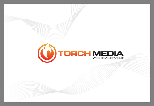
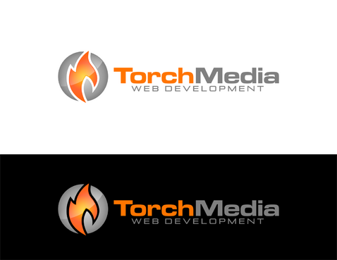
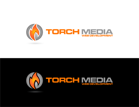
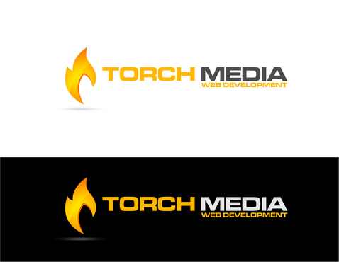
Torch Media Business Logo
Torch Media
|
Contest Holder
torchmedia
?
Last Logged in : 4869days6hrs ago |
Concepts Submitted
229 |
Guaranteed Prize
199 |
Winner(s) | A Logo, Monogram, or Icon |
|
Live Project
Deciding
Project Finalized


Creative Brief
Torch Media Business Logo
Torch Media
Web Development
Yes
Logo for our web development company, we build small websites, php applications, graphic design and printing services
Internet Services
Logo Type
![]()
Symbolic
![]()
Clean/Simple
Industry Oriented
Traditional
black/white, orange/red
not sure
We do not want hot-rod style flames whatsoever. See http://i.istockimg.com/file_thumbview_approve/16254743/2/stock-illustration-16254743-seamless-flame.jpg as an example.
We want to get away from the logo being a long single line as well, so feel free to stack words.
See torchmedia.ca for existing logo.
Related Contests


Comments
Project Holder
Project Holder
Project Holder
Project Holder
Project Holder
Project Holder