SALES / SUPPORT : +1-877-525-5646   |  


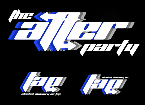
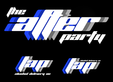
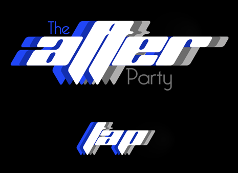
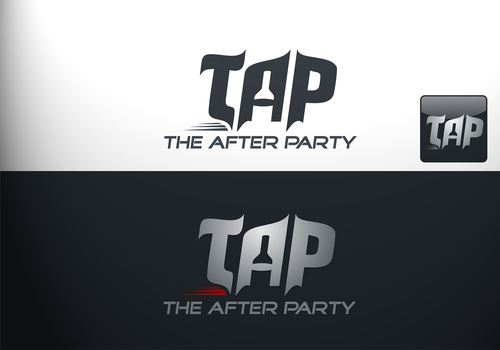
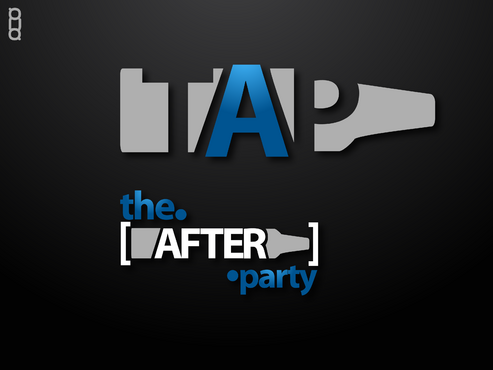
'The After Party' Fresh new logo

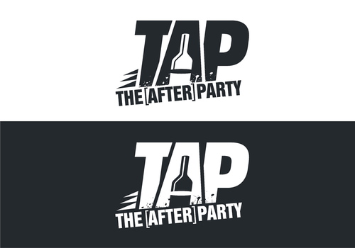
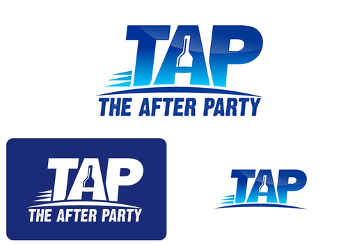
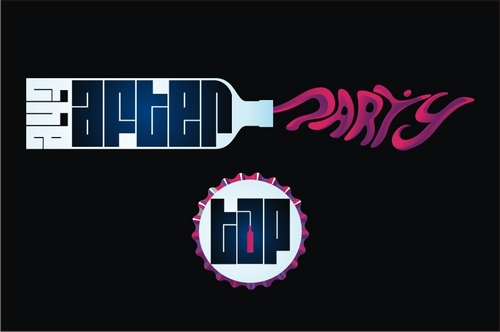
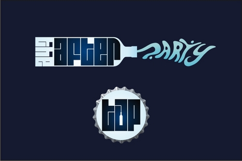
The After Party (additional separate logo of initals 'TAP')

Contest Holder theafterparty ?

Last Logged in : 4741days2hrs ago

Concepts Submitted

155

Guaranteed Prize
350
Winner(s)

1

A Logo, Monogram, or Icon veildAll design entries can be viewed by other designers. Featured Featured Contest
tick_gray

Live Project

tick_gray

Deciding

tick_blue

Project Finalized


Project: 'The After Party' Fresh new logo
Industry: Beverages Logo
Contest Launched: Aug 22, 2011
Selected: 1 winning design from 155 concepts
Winning Design by: mnorth
Close Date: Aug 31, 2011


'The After Party' Fresh new logo - Beverages


Awarded as a winner
Project Report    

Sort by:


#130

#111

#102

#101

#95

#91

#89

#115

#114

#112

#108

#76

#73

#68

#25


Creative Brief


'The After Party' Fresh new logo

The After Party (additional separate logo of initals 'TAP')

Optional additional tagline "Alcohol Delivery On TAP"

No

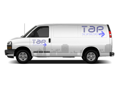
The After Party is an alcohol delivery company based in the UK. We need a fresh and stylish logo for our business to really get us noticed. The logo will be used on our website, stationary and vehicle graphics. Check out our website www.theafterpartydelivery.co.uk to see the colours we currently use.
I like the brackets around the 'After' and would like to keep it but its not essential if you feel it may hamper a better design.

Beverages

Logo Type
Logo Type

Symbolic
Symbolic

Abstract Mark
Abstract Mark

Initials
Initials

Illustrative
Illustrative


Cutting-Edge
Unique/Creative
Clean/Simple
Modern
Fun
Illustrative
Youthful
Abstract

Royal Blue, black, white, grey. www.theafterpartydelivery.co.uk

not sure

Needs to be much better than these guys!
competitors: www.beerrunner.com
www.boozersdelivery.com

Related Contests


restricted project for sallu
$501
Prize Money
5
Concepts
Logo for frozen Mocktails
$199
Prize Money
169
Concepts
Logo for SAHA Cafe
$200
Prize Money
265
Concepts
Mak d.o.o.
$200
Prize Money
89
Concepts

Discussion


Comments

  • August 24, 2011 12:01 AM
    theafterparty theafterparty
      Project Holder
    Could I also see the designs on a white background as well as dark, thanks.

    Like Icon 0   DislikeIcon 0
  • August 23, 2011 11:53 PM
    theafterparty theafterparty
      Project Holder
    Thought I'd add a few comments just to try and get you guys on my wavelength. The company is brand new, for younger people and is supposed to be fun - if possible, could the logos try and reflect this, please? People are likely to use my company when they are partying or in the party mood so the logo needs to suit the mood they're in other wise they won't relate to our company and therefore won't use us! I'm not looking for anything 'party popper' style with balloons or like a kids party, it has to be directed at adults but still have a party theme as well as trying to incorporate a feeling of 'delivery' and 'nightlife' Quite a difficult image to generate I'm sure, it's not really been done that much as the industry is quite new so it's going to take some inspiration. Please anything you want to ask me, just drop me a line. The designs so far are really good and I'm excited with whats to come and thank you for all your work so far. Rhys

    Like Icon 0   DislikeIcon 0
  • August 22, 2011 7:34 PM
    theafterparty theafterparty
      Project Holder
    #32: Really like this one, would it be possible tho to see some different colour variations? Instead of the orange maybe grey? Also I'm worried that the 'after' doesn't stand out enough and is hard to read - is it possible to improve this? #31: Is also cool, could I see some colour in them too, please? #28: Also like this, not sure of the turquoise 'party' colour though and #21's 'TAP' is nice. #24: could I see more designs, I like the direction its going. All in all, some great work so far! I'm really excited about the next week to see what comes up, thanks guys. Any feedback or info you want, please feel free to ask.

    Like Icon 0   DislikeIcon 0
  • August 22, 2011 3:34 PM
    theafterparty theafterparty
      Project Holder
    Really liking the work so far, just you let you guys know that the logo will generally be on a dark background, whether that would be on the website or the vehicle, thanks and look forward to seeing some more designs.

    Like Icon 0   DislikeIcon 0
  • August 22, 2011 3:18 PM
    theafterparty theafterparty
      Project Holder
    HungryPandaDesigns, really like your work 5* - worried that it may not stand out on the black background?

    Like Icon 0   DislikeIcon 0