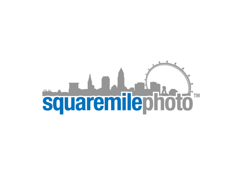
Square Mile Photo - Logo Design
Square Mile Photo
|
Contest Holder
jimmarshall87
?
Last Logged in : 5168days12hrs ago |
Concepts Submitted
142 |
Prize Money
155
|
Winner(s) | A Logo, Monogram, or Icon |
|
Live Project
Deciding
Project Finalized

Creative Brief
Square Mile Photo - Logo Design
Square Mile Photo
No
This will be an online store selling stunning photos of the City of London ("The Square Mile" is how London residents refer to the City). The photos are taken by people who live, breathe and work in the city and capture the essence of this amazing city.
Our target market is city professionals and businesses who want to buy high quality, framed photographs for their homes or offices.
Photography
Logo Type
![]()
Abstract Mark
![]()
Cutting-Edge
Unique/Creative
Clean/Simple
Sophisticated
Modern
Local/Neighborhood
Predominantly white background please.
2
I have played around a bit with a font called Suede that I like (http://www.dafont.com/suede.font) - but please don't restrict your designs to this. It should give you an idea of the general style I have in mind. I quite like the "flickr blue" colour which I think conveys some of the attributes above. Again, this is guidance though - do your own thing.
Please avoid obvious icons like cameras, photos etc. This needs to be edgy.
Related Contests


Comments
Project Holder
Project Holder
Project Holder
Project Holder
Project Holder
Project Holder
Project Holder
Project Holder
Project Holder
Project Holder
Project Holder
Project Holder
Project Holder
Project Holder
Project Holder