SALES / SUPPORT : +1-877-525-5646   |   Login


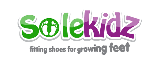
Sole Kidz logo

Sole Kidz

Contest Holder kryan ?

Last Logged in : 5012days20hrs ago

Concepts Submitted

73

Prize Money
200
Winner(s)

1

A Logo, Monogram, or Icon veildAll design entries can be viewed by other designers. Featured Featured Contest Expedite Expedite Contest
tick_gray

Live Project

tick_gray

Deciding

tick_blue

Project Finalized


Project: Sole Kidz logo
Industry: Retailers Logo
Contest Launched: Feb 08, 2011
Selected: 1 winning design from 73 concepts
Winning Design by: hatter
Close Date: Feb 15, 2011


Sole Kidz logo - Retailers


Awarded as a winner
Project Report    

Sort by:


#72

#62

#69

#63

#60

#59

#50

#38

#44

#32

#28

#26

#24

#23

#22

#18

#11

#3

#1

#73

#71

#70

#61

#58

#57

#56


Creative Brief


Sole Kidz logo

Sole Kidz

fitting shoes for growing feet

Yes

Children's shoe store. Selling shoes from infant to approx grade 6 (12 years old).

Retailers

Logo Type
Logo Type

Symbolic
Symbolic


Clean/Simple
Fun
Youthful

I would like the main logo to be 2 colours but the tag line could be an additional colour. Green and Purple, or Green and Fuchsia. I am open to other ideas.

3

I would like it to include a foot, footprint or shoe. The logo will be on a channel letter sign so ideally it will be on one line and the tag line will not be included on the store sign. Blue letters don't seem to show up well on the signs in our plaza.

Related Contests


Help create a visual identity for our gift shop!
$250
Prize Money
284
Concepts
Modern, Clean Logo for ecommerce site PuffSource.com
$250
Prize Money
273
Concepts
Logo for a country store
$200
Prize Money
105
Concepts
Logo for Rolling Shutters and Full Home Automation Showroom
$250
Prize Money
70
Concepts

Discussion


Comments

  • February 13, 2011 7:10 PM
    kryan kryan
      Project Holder
    Thanks everyone for the submissions. Sorry to cut the contest short, but we had a design that we were happy with and we are on a tight timeline with our sign design.

    Like Icon 0   DislikeIcon 0
  • February 11, 2011 4:16 PM
    artsie9324 artsie9324
     
    I thought the same when I looked at these! lol @hatter!

    Like Icon 0   DislikeIcon 0
  • February 11, 2011 10:58 AM
    hatter hatter
     
    Adwork #52-#57, you're kidding right??

    Like Icon 0   DislikeIcon 0
  • February 10, 2011 11:48 AM
    kryan kryan
      Project Holder
    Juayusta, I like #24 but could we try making the colours a deeper shade of green and purple. Thanks

    Like Icon 0   DislikeIcon 0
  • February 10, 2011 11:46 AM
    kryan kryan
      Project Holder
    Thanks Hatter!! I love the growing tagline!

    Like Icon 0   DislikeIcon 0
  • February 10, 2011 1:56 AM
    hatter hatter
     
    tagline 'growing inspired by me.

    Like Icon 0   DislikeIcon 0
  • February 09, 2011 7:45 PM
    kryan kryan
      Project Holder
    I like when the footprints are a bit slimmer so they don't look like baby footprints.

    Like Icon 0   DislikeIcon 0
  • February 09, 2011 7:41 PM
    kryan kryan
      Project Holder
    I like when "growing" in the tagline is growing!

    Like Icon 0   DislikeIcon 0
  • February 09, 2011 7:39 PM
    kryan kryan
      Project Holder
    I like the use of the foot in the middle of the "o" and or "d". I also like it used in place of the "i" like draft #18. The more simple letters will work best for the channel letter sign but I want to make sure that it doesn't look too juvenile. We need the older kids to see it as a cool place too.

    Like Icon 0   DislikeIcon 0