SALES / SUPPORT : +1-877-525-5646   |   Login


Radian Design Group Business Logo

Radian Design Group or Radian Design Group, Inc.

Contest Holder mrussell1 ?

Last Logged in : 2692days9hrs ago

Concepts Submitted

215

Guaranteed Prize
400
Winner(s)

1

A Logo, Monogram, or Icon veildAll design entries can be viewed by other designers. Featured Featured Contest
tick_gray

Live Project

tick_gray

Deciding

tick_blue

Project Finalized


Project: Radian Design Group Business Logo
Industry: Architecture Logo
Contest Launched: Aug 19, 2011
Selected: 1 winning design from 215 concepts
Winning Design by: nethbnice
Close Date: Aug 26, 2011


Radian Design Group Business Logo - Architecture


Awarded as a winner
Project Report    

Sort by:


#195

#194

#198

#197

#41

#19

#215

#214

#212

#210

#209

#208

#207

#206

#205

#204

#203

#196

#193

#192

#189

#183

#182

#180


Creative Brief


Radian Design Group Business Logo

Radian Design Group or Radian Design Group, Inc.

Yes

Radian Design Group is a new architectural design firm which will be one of six companies.
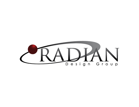
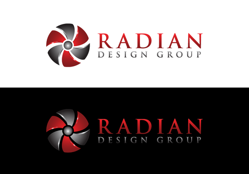
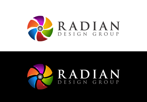
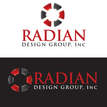
Webster's dictionary defines "Radian" as: a unit of plane angular measurement equal to the angle at the center of a circle subtended by an arc equal in length to the radius. one radian is equal to about 57.89 degrees. In short, a radian is a circle with 6 equal angles or "pizza" slices. We have 6 companies with Radian Design Group the last of six. I don't want the logo looking like 6 pizza slices or two dimensional so a sphere or three dimensional circle with 6 equal segments or some abstraction of a circle with 6 equal parts is expected to anchor the overall logo. The words "Radian Design Group" can be used to anchor the logo. Preferable in Garamond or letter style that will communicate good design and reflect highly on the firm as an architectural design firm.

Architecture

Symbolic
Symbolic

Illustrative
Illustrative

Character
Character


Cutting-Edge
Unique/Creative
Sophisticated
Corporate
High Tech
Geometric

Radian seems to communicate a "hot" color so I would rather have red ( not orange or yellow ) with black or dark grey. The logo could be strong background color of red with with lettering to create reverse reading logo ( maybe sphere playing off a background square or red ?)". The six segment, pie shapes or 6 triangles can be 6 colors that compliment each other but are unique colors. They also could be 6 shades of a same color but I will leave that up to the designers

3

To summarize: 2 color schemes- one with red black and white or red dark grey and white. The other 6 different colors. Use a circle,sphere or three dimensional variation showing six radians or segments with artistic license. Anchor the logo w/ the "Radian Design Group" in refined or lettering that communicates we are architectural designers. Preferably like Garamond or some othere refined upeer case letterring style.

Related Contests


CMS Insite
$200
Prize Money
100
Concepts
Logo for Interior Designers
$250
Prize Money
183
Concepts
SAVANNAH SYSTEMS
$199
Prize Money
51
Concepts
logo for a fiber wall panel company
$200
Prize Money
41
Concepts

Discussion


Comments

  • August 26, 2011 4:40 PM
    mrussell1 mrussell1
      Project Holder
    Clearly - we are very happy with the response to our competition. We continue to recieve logos that are worthy of consideration. When the competition closes in less than a half hour we will print the finalists, distribute to our Principals and adminstrative team and meet Monday to select and announce the winner. Thank you for all of your impressive work. Radian Design Group

    Like Icon 0   DislikeIcon 0
  • August 25, 2011 7:34 PM
    mrussell1 mrussell1
      Project Holder
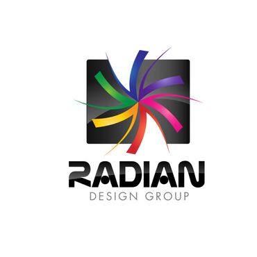
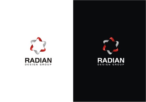
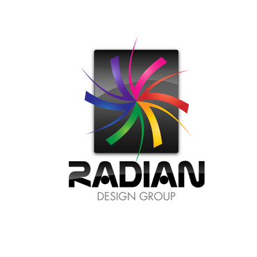
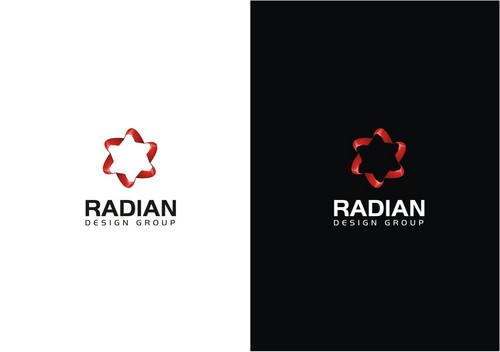
    As you can see, we have narrowed the field of ideas significantly but remain open to a variety of geometries. If you are looking for that common thread, there isn't one. Some of the attached logos still in the running are for the lettering styles or the composition of lettering and formatting. Some of the full color logos show creativity that is still under consideration but our emmphasis is still probably going to come down to a 6 element logo in full color ( preferably very 3 dimensional ) or the red/grey/black and white color schemes ( also very 3 dimensional). We are still drawn to the logos that have 3 dimensional qualities but are strong geometries that will go beyond just business cards because most architects think they are good graphic designers when this is often NOT the case. That is why this competition has worked so well for us. Graphic artists and designers can define a logo that will set us apart from the plain, flat looking logos designed by one of the in-house architects and that is where we want a leg up. However, if they are too complex and "muddy" when it comes to the geomtry then they will not work for our Title Blocks on our 24"x36" and 30"x42" drawing sheets. We will also need to have the logo as well on our Brochures, Requests for Qualifications on architectrual projects and, of course, letterhead and envelopes to come. For these reasons the black backgrounds or dark backgrounds with lighter lettering are still in the lead by a majority of those who have a vote on the final logo selection tomorrow afternoon (or shortly therafter) because they will pop better and set us off against other competitor's logos. Particularly when they don't have a clue on how to make them three dimensional with drop shadows, reflective edges, gradations to enhance edges, and other techniques to "come off the page". Good luck on our last day.

    Like Icon 0   DislikeIcon 0
  • August 25, 2011 4:58 PM
    mrussell1 mrussell1
      Project Holder
    We have continued to be impressed by the variety and creative approaches to the Logo we are looking for to brand our Architectural Firm. We have had several conferences reviewing each and every one of your submissions. After initially "scoring" with star ratings it seemed to be counterproductive as several newer logos moved up and made us re-evaluate our rankings when there was a much smaller pool of design to look at. With that said, we will be ranking and/or deleting them if they are not going to work for us at the end of today so there is time left to see which Logos seem to rising to the top and give all designers one final oppurtunity to contribute to our efforts to develop the right "look" for our firm. As I stated earlier, this will be the last of 6 companies in the Family of Companies bu the process has been so productive and crative that we will be considering "refreshing" some of the company logos, letterhead etc. that are already in place. Thank you for your contributions to date.

    Like Icon 0   DislikeIcon 0
  • August 20, 2011 12:43 PM
    mrussell1 mrussell1
      Project Holder
    Should have proofed our comments better. Where we state "and particularly #" in our first comment post- it should have said design "#7". We do like the negative space samples (on black background) to look at in Designs #5,7,8,9. We also would like to explore the black or red background behind the sphere shape like design #7 since our business cards will probably be vertical format and not horizontal. We are still open to using designs that stand on their own merit ( with respect to shapes ) without a black or red panel background although it does help to show both versions so we can see how the lettering contrasts and how readable the "Radian Design Group" remains. Great work so far! At this rate we might be refreshing our other five company logos!

    Like Icon 0   DislikeIcon 0
  • August 20, 2011 12:34 PM
    mrussell1 mrussell1
      Project Holder
    To all designers: Off to a great start. The reflective touches in design #5 and particularly #added a lot to the geometry of the logo. Both #5 and #7 show good examples of the multi-color and the red,black/grey and white approaches. We are still open to both color concepts. Design #8 while intersting in how it developed the three dimensional quality of the sphere made the "R" wrapped around so abstract that it appears upon first glance as an "S" so that needs refinement to work for our corporate identity. Designs #9 and #11 have abstracted the radians but stayed true to the six segments or elements that represent our six companies so they are still ok. The three dimensional qualities of many of the designs step the design up a lot and make the flatness of #1,#2,#4,#10 and #12 stand out as not as desireable even though some of the design approaches are starting to gel. We seem to be drawn to the attempts to create three dimensional logos since as architects that is what we do for a living - create three dimensional buildings created from two dimensional sets of drawings. All of your variations from the a true radian and six per circle are still ok to explore. We are liking the variety of approaches so far!

    Like Icon 0   DislikeIcon 0