SALES / SUPPORT : +1-877-525-5646   |   Login


Pro-Fit - PPE

Pro-Fit PPE (Personal Protective Equipment)

Contest Holder mgimarketing ?

Last Logged in : 5122days16hrs ago

Concepts Submitted

85

Guaranteed Prize
300
Winner(s)

1

A Logo, Monogram, or Icon veildAll design entries can be viewed by other designers. Featured Featured Contest Expedite Expedite Contest
tick_gray

Live Project

tick_gray

Deciding

tick_blue

Project Finalized


Project: Pro-Fit - PPE
Industry: Apparel Logo
Contest Launched: Jul 05, 2010
Selected: 1 winning design from 85 concepts
Winning Design by: maxmix
Close Date: Jul 12, 2010


Pro-Fit - PPE - Apparel


Awarded as a winner
Project Report    

Sort by:


#56

#55

#52

#51

#70

#57

#54

#69

#34

#33

#32

#49

#75

#74

#68


Creative Brief


Pro-Fit - PPE

Pro-Fit PPE (Personal Protective Equipment)

Better by Design

Yes

Pro-Fit is a range of PPE (Personal Protective Equipment) for use in the food processing, Agriculture and Construction industries. Products include Wellington Boots in White Black and Green colours. Safety Gloves, Factory workwear, outerwear, High vis jackets Hard hats etc

Apparel

Logo Type
Logo Type

Symbolic
Symbolic


Black & White or Purple & Orange

2

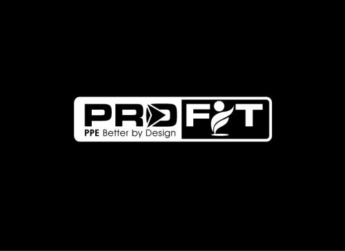
For trademark purposes we must include the letters PPE int e logo. but we would like to also incorporate our tagline "Better by design" we dont want a cluttered look so if designers feel it is not working with the tagline they can leave it out.

Related Contests


Logo for "Aloha Gold" : An Upscale Men's and Women's casual/urban clothing line
$350
Prize Money
341
Concepts
Logo for a gypsy-bohemian women's clothing line
$325
Prize Money
232
Concepts
Logo for Fashion Product
$375
Prize Money
72
Concepts
private logo
$250
Prize Money
13
Concepts

Discussion


Comments

  • July 10, 2010 4:39 PM
    mgimarketing mgimarketing
      Project Holder
    To all designers who participated in this project so far. Thank you. Im running another project called Ultra-Tender at the moment so please submit some designs for that also. thanks again.

    Like Icon 0   DislikeIcon 0
  • July 10, 2010 4:38 PM
    mgimarketing mgimarketing
      Project Holder
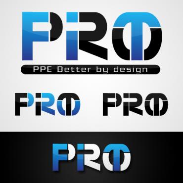
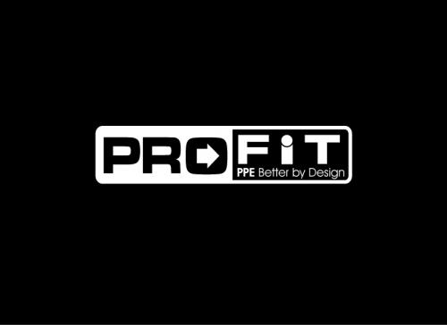
    maxmix, what does the i in design #68 symbolise im curious?? i gotta say im really a fan of designs #55 & #56 but i just cant pick one over the other. the log will appear on stationary brochures but most importatnly PPE equipment of all shapes and sizes and in a range of colours so i need to pick the one which is most flexible. any suggestions?

    Like Icon 0   DislikeIcon 0
  • July 10, 2010 1:29 PM
    lakshmiks lakshmiks
     
    nice.. maxmix best of luck..

    Like Icon 0   DislikeIcon 0
  • July 09, 2010 4:24 AM
    maxmix maxmix
     
    I just thought it was one of my entry logo design here.

    Like Icon 0   DislikeIcon 0
  • July 09, 2010 3:26 AM
    maxmix maxmix
     
    nice logobos...

    Like Icon 0   DislikeIcon 0
  • July 08, 2010 12:00 PM
    mgimarketing mgimarketing
      Project Holder
    ktwist, your design #49 is nice but too delicate for my application. this logo needs to be strong as it will be on wellington boots hardhats etc. the colours should also be strong.thanks.

    Like Icon 0   DislikeIcon 0
  • July 08, 2010 11:58 AM
    mgimarketing mgimarketing
      Project Holder
    lakshmiks, designs 41 & 43 are interesting. can you straighten the rectangle within the logo for me please. thanks.

    Like Icon 0   DislikeIcon 0
  • July 08, 2010 11:56 AM
    mgimarketing mgimarketing
      Project Holder
    dave0585, design #54 is very intelligent! maybe too intelligent! im a little worried that if you didnt know the brand was called pro-fit you may not figure it out without being told by someone! maybe you could simplify your design a little. thanks

    Like Icon 0   DislikeIcon 0
  • July 08, 2010 11:53 AM
    mgimarketing mgimarketing
      Project Holder
    maxmix, 51 & 52 look very good. i would like to see them with the orange colour replaced by black just for comparison. thanks.

    Like Icon 0   DislikeIcon 0
  • July 08, 2010 6:12 AM
    mgimarketing mgimarketing
      Project Holder
    maxmix, thank you for trying out the different variation of the letter i in designs 45 & 48 but i think your original designs 28 & 29 are your best. i think the orange works but i would like to see variations of 28 & 29 in Black on a white background and vice versa. Thanks.

    Like Icon 0   DislikeIcon 0
  • July 07, 2010 5:38 PM
    mgimarketing mgimarketing
      Project Holder
    To all designers. please now only use a white or black background (or both) so i can make very unbiased comparisons between logo's. thank you.

    Like Icon 0   DislikeIcon 0
  • July 07, 2010 3:43 PM
    mgimarketing mgimarketing
      Project Holder
    maxmix, your designs 28 & 29 are very interesting. i would like to see some other colour variations in this and also on a white background please. im not sure what the symbol you have used for i means? maybe you could try a more standard i just for comparison or something else which illustrates the word FIT???

    Like Icon 0   DislikeIcon 0
  • July 07, 2010 8:31 AM
    mgimarketing mgimarketing
      Project Holder
    lakshmiks, can i see design #5 against the green background also please.

    Like Icon 0   DislikeIcon 0
  • July 07, 2010 8:28 AM
    mgimarketing mgimarketing
      Project Holder
    lakshmiks, can i see design #11 with the colours reversed against the green background also please.

    Like Icon 0   DislikeIcon 0
  • July 07, 2010 8:21 AM
    mgimarketing mgimarketing
      Project Holder
    lakshmiks, i think you misunderstood my last comment, i would like to see how design #6 would look against a green background please.

    Like Icon 0   DislikeIcon 0
  • July 07, 2010 7:32 AM
    mgimarketing mgimarketing
      Project Holder
    lakshmiks,Design #6 is nice in those colours.The logo will need to be applied to a dark green wellington boot i wonder how those colours will stand up against that background?

    Like Icon 0   DislikeIcon 0
  • July 07, 2010 6:21 AM
    mgimarketing mgimarketing
      Project Holder
    lakshmiks, your logo is clean and simple. i like how you have encorporated the letters ppe beside our tagline. My main issue is the font you have used for Pro-Fit. it needs to be more chunky and strong with a technical feel. Thanks

    Like Icon 0   DislikeIcon 0
  • July 07, 2010 6:18 AM
    mgimarketing mgimarketing
      Project Holder
    Alexa , your logo is good i like how it encoroprates the letters PPE and also our tagline. both colour schemes work fine. i would like to see some other fonts for the text just for comparison.

    Like Icon 0   DislikeIcon 0
  • July 06, 2010 7:22 AM
    mgimarketing mgimarketing
      Project Holder
    The Name of the brand is Pro-Fit it is a range of ppe products.

    Like Icon 0   DislikeIcon 0
  • July 05, 2010 7:06 PM
    robertozozaya robertozozaya
     
    What is the name that you want on the logo? It has to have "PPE" as you mentioned, but also Pro-Fit?

    Like Icon 0   DislikeIcon 0