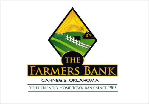
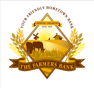
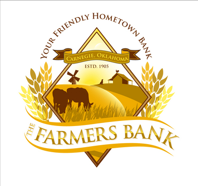
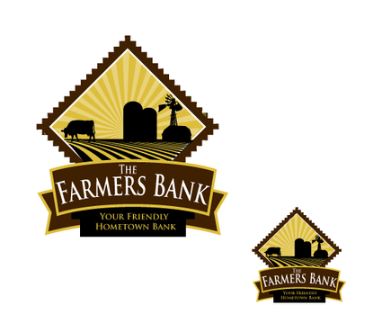
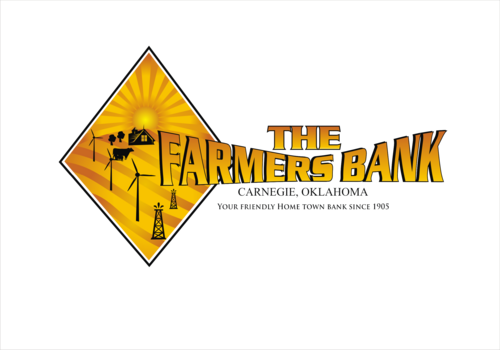
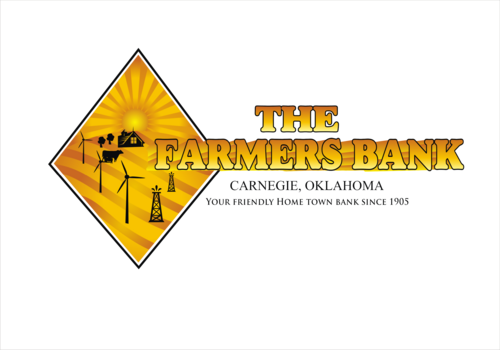
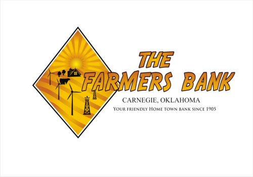
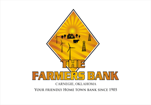
New Logo for 100 Year Old Bank!
The Farmers Bank
|
Contest Holder
bestinthemidwest
?
Last Logged in : 4525days16hrs ago |
Concepts Submitted
218 |
Guaranteed Prize
750 |
Winner(s) | A Logo, Monogram, or Icon |
|
Live Project
Deciding
Project Finalized

Creative Brief
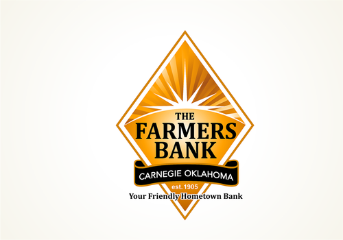
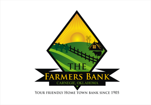
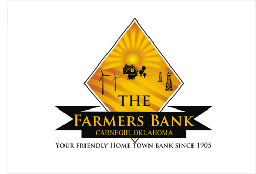
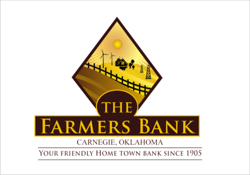
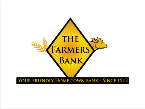
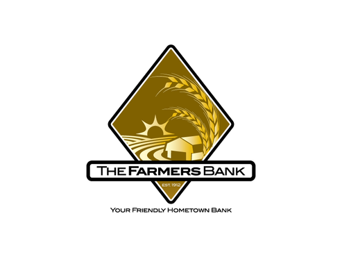
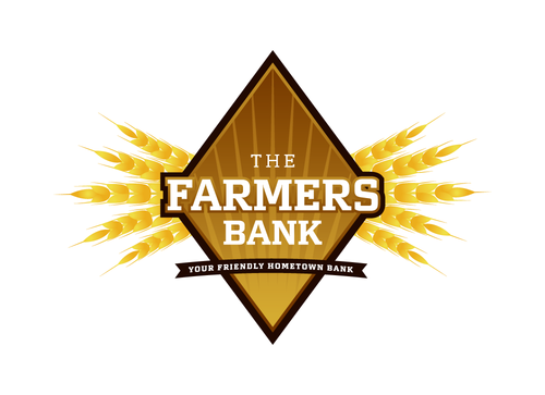
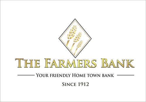
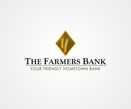
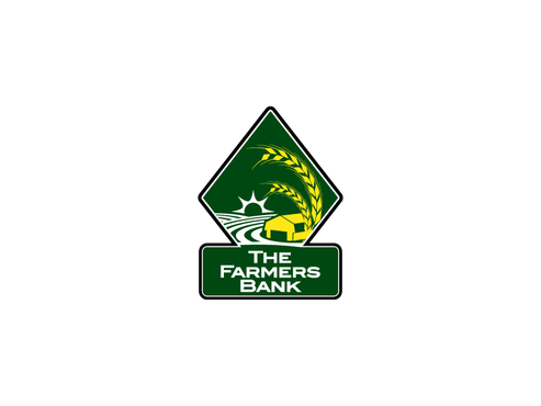
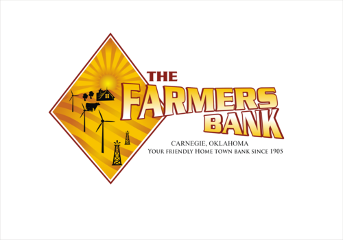
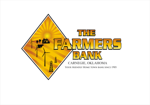
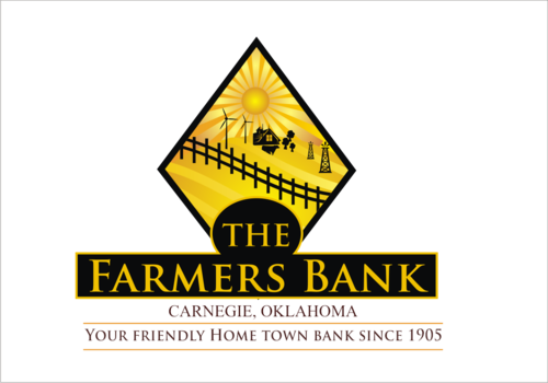
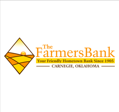
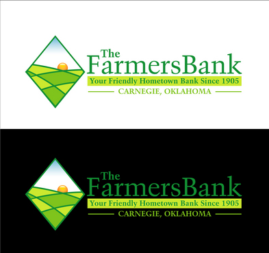
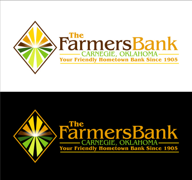
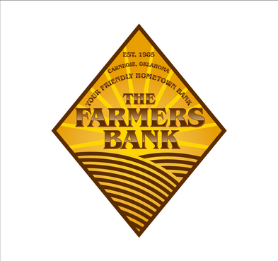
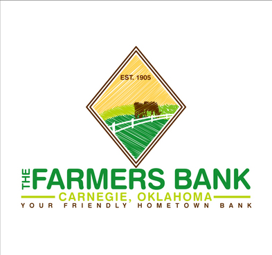
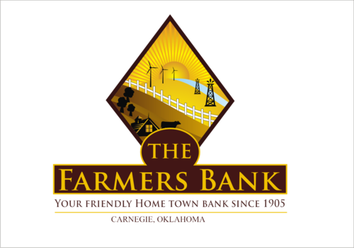
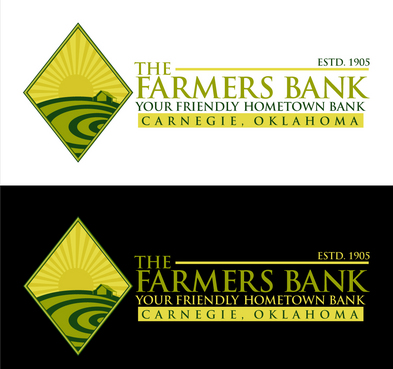
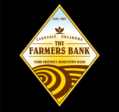
New Logo for 100 Year Old Bank!
The Farmers Bank
Your Friendly Hometown Bank
Yes
We are one of the largest independent banks in the midwest. Our customers are honest, small town, hard working people. Our main focus is the farming community. We are very old fashioned here but need a fresh take on our logo. Think....Farming, Wheat, Community, Strength!
We've always used a diamond shape in our design and would love to incorporate that some way.
Financial Services
Abstract Mark
![]()
Industry Oriented
Traditional
Local/Neighborhood
Black, Brown, White, Gold.....
not sure
Country is good
Related Contests


Comments
Project Holder
Project Holder
Project Holder
Project Holder
Project Holder
Project Holder
Project Holder
Project Holder
Project Holder
Project Holder