SALES / SUPPORT : +1-877-525-5646   |   Login


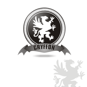
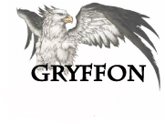
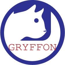
New company logo: Gryffon

Gryffon

Contest Holder Fabien ?

Last Logged in : 4818days18hrs ago

Concepts Submitted

207

Guaranteed Prize
400
Winner(s)

1

A Logo, Monogram, or Icon veildAll design entries can be viewed by other designers. Featured Featured Contest
tick_gray

Live Project

tick_gray

Deciding

tick_blue

Project Finalized


Project: New company logo: Gryffon
Industry: Engineering Logo
Contest Launched: Jul 28, 2011
Selected: 1 winning design from 207 concepts
Winning Design by: sergiulazin
Close Date: Aug 08, 2011


New company logo: Gryffon  - Engineering


Awarded as a winner
Project Report    

Sort by:


#41

#39

#38

#36

#23

#15

#13

#12

#10

#119

#104

#99

#98

#69

#50

#47

#46

#45

#44

#27

#26


Creative Brief


New company logo: Gryffon

Gryffon

Yes

Gryffon is a specialized company that proposes Industrial Rope Access (abseiling) with Non destructive testing of welds & other types of metal structural survey (I.e: Cargo oil tanker internal structural survey). There is a strong emphasis on safety management and technical expertise. Our services are proposed to multinational companies working in the Offshore, Oil & gas, Energy and Industrial construction sector. We are a young and dynamic companies with a open minded attitude, an “out of the box” approach to technical difficulties and a dynamic group of specialists. For other details refer to "additional suggestions".

Engineering

Character
Character


Modern
Industry Oriented
Illustrative
Masculine

Considering that we mainly work in Industry construction site certain color tones are not going to work.

not sure

The company name is inspired from a legendary animal called a “Griffon” (in French at least). Griffon: the head (and sometimes also the front legs) of an eagle coupled with the body of a lion, with wing and a snake tail.
Representation of a Gryffon that caught our attention: http://animewallpapers.lt/Fantasy/Fantasy-art-series/griffon-63550p.html
http://www.cours.fse.ulaval.ca/ten-20727/sitesdescours/000_8ete2002/potterharry/troisieme_tome.html#griffon (black & white drawing)

The logo must be inspired from the animal and the different physical attributes of the animal need to be identifiable as they embodies the rare type of multi skills services that we deliver, and the “airborn” aspect involves with rope working at height.

Related Contests


Logo for a mapping and data collection company
$200
Prize Money
82
Concepts
logo for an engineering consulting company
$400
Prize Money
537
Concepts
RSH Engineering and Construction
$200
Prize Money
409
Concepts
Modern logo for engineering company.
$300
Prize Money
181
Concepts

Discussion


Comments

  • August 05, 2011 9:01 AM
    SiteAdmin SiteAdmin
     
    Contest is extended for revisions.

    Like Icon 0   DislikeIcon 0
  • August 02, 2011 7:11 PM
    Fabien Fabien
      Project Holder
    We are impressed by the quality of the draft since yesterday but we ought to inform all participants that we have now set our mind to 1 particular designer concept and it is unlikely that we will change. So for respect of your work and the consideration for the time that you all have invested we advise you to "stand by" until further notice. I would also like to take the opportunity to apologize for not answering to several designers who asked me feed back. Due to limited time I had to provide direction to the favorite concept so that it could be developed 100%.

    Like Icon 0   DislikeIcon 0
  • August 02, 2011 3:19 AM
    Fabien Fabien
      Project Holder
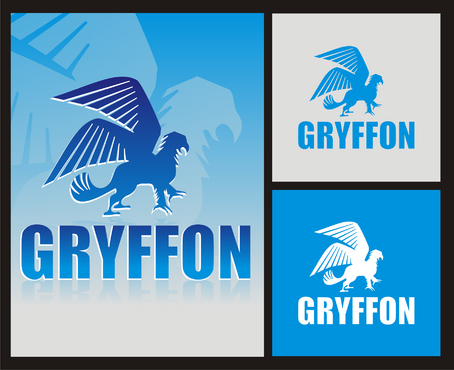
    Thanks to all the participating designers, the concept is taking shape and we are very excited about the final result. We are now starting to have a clear idea of what “specificities” we want our logo to have. With 2 days to go, this will ensure that designers save their time and energy for better result. Specific: Preference to “Uncolored” Griffon showing by contrast on a 2 blue ocean like color (1 dark, 1 clear) background. Using thin line for the animal outlines or to give it perspective. The background is of spherical style. But not with hard edges and closed as it make the logo look like a knight “blazon”. We want an open “environment” for the Griffon to “stand out” from, with slight outline effect like on concept # 73 & #82 so it renders the whole concept more dynamic. “Lighting” effect among 1 of the 2 background color is encouraged. We have not yet decided on a particular “griffon” drawing (proposed draft) yet but the closest that we can relate to is the provided reference in term of: Form & Poise (and the physical attributes. So the head is one of an eagle) We have not yet chosen if the griffon shall be “flat” or with “perspective”. But at the moment the preference goes for “perspective”. We propose 3 directions for further Griffon’s representation: Inspire from the Singha beer uploaded logo, or Stay in the same style as the initial griffon reference itself, or We have also uploaded a very interesting concept developed by an independent designer. It is a very modern drawing with potential for development for a bold designer. The animal is compact, fluid and offer an element of perspective. Down point is that the “eagle” head is not recognized by people… The body lacks character. It needs biffing up, with claws for instance… And perhaps the wing needs a little touch up. This last logo being so modern, it is perhaps not necessary to incorporate it in a 2 color background. Perhaps the 2 color code can be used to draw the animal itself. A bit more freedom there..

    Like Icon 0   DislikeIcon 0
  • August 01, 2011 11:42 PM
    designXtreme designXtreme
     
    Hi PH, Are you still looking at getting a Lion's face rather than a griffon which has a bird's face? Thanks,

    Like Icon 0   DislikeIcon 0
  • August 01, 2011 4:20 AM
    Fabien Fabien
      Project Holder
    #84 & 82 is opening the way to the 2 (or 3) colors system that we want, although we think more about 2 contrasted shades of the same color (I.e: blue). The "contrasted" uncolored griffon is also very interesting. It makes the animal "light" and gives an impression of volume to the logo that is really good. Only "down" point is that it is made with the griffon that we have provided. We would still prefer to have our unique drawing for the animal. But overall this concept is on target with what we are looking for.

    Like Icon 0   DislikeIcon 0
  • August 01, 2011 4:06 AM
    Fabien Fabien
      Project Holder
    I would like to thank all designers who have contributed to the project so far. This would not have evolved so much without everyone contribution. The concept is starting to take shape and those last days have been very productive. But also very challenging as we are trying to give you the best feed back so you can use your talents to the best result.

    Like Icon 0   DislikeIcon 0
  • July 30, 2011 8:03 PM
    Fabien Fabien
      Project Holder
    #62. Good work there too. This is a good attempt to re-styled the griffon and make it more modern.

    Like Icon 0   DislikeIcon 0
  • July 30, 2011 7:59 PM
    Fabien Fabien
      Project Holder
    #73 Great work there. Good colors and typo. Modern effect. There is some energy in this draft. We are not fixed on the particular drawing and sphere effect with the wings. But altogether this draft is showing the coherence and the character that we are seeking. I hope this comment help everyone. Keep going.

    Like Icon 0   DislikeIcon 0
  • July 30, 2011 5:40 AM
    Fabien Fabien
      Project Holder
    After some consideration we think that a much more modern and refined version of our Logo creature is more suited for our image. The griffon has always been associated with chivalry but we do not want to associate our company with this historical image or style. 2 documents have been uploaded in the project and I am not sure if designers can access to them. The image are the old and New logo of a multinational company that works in Oil & gas. Check out: http://exprogroup.com/ Or rather google: "Expro" and look for "images". You will surely find what logos I am referring at. Logo #1: Old "chivalry" style lion. Logo #2: Very refined corporate logo carrying a strong identity. This is the sort of style that we are seeking for our company logo. (But as a whole animal)

    Like Icon 0   DislikeIcon 0
  • July 30, 2011 5:24 AM
    Fabien Fabien
      Project Holder
    #35 so far it is the favorite design. Typo & color is on the right track. The griffon has a "younger" look and has some character associated with it. Good work on the wings showing some dynamic. But we need a design that is be more modern & more refined.

    Like Icon 0   DislikeIcon 0
  • July 29, 2011 6:41 PM
    designXtreme designXtreme
     
    Thanks a lot Fabien, Appreciate the feedback. Will have something soon.

    Like Icon 0   DislikeIcon 0
  • July 29, 2011 4:51 AM
    Fabien Fabien
      Project Holder
    Thank you all for the quick submission we appreciate your enthusiasm for our projects. We have been thinking about the logo for a while and have also hired designers. Our expectation are high as we think there is great potential with our logo's inspiration subject. So don't mind the low rating for now it will certainly improve as days go by. We would prefer a 1 to 3 color combination for the logo as opposed to back/grey/white combination that look impersonal and not lively. The logo shall display the 3 specific attributes of the "griffon": lion, wing and feather on the front legs. It is possible to replace the eagle head by a lion head as it brings more character to the logo.

    Like Icon 0   DislikeIcon 0