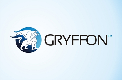
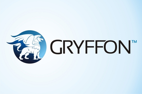
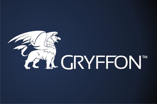
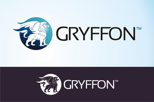
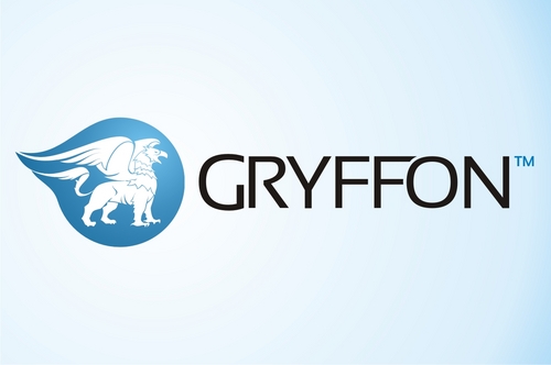
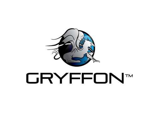
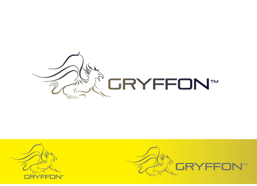
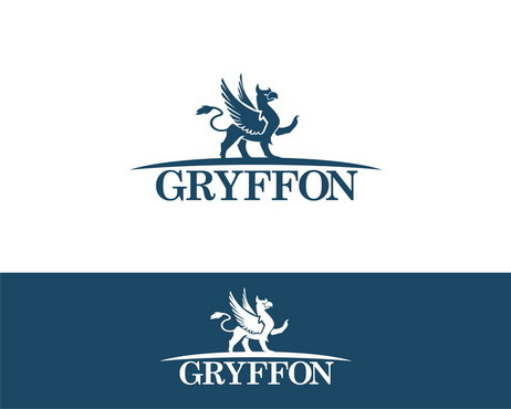
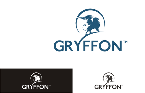
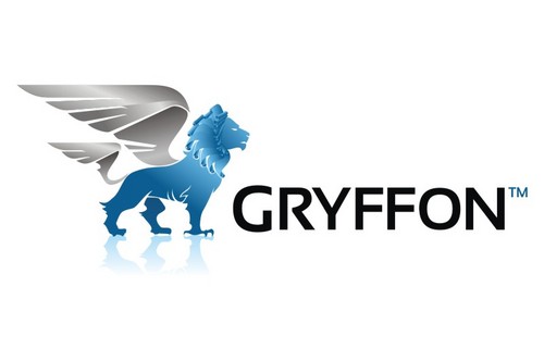
New company logo: Gryffon
Gryffon
|
Contest Holder
Fabien
?
Last Logged in : 5187days4hrs ago |
Concepts Submitted
207 |
Guaranteed Prize
400 |
Winner(s) | A Logo, Monogram, or Icon |
|
Live Project
Deciding
Project Finalized


Creative Brief
New company logo: Gryffon
Gryffon
Yes
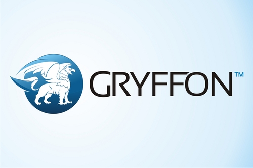
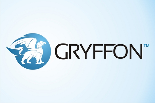
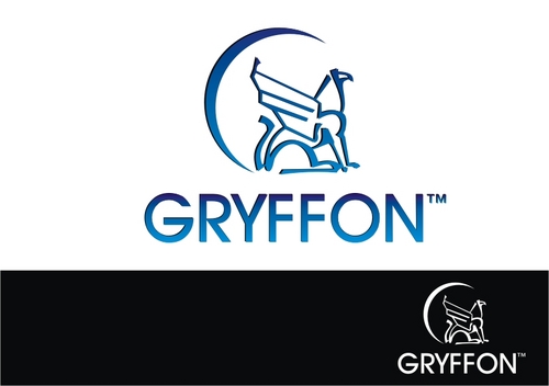
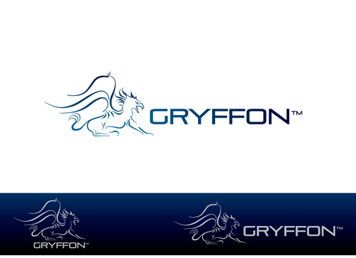
Gryffon is a specialized company that proposes Industrial Rope Access (abseiling) with Non destructive testing of welds & other types of metal structural survey (I.e: Cargo oil tanker internal structural survey). There is a strong emphasis on safety management and technical expertise. Our services are proposed to multinational companies working in the Offshore, Oil & gas, Energy and Industrial construction sector. We are a young and dynamic companies with a open minded attitude, an “out of the box” approach to technical difficulties and a dynamic group of specialists. For other details refer to "additional suggestions".
Engineering
Character
![]()
Modern
Industry Oriented
Illustrative
Masculine
Considering that we mainly work in Industry construction site certain color tones are not going to work.
not sure
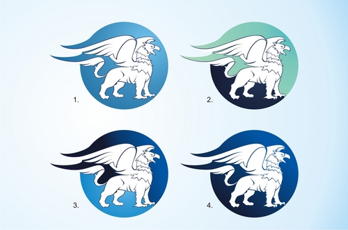
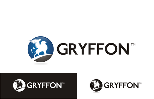
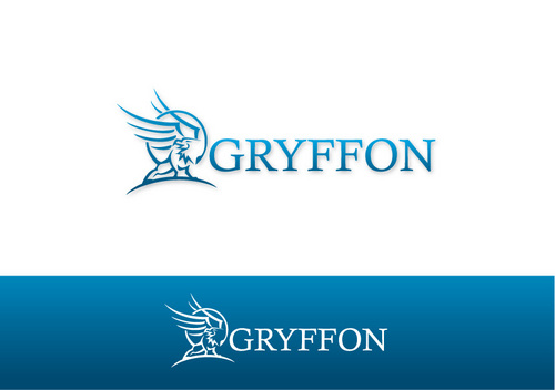
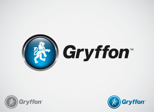
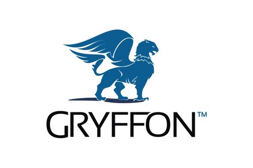
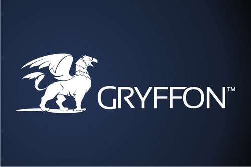
The company name is inspired from a legendary animal called a “Griffon” (in French at least). Griffon: the head (and sometimes also the front legs) of an eagle coupled with the body of a lion, with wing and a snake tail.
Representation of a Gryffon that caught our attention: http://animewallpapers.lt/Fantasy/Fantasy-art-series/griffon-63550p.html
http://www.cours.fse.ulaval.ca/ten-20727/sitesdescours/000_8ete2002/potterharry/troisieme_tome.html#griffon (black & white drawing)
The logo must be inspired from the animal and the different physical attributes of the animal need to be identifiable as they embodies the rare type of multi skills services that we deliver, and the “airborn” aspect involves with rope working at height.
Related Contests