SALES / SUPPORT : +1-877-525-5646   |  


modern logo for South Texas District

South Texas District UPCI

Contest Holder FirstChurch ?

Last Logged in : 4777days18hrs ago

Concepts Submitted

117

Guaranteed Prize
350
Winner(s)

1

A Logo, Monogram, or Icon veildAll design entries can be viewed by other designers. Featured Featured Contest
tick_gray

Live Project

tick_gray

Deciding

tick_blue

Project Finalized


Project: modern logo for South Texas Distr ...
Contest Launched: Aug 09, 2011
Selected: 1 winning design from 117 concepts
Winning Design by: room171
Close Date: Aug 16, 2011


modern logo for South Texas District - Religion and Spirituality


Awarded as a winner
Project Report    

Sort by:


#107

#104

#98

#93

#71

#70

#54

#35

#34

#31

#30

#16

#1

#4

#24

#9

#3

#2

#117

#116

#115

#113

#112

#110

#109

#108

#105

#103

#102


Creative Brief


modern logo for South Texas District

South Texas District UPCI

No

We are a religious organization that serves as a support and governing body for 300 churches in the Houston/Austin/San Antonio metro areas.

Religion and Spirituality

Abstract Mark
Abstract Mark


Cutting-Edge
Unique/Creative
Sophisticated
Modern

Combination of deep/rich colors and vibrant colors

not sure

We like the idea of using some element of the shape of the state of Texas, either through partial outline or a total map-like shape. However, this is not an absolute necessity. Feel free to experiment with any designs that come to mind.

We want it to feel very modern. You can also use a flame/fire element if you'd like. Again, not necessary, but a possibility.

We are open to any and all interpretations. We would like to stay away from traditional religious imagery however...no crosses, doves, etc. The organization is religious in nature, but serves just as much as a social organization.

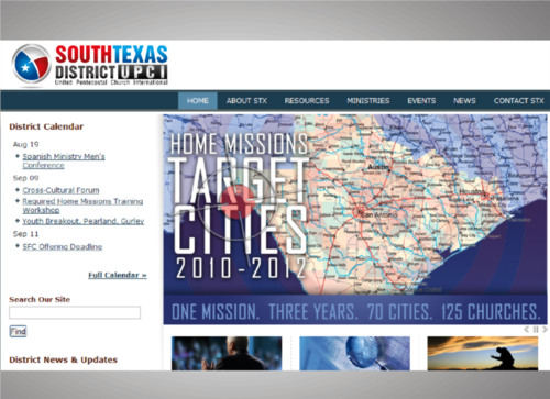
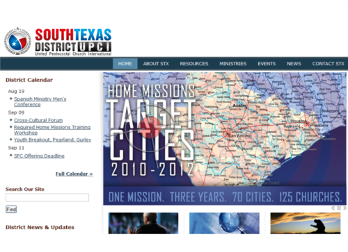
Visit stxupci.com to view the current logo. We would like to significantly update this logo. We are also moving forward with a website redesign in conjunction with the new branding.

As far as typography, we'd like "South Texas District" to be the primary visible text. "UPCI" which stands for United Pentecostal Church International, should be under or beside the primary text, much smaller.

Related Contests


Youth Evangelism Conference logo
$354
Prize Money
59
Concepts
Church Logo
$300
Prize Money
161
Concepts
Faith Reformed Church Logo
$200
Prize Money
116
Concepts
New Church Logo
$250
Prize Money
90
Concepts

Discussion


Comments

  • August 20, 2011 7:37 PM
    crizzyARTz crizzyARTz
     
    shariqssa your the best designer here..Congrats, I think your the winner here in this contest..GOod Luck

    Like Icon 0   DislikeIcon 0
  • August 16, 2011 10:33 AM
    shariqssa shariqssa
     
    My design is #100 ---- #101 \/ logozone design #106

    Like Icon 0   DislikeIcon 0
  • August 16, 2011 10:16 AM
    shariqssa shariqssa
     
    MY DESIGN IS #100 LOGOZONE DESIGN #106 what's wrong with you ?

    Like Icon 0   DislikeIcon 0
  • August 15, 2011 5:00 PM
    shariqssa shariqssa
     
    My #62 Even you copy my text composition ! Your #74

    Like Icon 0   DislikeIcon 0
  • August 15, 2011 4:55 PM
    shariqssa shariqssa
     
    Hey! bfourk My design is #34 & you copy my concept very bad #75 You are a good designer why doing this man ?

    Like Icon 0   DislikeIcon 0
  • August 14, 2011 6:46 PM
    FirstChurch FirstChurch
      Project Holder
    #45 Great design! Can you put the "South Texas" font of #44 into #45?

    Like Icon 0   DislikeIcon 0
  • August 13, 2011 7:40 PM
    shariqssa shariqssa
     
    Thank you for rating ! please identify if you want more improvement in this logo #31 Thankyou once again

    Like Icon 0   DislikeIcon 0
  • August 11, 2011 10:32 AM
    FirstChurch FirstChurch
      Project Holder
    #1 Love this! Can you experiment with a star shape or a flame shape in the state shape rather than the cross? We like the cross, we'd just like a couple of other options. (Love the style of the cross, if you could do a star or a flame in the same "hand drawn" style, I think it would be really nice. Also love the fonts.

    Like Icon 0   DislikeIcon 0
  • August 11, 2011 10:29 AM
    FirstChurch FirstChurch
      Project Holder
    #4 Can you experiment with a more contemporary font? (A nice bold sans serif, very standard). Also, can you take the top red quarter of texas and make it the same blue?? The bottom red actually closely defines our actual region.

    Like Icon 0   DislikeIcon 0
  • August 09, 2011 8:59 PM
    FirstChurch FirstChurch
      Project Holder
    Also, feel free to experiment with "STXD" as an abbreviation if you prefer to work with an initial-type logo.

    Like Icon 0   DislikeIcon 0