SALES / SUPPORT : +1-877-525-5646   |  


Logo for Youth Football

Logo for Youth Football

Contest Holder RollTide ?

Last Logged in : 4557days23hrs ago

Concepts Submitted

172

Guaranteed Prize
200
Winner(s)

1

A Logo, Monogram, or Icon veildAll design entries can be viewed by other designers.
tick_gray

Live Project

tick_gray

Deciding

tick_blue

Project Finalized


Project: Logo for Youth Football
Industry: Sports Logo
Contest Launched: Mar 01, 2012
Selected: 1 winning design from 172 concepts
Winning Design by: rezaray
Close Date: Mar 21, 2012


Logo for Youth Football - Sports


Awarded as a winner
Project Report    

Sort by:


#156

#158

#136

#134

#133

#130

#129

#101

#93

#92

#91

#90

#89

#88

#87

#71

#64

#155

#138

#137

#132

#128

#84

#83

#82

#63

#52

#49

#48


Creative Brief


Logo for Youth Football

Logo for Youth Football

No

Create a logo for Youth Football (American) for kids ranging from 6 to 14 years of age. The logo will serve as the identity and branding of our football website and must be original, athletic, simple and to the point. The design will be simple and easy for kids to remember, recognize, and associate with our website. We require an original, cutting edge, custom design. We do not want any “shields” or other “crests” designs. A silhouette of a football quarterback, running back, linebacker contained within or outside of the logo is desirable. We will automatically reject any logo clones, clipart logos, or logos including simple round/circle icons above the business. The logo must have very fine edges and not be rough (see the Jordan-1 and Soccer-5 logos). Please remember this logo is for American Football, not soccer, basketball, or baseball. The final logo must be provided in formats used on our website; clothing; letterhead; envelops; business cards; postcards; brochures; and other marketing and/or advertising materials. We will require several files of the final logo in numerous color formats. We may require final designs in both offensive (quarterback) and defensive (linebacker) formats. The final files must be provided in jpeg and vector file formats. High resolution jpegs are required as well. Association name: LowCountryFootball.

Sports

Symbolic
Symbolic

Abstract Mark
Abstract Mark

Illustrative
Illustrative

Character
Character


Cutting-Edge
Unique/Creative
Clean/Simple
Fun
Illustrative
Masculine
Youthful
Abstract
Geometric

Deep Red Background / White Blue / White / Red Black / White

2

CHARACTERISTICS / SYMBOLS
Football players / Silhouettes
Footballs
All-Stars
Stars
Champions
Aggressive

Related Contests


Spartan Karate Logo
$199
Prize Money
54
Concepts
Hip Logo for Running Website
$200
Prize Money
98
Concepts
Logo for apparel line
$250
Prize Money
273
Concepts
Icon for parachute piloting school
$200
Prize Money
68
Concepts

Discussion


Comments

  • March 15, 2012 10:07 PM
    RollTide RollTide
      Project Holder
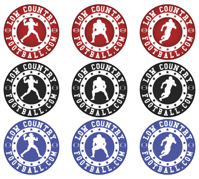
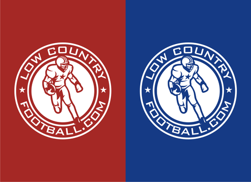
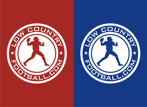
    #158: Add the 2 stars again. Also, fix the QB’s legs near his socks as requested. #155: Change the background back to red like #139. Also, insert the latest QB into the circle design #139.

    Like Icon 0   DislikeIcon 0
  • March 11, 2012 1:07 PM
    RollTide RollTide
      Project Holder
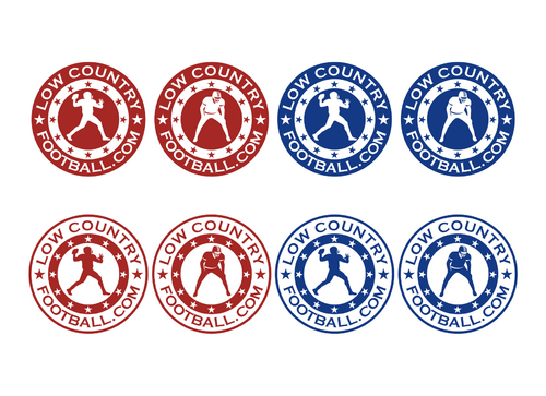
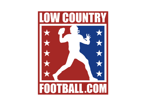
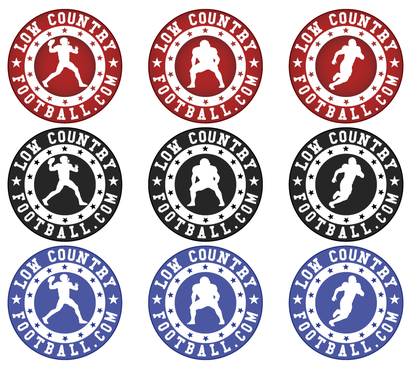
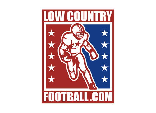
    #138: Decrease the size of the player to fit into the red background. We would also like to see this design with red to the left of the player and blue to the right of the player like in #134. #137: Make the QB fit in the red circle. #135: Remove the red borders around the players. #134/136: Can you decrease the size of the QB’s left hand? It looks very big right now. Change the font in ALL DESIGNS to the attached and notes we have recently provided. Use the font from #100, however, simply square off the “C” throughout.

    Like Icon 0   DislikeIcon 0
  • March 11, 2012 10:56 AM
    RollTide RollTide
      Project Holder
    Reza ray..please read the most recent comment.

    Like Icon 0   DislikeIcon 0
  • March 10, 2012 11:04 PM
    RollTide RollTide
      Project Holder
    Take the QB from #127 and insert him in #101 and #41. Thanks.

    Like Icon 0   DislikeIcon 0
  • March 10, 2012 10:52 PM
    RollTide RollTide
      Project Holder
    #127: Make the QB's non-throwing arm (left arm) larger love hospital other arm. You may have to move his hand away from his arm a little bit also. On the outer circle....replace the 2 star with footballs pointing horizontal. Thanks!

    Like Icon 0   DislikeIcon 0
  • March 10, 2012 10:26 AM
    RollTide RollTide
      Project Holder
    #116: Please make the QB fit inside to the red background. We'd also like to see another version with him larger and for his head to replace the star above it and his legs/feet replace the stars below them. Same with the defensive player. The QB's left arm looks very small compared to his right arm. Please alter this silhouette. Defensive player: Please add a wait "slash" effect or similar. Same thing with design #115.

    Like Icon 0   DislikeIcon 0
  • March 09, 2012 12:22 AM
    rezaray rezaray
     
    ok..will do.. thanks

    Like Icon 0   DislikeIcon 0
  • March 08, 2012 10:46 PM
    RollTide RollTide
      Project Holder
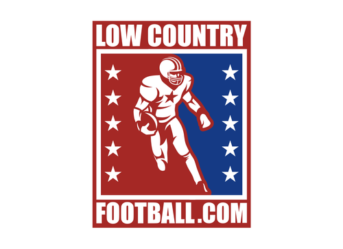
    Rezaray: We would love to see the QB from #105 used with the design from #64. Also, with the QB, can you define his facemask and the bars with the facemask better? Thanks.

    Like Icon 0   DislikeIcon 0
  • March 07, 2012 11:43 PM
    rezaray rezaray
     
    ok..will do.thanks

    Like Icon 0   DislikeIcon 0
  • March 07, 2012 11:40 PM
    RollTide RollTide
      Project Holder
    #88: The background star needs to be sharper, "pointier". It's too wide/fat right now.

    Like Icon 0   DislikeIcon 0
  • March 07, 2012 11:25 PM
    RollTide RollTide
      Project Holder
    #89: Please redesign with the white border around the players not so wide. #93: Please define the facemask like #84. Great work everyone! Keep it up!!! Best of luck.

    Like Icon 0   DislikeIcon 0
  • March 07, 2012 11:10 AM
    RollTide RollTide
      Project Holder
    *Note: Especially his left leg area.

    Like Icon 0   DislikeIcon 0
  • March 07, 2012 11:10 AM
    RollTide RollTide
      Project Holder
    Skovran-Thanks for creating a silhouette from the photo we provided. However, the outline is a little rough and needs to be smoother. Can you do this as well and make it look more like the examples we uploaded? Other designers are welcome to do the same. Thanks!

    Like Icon 0   DislikeIcon 0
  • March 07, 2012 10:31 AM
    RollTide RollTide
      Project Holder
    Skovran-I have requested designers NOT to remove ANY designs from this project. If you have an issue, please deal with me or logodesignguru, not the other designers. Rezaray-I disagree that you copied Skovran's design as you simply used the example LowCountryLacross that we uploaded. If you copied another design, so did Skovran. Your player is different and we want to see the design within this project again today.

    Like Icon 0   DislikeIcon 0
  • March 06, 2012 4:54 PM
    RollTide RollTide
      Project Holder
    Can anyone make a silhouette from the QB-Bama / QB-Bama-1 picture/pdf we have provided? This seems like it would make a good one.

    Like Icon 0   DislikeIcon 0
  • March 06, 2012 11:23 AM
    RollTide RollTide
      Project Holder
    Good new ideas and concepts. Designers, we are looking for player designs more like #52, #43, and #48/39. #48/39 is a different look which catches our eye. We like the stars in this design and in #43. #44-45: The football is turned sideways and we assume the ball is really in his other arm as that would be the normal look. We will have to think about this one for a few days as it might be TOO much for us. Not quite sure yet. #48 or #45: We would like to see this player in a design similar to the combination of #45 and #48. However, include Lowcountryfootball.com in the logo. #46-47 has too much going on and is almost cartoonish. Again, we want a simple, striking logo design. #45: We really like the simplicity of this logo but the player design needs some work. #43: We really like the simplicity of this logo but the QB player design needs work. We would also like to see Lowcountryfootball.com on the inner circle and the stars on the outside. Keep up the good work designers! And best of luck!

    Like Icon 0   DislikeIcon 0
  • March 05, 2012 9:24 PM
    RollTide RollTide
      Project Holder
    #36-40: Good designs but the player needs shoulder pads. Also, we would like to see his helmet with two stripes down the middle. #31: We need a silhouette, not a colored player. #33, 22, 16: We would like to see LOWCOUNTRY on the top of the circle, and FOOTBALL.COM on the bottom part of the circle. We are very impressed with the development of this logo. Keep up the good work. We look forward to seeing additional designs. Best of luck!

    Like Icon 0   DislikeIcon 0
  • March 04, 2012 7:50 PM
    RollTide RollTide
      Project Holder
    #27-29: You are going in the right direction. Good designs but the QB still needs a little work. We really appreciate and like the defensive player you have provided as well, which will be a secondary logo and should have the same look/feel as the primary logo. I will upload more information soon. Designers, please keep up the good work. We look forward to seeing more work. Best of luck!

    Like Icon 0   DislikeIcon 0
  • March 03, 2012 1:15 PM
    RollTide RollTide
      Project Holder
    Designers-Please do not withdraw your designs. The organization name is: LowCountryFootball.com. Please use this name with the logo. #3-11: The QB concept is good, however, we are not happy with this particular QB. His left arm is mainly hidden and we don't like the towel between his legs. Please incorporate LowCountryFootball.com instead of "Youth Football". #1: As per our description, please include all arms, legs, ball, etc... with the player. We look forward to seeing additional designs. Best of luck!

    Like Icon 0   DislikeIcon 0