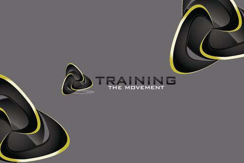
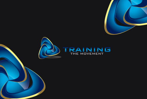
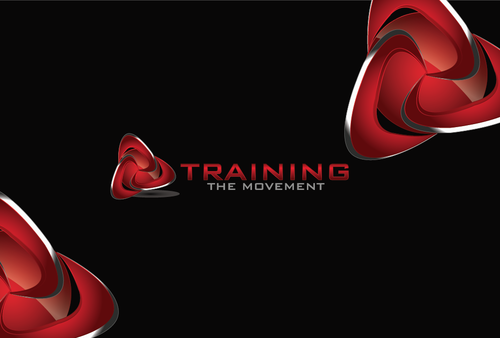
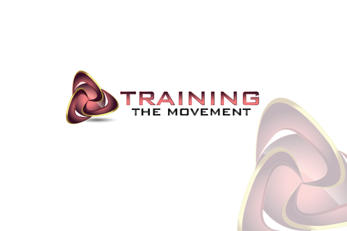
Logo for Functional Movement Specialist
Training the Movement
|
Contest Holder
copper
?
Last Logged in : 4015days6hrs ago |
Concepts Submitted
78 |
Guaranteed Prize
200 |
Winner(s) | A Logo, Monogram, or Icon |
|
Live Project
Deciding
Project Finalized

Creative Brief
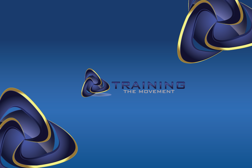
Logo for Functional Movement Specialist
Training the Movement
No
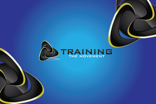
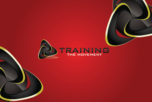
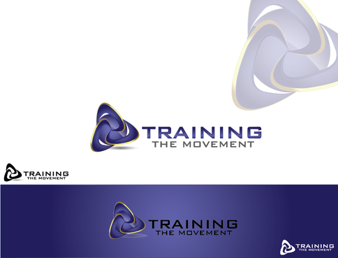
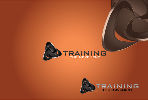
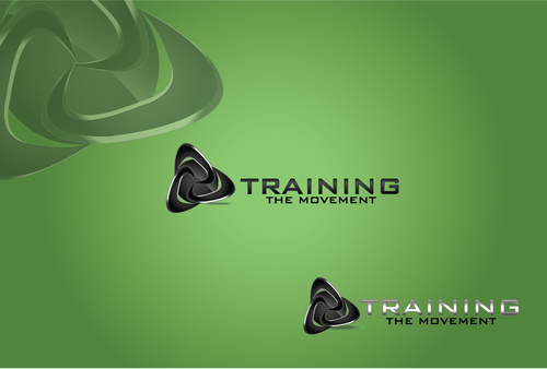
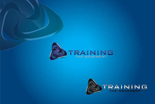
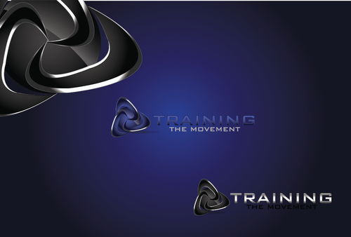
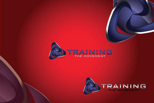
The logo represents a business that does Sport or Activity specific movement analysis. A customized treatment and exercise program is designed to provide more efficient and consistent performance throughout the movement. The logo should convey 3 Dimensional joint and muscle motion, the human connection between mind, body and spirit and the idea of kinetic chain reaction biomechanics (like a ripple effect) For example, if you stand still and turn your body in one direction there is an entire reaction of movement from the foot up to the head. This is chain reaction.
Health
Logo Type
![]()
Symbolic
![]()
Cutting-edge
Open to the artist's suggestions but thinking of red and black for the boldness or two shades of Blue??
2
I really like the Celtic symbols for the trinity and connectedness of mind, body and spirit. They are commonly 3 spirals interconnected or 3 intersecting loops forming a triangle.
Related Contests


