SALES / SUPPORT : +1-877-525-5646   |   Login


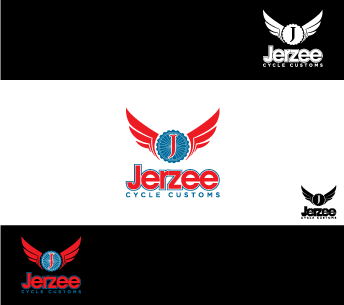
Logo for custom motorcycle shop.

Jerzee Cycle Customs

Contest Holder jerzeecycle ?

Last Logged in : 3761days15hrs ago

Concepts Submitted

57

Prize Money
300
Winner(s)

1

A Logo, Monogram, or Icon veildAll design entries are veiled from other designers till the end of the contest.
tick_gray

Live Project

tick_gray

Deciding

tick_blue

Project Finalized


Project: Logo for custom motorcycle shop.
Industry: Automotive Logo
Contest Launched: Jul 29, 2013
Selected: 1 winning design from 57 concepts
Winning Design by: mazyo2x
Close Date: Mar 13, 2014


Logo for custom motorcycle shop. - Automotive


Awarded as a winner
Project Report    

Sort by:


Creative Brief


Logo for custom motorcycle shop.

Jerzee Cycle Customs

No

A logo thats eye catching, simple, and stands out from other motorcycle businesses and has a focus on custom sport bikes.

Automotive


Masculine
Modern
Cutting-edge
Youthful
Simple

not sure

Related Contests


Expedite Project: auto care shop logo
$500
Prize Money
221
Concepts
Pre-Owned Automotive sales
$200
Prize Money
28
Concepts
Logo for an Automotive SMS/Chat Software Platform
$200
Prize Money
56
Concepts
S.AUTOMOBILES - Premium cars showroom / France, needs a new logo
$200
Prize Money
119
Concepts

Discussion


Comments

  • August 04, 2013 8:55 PM
    jerzeecycle jerzeecycle
      Project Holder
    Draft #48 - use the font style like #40. I think that's gonna look best.

    Like Icon 0   DislikeIcon 0
  • August 03, 2013 11:55 AM
    jerzeecycle jerzeecycle
      Project Holder
    Draft #18 - Im not liking the style of the font or the rpm gauge. This design can work but it has to be different, or its just going to look like every other motorsports logo out there.

    Like Icon 0   DislikeIcon 0
  • August 03, 2013 11:50 AM
    jerzeecycle jerzeecycle
      Project Holder
    Draft #19 #20 #21 - Not quite what Im looking for. Draft #22 #23 #24 #25 - Creative ideas, but they are better fit for a bicycle shop. Draft # 30 #31 #32 - I Like the colors and the lines. They style of motorcycle doesn't fit our business. We are more sportbike driven. Draft #26 #27 #28 #29 - It catches my eye at first, but at second glance I dislike, I don't know what it is. Draft #8 - Can I see this with the motorcycle in all black and white please...

    Like Icon 0   DislikeIcon 0
  • July 31, 2013 4:28 PM
    jerzeecycle jerzeecycle
      Project Holder
    Draft #13 - Looks a little better. Still not quite the eye catcher I was planning on. What can we add to either #13 or #8 to make it more attractive? I like em, but I feel they're very plain and too simple. Draft #15 - Looks good, but not the style bike we thrive on. Draft #16 - Nice, but not quite what im looking for.

    Like Icon 0   DislikeIcon 0
  • July 31, 2013 9:51 AM
    jerzeecycle jerzeecycle
      Project Holder
    Draft #8 #11 #12 - I like #8 the most, but I feel I've seen similar logos for a lot of the motorcycle industry. Just a long shot but for #12 would u be able to give the motorcycle a lowet stance and the rear wheel stretched further back? Draft #9 & #10 - I'm not a fan of the tribal at all, sorry.

    Like Icon 0   DislikeIcon 0
  • July 30, 2013 2:52 PM
    jerzeecycle jerzeecycle
      Project Holder
    Draft #6 - I really like the concept. Im just not liking the style of motorcycle the lettering turns out to be. It has a scooter/cruiser look. We are more sportbike driven.

    Like Icon 0   DislikeIcon 0
  • July 30, 2013 10:27 AM
    jerzeecycle jerzeecycle
      Project Holder
    Draft #5 - It looks like an image straight out of a clip art catalog. Id like to see more of a custom motorcycle image. I'm also, not liking the script font. Draft #4 and #3 - I like the concept, I like the way the letters are incorporated into the image. Very professional and simple. Just neither logo screams custom motorcycles. Draft #2 and #1 - I like the lettering. I like the abbreviated version but it is very complicated to make out. I would like to have a more image based logo then just lettering. Not a fan of the colors in #1.

    Like Icon 0   DislikeIcon 0
  • July 30, 2013 8:02 AM
    SiteAdmin SiteAdmin
     
    Attention Designers!! MycroBurst permits you to submit unlimited designs with unlimited variations. However, if you are providing 2 or 3 different color versions of the same logo in one draft, please make sure that if the particular draft gets finalized, each color version should be separated before you will send the final files. Thanks, MB/LDG/LS Team

    Like Icon 0   DislikeIcon 0
  • July 30, 2013 12:39 AM
    valiWORK valiWORK
     
    Hi! Feedback is welcomed

    Like Icon 0   DislikeIcon 0