SALES / SUPPORT : +1-877-525-5646   |   Login


Logo for church

East to West Ministry

Contest Holder jdwhy ?

Last Logged in : 3024days7hrs ago

Concepts Submitted

96

Guaranteed Prize
200
Winner(s)

1

A Logo, Monogram, or Icon veildAll design entries are veiled from other designers till the end of the contest. Featured Featured Contest
tick_gray

Live Project

tick_gray

Deciding

tick_blue

Project Finalized


Project: Logo for church
Contest Launched: Mar 02, 2016
Selected: 1 winning design from 96 concepts
Winning Design by: bilalali
Close Date: Mar 05, 2016


Logo for church - Religion and Spirituality


Awarded as a winner
Project Report    

Sort by:


#70

#68

#56

#44

#96

#95

#79

#78

#77

#76

#75

#74

#73

#72

#71

#69

#67

#66

#61


Creative Brief


Logo for church

East to West Ministry

Yes

We are refreshing our current logo as we have a new website.
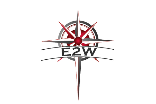
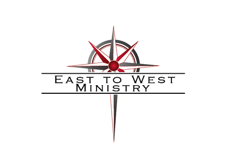
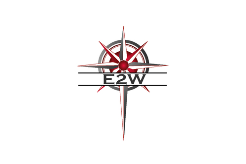
We have two versions of the logo, one with "East to West Ministry" and one logo with "E2W"
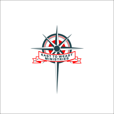
Please keep the compass/cross that is on the current logo. Please add a red or crimson color to the logo.
This is a ministry is for those underserved and disadvantaged in our community. We are not considered traditional.

Religion and Spirituality

Symbolic
Symbolic


Cutting-edge
Simple

Please add a red or crimson color to the current logo. Please be sure the logo will coordinate with the following colors some how: BDE66C 423D31 6EBD63 70BD64 23454D D4E3E6

2

Please keep in mind this is not a change in logo but a refresh by adding colors that will coordinate with our new website.
We would like to see colors added if possible, the current black and white logo is too plain. We do prefer a red added to the compass/cross but a red that coordinates with our preferred colors listed.

Related Contests


Logo for a women's church ministry
$200
Prize Money
43
Concepts
Faith Reformed Church Logo
$200
Prize Money
116
Concepts
Logo for Outreach Ministry
$200
Prize Money
75
Concepts
Logo for a Junior High Worship Camp
$209
Prize Money
56
Concepts

Discussion


Comments

  • March 03, 2016 3:07 PM
    jdwhy jdwhy
      Project Holder
    I like many of the designs, thank you for submitting them. On the East to West Ministry logos-try making the words on two lines, this current design seems too wide. What do you think would work? I like so many designers have used the colors they look good. I was wondering if the colors could come out more and the red be more of an accent maybe on the inside wheel of the compass at the center and one of the the thin outer circles? I hope that makes sense. Thank you again for your ideas.

    Like Icon 1   DislikeIcon 0
  • March 03, 2016 3:34 AM
    crossdesain crossdesain
     
    Dear CH, could you attach your current logo in high resolution format. Thank you.

    Like Icon 1   DislikeIcon 2