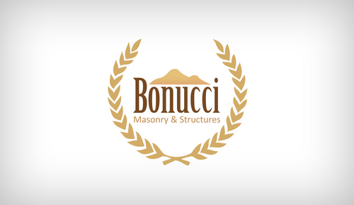
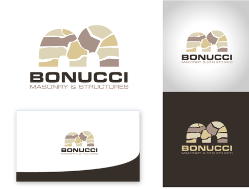
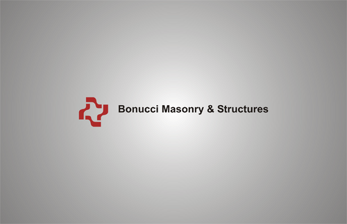
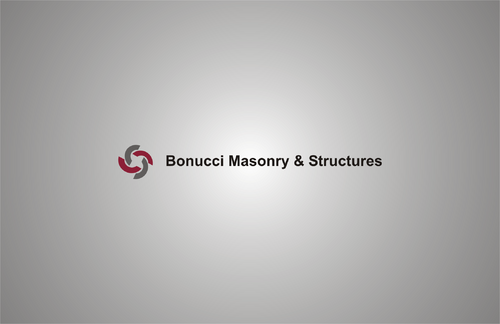
Logo for a stone masonry company
Bonucci Masonry & Structures
|
Contest Holder
177771
?
Last Logged in : 4635days7hrs ago |
Concepts Submitted
81 |
Guaranteed Prize
199 |
Winner(s) | A Logo, Monogram, or Icon |
|
Live Project
Deciding
Project Finalized

Creative Brief
Logo for a stone masonry company
Bonucci Masonry & Structures
No
This company is about hand crafted stone work. The company does patios, fireplaces, stone walls, pool house structures, stone columns and arches. The logo should represent old world charm or european flare. Logo should not be too definiative so it narrows our company image.
Construction
Logo Type
![]()
Symbolic
![]()
I don't want tans or greens.
not sure
Related Contests


