SALES / SUPPORT : +1-877-525-5646   |   Login


Logo for a live entertainment show

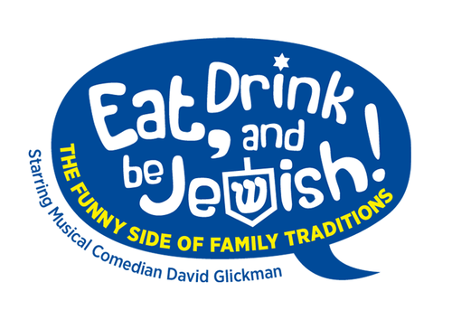
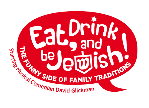
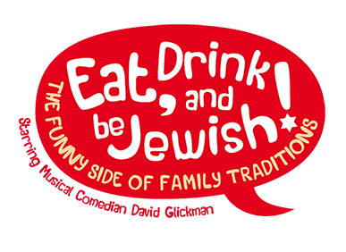
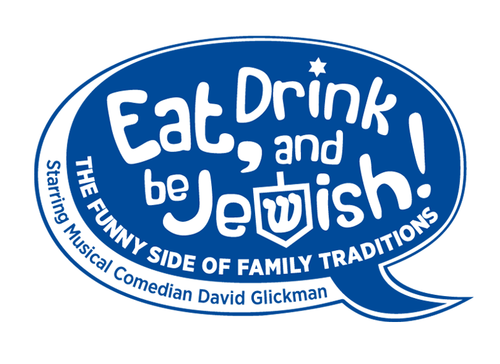
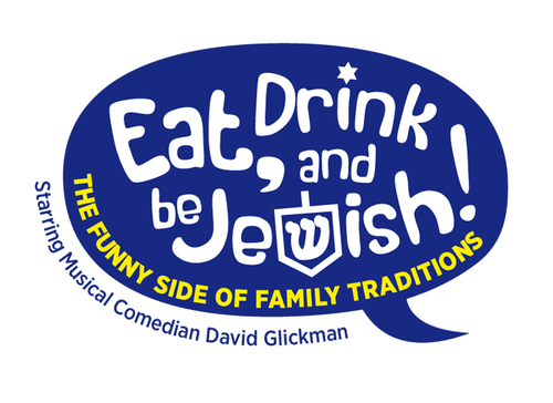
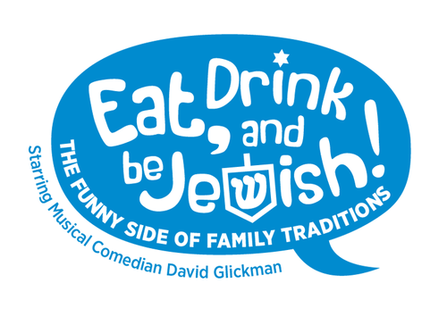
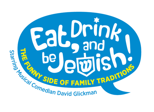
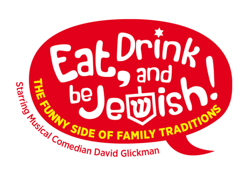
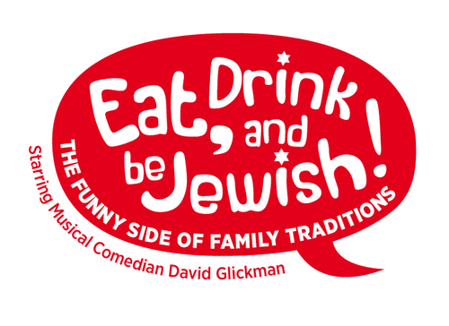
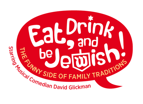
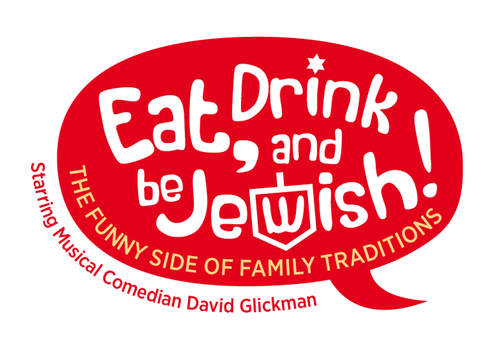
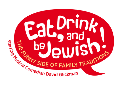
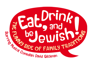
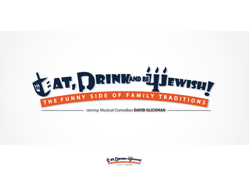
Eat, Drink and Be Jewish! The Funny Side of Family Traditions

Contest Holder glickshtick ?

Last Logged in : 1574days18hrs ago

Concepts Submitted

82

Guaranteed Prize
350
Winner(s)

1

A Logo, Monogram, or Icon veildAll design entries are veiled from other designers till the end of the contest. Featured Featured Contest
tick_gray

Live Project

tick_gray

Deciding

tick_blue

Project Finalized


Project: Logo for a live entertainment sho ...
Industry: Entertainment Logo
Contest Launched: Aug 19, 2013
Selected: 1 winning design from 82 concepts
Winning Design by: alcoholix
Close Date: Aug 30, 2013


Logo for a live entertainment show - Entertainment


Awarded as a winner
Project Report    

Sort by:


#79

#80

#78

#72

#60

#59

#37

#17

#77

#73

#71

#70

#69

#68

#48

#47

#46

#45

#44

#43

#42

#36

#31

#30

#29

#28

#26

#15


Creative Brief


Logo for a live entertainment show

Eat, Drink and Be Jewish! The Funny Side of Family Traditions

Starring Musical Comedian David Glickman

Yes

I am a professional comedian who specializes in several 'niche' shows. This is one of the shows I offer for a specific audience. It is a musical comedy show that is primarily geared to Jewish audiences in the US. It is not geared so much for the religious aspects of the religion, but more so for the cultural aspects of the religion. You can look at my current site, www.JewishComedian.com, and you will see what the show is like. That site is promoting the show under its old name--this new logo will promote the show under its new name--but the show will be very similar.

"Eat, Drink and Be Jewish!" is the primary name of the show. "The Funny Side of Family Traditions" is like the sub-title of the show, so should not be as prominent as the primary name. And the tagline "Starring Musical Comedian David Glickman" is the least important element of the logo. The tagline can be separate from the logo--it doesn't have to be attached.

I do like the logo for the old show very much, so don't be afraid to use ideas from that to inspire you for this project.

The logo should convey that the show is fun, funny, exciting, and possibly with graphic elements that represent Jewish culture. However, the logo should not be too heavy into the Jewish symbolism that it alienates audience members from other religions from wanting to see it. Even though the primary audience is Jewish, the show also appeals to non-Jews, as well.

Entertainment

Symbolic
Symbolic

Illustrative
Illustrative

Web 2.0
Web 2.0


Modern
Elaborate
Professional

I like more of the primary colors--blue, green, red, white, black. I also like purple and teal. I don't like browns, or muted colors.

not sure

Related Contests


Revamping logo for a international film distribution company
$200
Prize Money
102
Concepts
Logo for a Digital Animation and Visual Effects Company
$200
Prize Money
115
Concepts
Sophisticated logo for a gospel choir competition
$200
Prize Money
39
Concepts
Elegant Logo for a Prfessional Disc Jockey Company
$200
Prize Money
124
Concepts

Discussion


Comments

  • August 23, 2013 8:30 PM
    glickshtick glickshtick
      Project Holder
    Hi Designers! Just a thought that I didn't include in the brief. If you're considering images or graphics or symbols to incorporate into the logo, here a few suggestions: 1. A dreidel (That is the spinning top you see on my current logo. It is used during Hanukah.) 2. A bagel. (A food that is very popular in the Jewish religion.) 3. A wine glass. (Can be 'glass' or 'silver'. You can find images if you search 'Kiddish cup'.) 4. A piece of matzah or a box of matzah (This is the flat cracker-like bread that is eaten at Passover.) 5. A menorah. (This is the candelabra that is used at Hanukah.) 6. A torah scroll. (This is an image that is also on my current logo.) 7. A Jewish star. (Also called a 'star of David'.) These are just a few that come to mind. If you do an 'images search' for any of these, you'll see what they look like. BUT please know that you don't have to use any of these at all! The winning design may end up with no graphics or symbols and just be a great way of displaying the words. But I wanted to give you some additional ideas, if it would help you. Thanks! David

    Like Icon 0   DislikeIcon 0
  • August 20, 2013 8:09 AM
    SiteAdmin SiteAdmin
     
    Attention Designers!! MycroBurst permits you to submit unlimited designs with unlimited variations. However, if you are providing 2 or 3 different color versions of the same logo in one draft, please make sure that if the particular draft gets finalized, each color version should be separated before you will send the final files. Thanks, MB/LDG/LS Team

    Like Icon 0   DislikeIcon 0