SALES / SUPPORT : +1-877-525-5646   |   Login


Logo for a city political campaign.

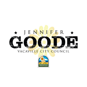
Jennifer Goode, Vacaville City Council

Contest Holder Splitgrey ?

Last Logged in : 3757days2hrs ago

Concepts Submitted

94

Guaranteed Prize
300
Winner(s)

1

A Logo, Monogram, or Icon veildAll design entries are veiled from other designers till the end of the contest. Featured Featured Contest
tick_gray

Live Project

tick_gray

Deciding

tick_blue

Project Finalized


Project: Logo for a city political campaig ...
Industry: Government Logo
Contest Launched: May 03, 2014
Selected: 1 winning design from 94 concepts
Winning Design by: Meganovsky85
Close Date: May 12, 2014


Logo for a city political campaign. - Government


Awarded as a winner
Project Report    

Sort by:


#57

#56

#55

#54

#53

#52

#51

#49


Creative Brief


Logo for a city political campaign.

Jennifer Goode, Vacaville City Council

No

Logo revision for popular candidate with strong public safety backing. Candidate is younger female and brings a fresh perspective and vision, but logo needs to balance that with maturity and tradition. A simplistic, streamlined logo is preferred.

Government

Abstract Mark
Abstract Mark

Illustrative
Illustrative


Cutting-edge
Sophisticated
Professional

Because of the strong public safety backing, logo should be within the blue color palate. Open to accent color.

2

Included will be two files. One file includes the candidates logo currently being utilized in existing print materials. The new, revised logo being created needs to complement the existing logo as we still want it to be recognizable.

The second file is the actual logo design for the city the candidate is running for. This logo is quite antiquated. That said, I would like to see some elements(i.e. hills) from the city logo updated and integrated into the revised candidates logo. Almost on a subliminal level.

If you would like to use a 'G' from the candidates last name as the surround for the logo, perhaps that could work as well(i.e. the Obama logo). We will be quite responsive in the design process and happy to answer any questions promptly.

Related Contests


Logo for Historic Southern City
$400
Prize Money
141
Concepts
NC Senate Candidate Campaign Logo
$320
Prize Money
49
Concepts
Johnson for New Jersey
$260
Prize Money
55
Concepts
	Logo & Stationary Design for Messia Associates, LLC
$250
Prize Money
49
Concepts

Discussion


Comments

  • May 06, 2014 4:13 PM
    Splitgrey Splitgrey
     
    Designers, hello and thank you all for your submissions!! It is clear that there is quite a bit of talent out there and we appreciate all of the entries. After viewing the many different styles of logos that have been submitted, we can start narrowing down to a specific concept. The most liked styles thus far have been logos that have these qualities: 1) Retained a similar font and feel of the original "Jennifer Goode, Vacaville City Council" logo. But yet added some flair like a light gradient across the letters. 2) The logo has an illustrated icon that can go both to the left of the text and/or above the text. 3) The icon has a unique feel that embodies a 'fresh perspective.' The icon shape seems nice when it's circular or square. 4) Fluid lines seem nice in the icon 5) Colors with gradients seem favorable 6) Icons with the hills and the sun seem to be favored as well, BUT NOT AN EXACT REPLICA. Thankyou again everyone for your efforts!

    Like Icon 0   DislikeIcon 0
  • May 04, 2014 2:03 PM
    Splitgrey Splitgrey
     
    Thank you for the submissions, thus far. Here is some feedback after review: We are open to more creative liberty with the design. The most important elements are being able to read the last name: 'Goode' and relating that to the position: 'Vacaville City Council.' If you choose to incorporate elements of the City's logo (not required), we prefer them to be more interpretive or impressionist (softer, more fluid lines, gradients), and less a copy of that logo to avoid any copyright issues, referring to the sun rays in Design #2 and #3. The rolling hills are indicative of the geography of the City. The accent colors of yellow and gold are nice, but we're concerned about losing them if used on a white background during print. For example, in Design #1, the position title gets lost on the white background, and is difficult to read. Have fun with this and don't be afraid to take more liberties - think fresh, new, sophisticated. The design of the last name needs to be the only element that complements the old/existing campaign logo - we just need it to be recognizable.

    Like Icon 0   DislikeIcon 0