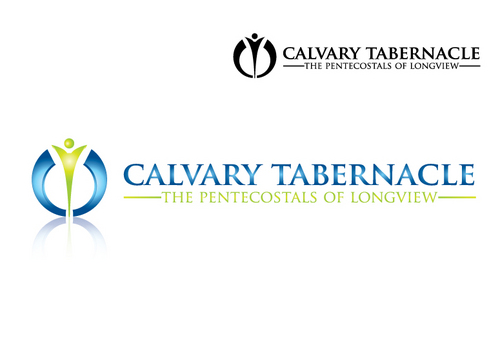
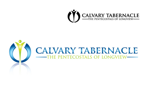
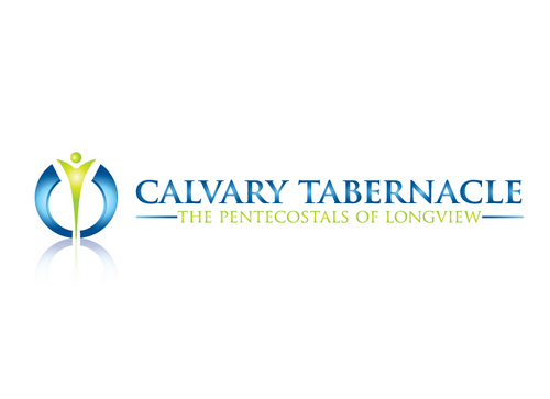
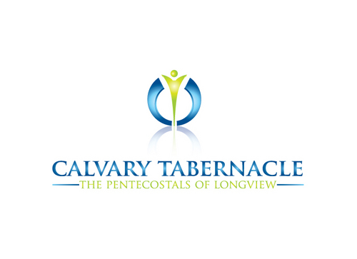
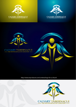
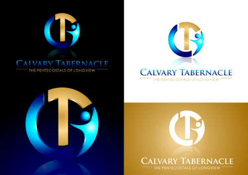
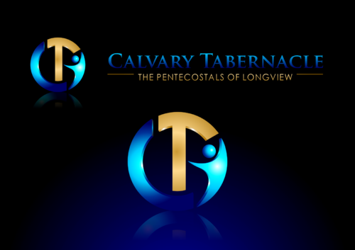
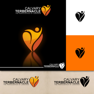
Logo for a church
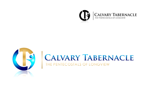
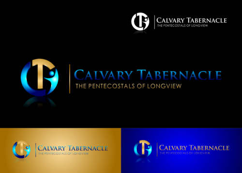
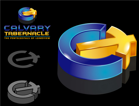
Calvary Tabernacle
|
Contest Holder
Charlesct
?
Last Logged in : 4106days21hrs ago |
Concepts Submitted
545 |
Guaranteed Prize
500
|
Winner(s) | A Logo, Monogram, or Icon |
|
Live Project
Deciding
Project Finalized
Ended
Contest Holder has withdrawn the contest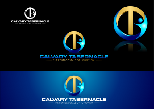

Creative Brief
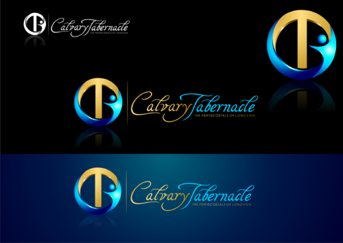
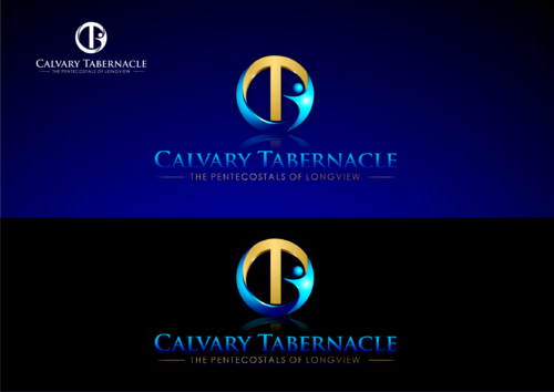
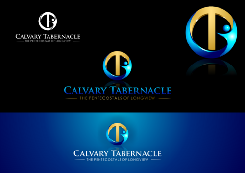
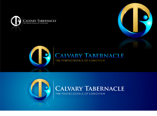
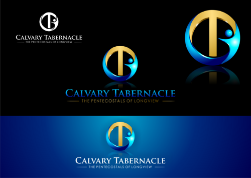
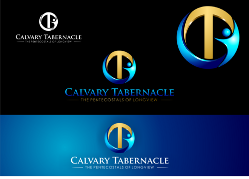
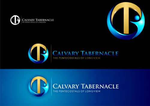
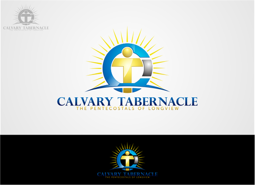
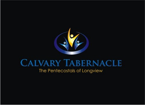
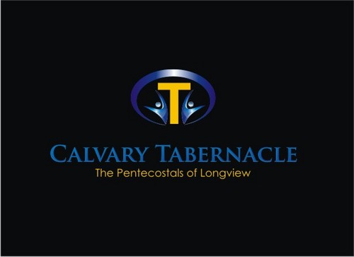
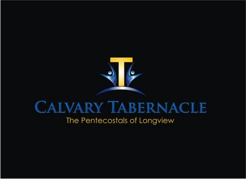
Logo for a church
Calvary Tabernacle
The Pentecostals of Longview
Yes
Logo for letterhead, sign, website, etc
Religion and Spirituality
Logo Type
![]()
Symbolic
![]()
Abstract Mark
![]()
Initials
![]()
Illustrative
![]()
Character
![]()
Web 2.0
![]()
Cutting-Edge
Unique/Creative
Clean/Simple
Sophisticated
Primary
3
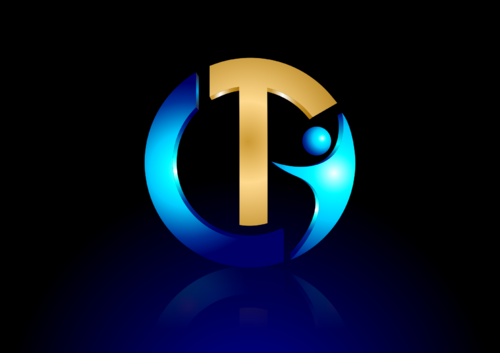
I need a logo that can stand alone -- it can use the "CT," a cross on a hill, or any combination, as long as it portrays life, hope, health, inspiration. Please, don't use any crescents or clip art. The font used in "Calvary Tabernacle" should be modern, progressive, but not sterile and scientific. Also, I would like the name/font to have a couple of colors, possibly a mirrored effect, and a unique design that can stand separately from the logo, and clearly reflect work that was done professionally, which should be clear that I could not have done myself. If using the name "Calvary Christian Tabernacle" allows for better designs, feel free to use it.
If it helps to have a TAGLINE, you can use the following:
"The Pentecostals of Longview" but not necessary.
Comments
Project Holder
Project Holder
Project Holder
Project Holder
Project Holder
Project Holder
Project Holder
Project Holder
Project Holder
Project Holder
Project Holder
Project Holder