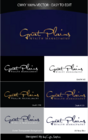
Logo Design for Financial Planner
LifePlan Financial Design, Inc.
|
Contest Holder
lifeplan
?
Last Logged in : 5152days8hrs ago |
Concepts Submitted
207 |
Guaranteed Prize
300 |
Winner(s) | A Logo, Monogram, or Icon |
|
Live Project
Deciding
Project Finalized


Creative Brief
Logo Design for Financial Planner
LifePlan Financial Design, Inc.
Preservation Specialists
Yes
We are a small financial advisory business.
We work solely with retirees who want to secure their assets.
We want to provide safety, security and peace of mind in retirement through the products we offer.
Financial Services
Symbolic
![]()
Initials
![]()
Clean/Simple
Sophisticated
Corporate
Industry Oriented
Local/Neighborhood
Something that works with Blue. Or, Gold.
2
Please note: LifePlan is one word. I prefer Cap letters vs. lowercase. The word "LifePlan" should be the main word in the logo. The rest of the business name "...Financial Design, Inc." can be incorporated in small letters.
Please explore use of the "L" and the "P" Initial.
Or, An image such as "CuteCindy"'s work on the Brandon Insurance Project. I liked the use of the road into the horizon.
A local designer is telling me the L&P cannot be used together in a logo..."it's too hard." Please prove them wrong! :)
Related Contests


Comments
Project Holder
Project Holder
Project Holder
Project Holder
Project Holder
Project Holder
Project Holder
Project Holder
Project Holder
Project Holder
Project Holder
Project Holder
Project Holder
Project Holder
Project Holder
Project Holder
Project Holder