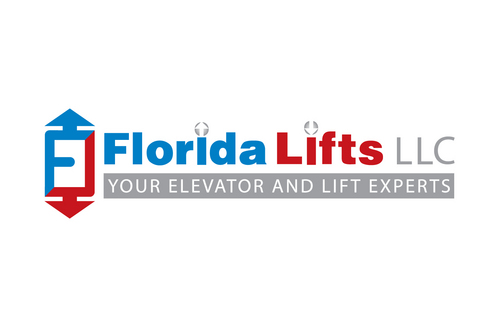
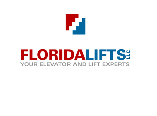
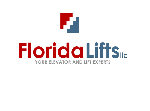
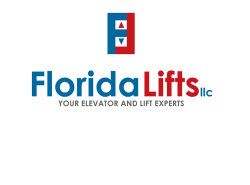
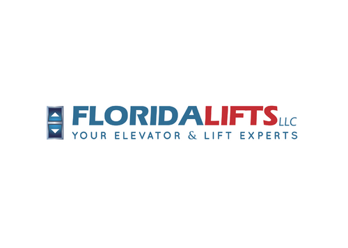
Logo design for a Florida elevator and lift company
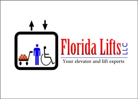
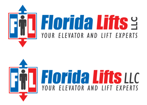
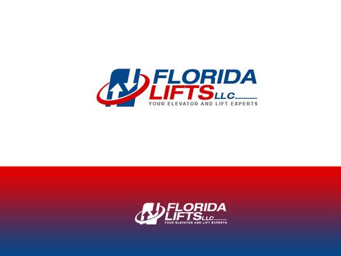
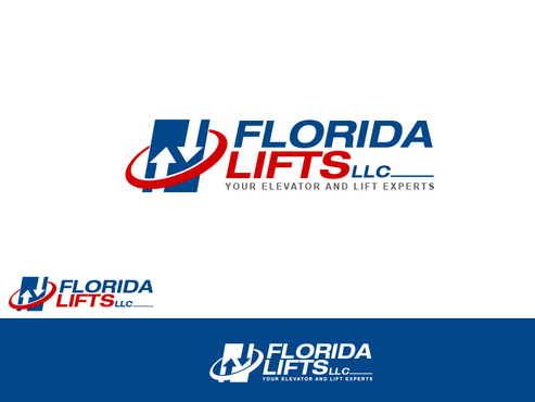
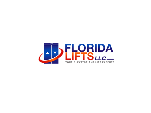
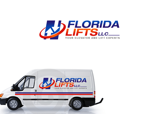
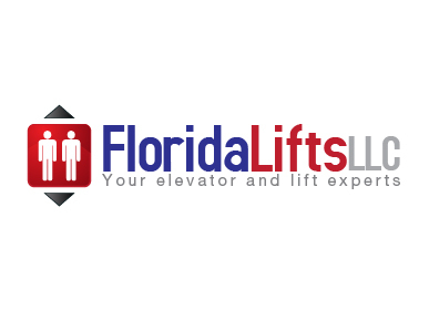
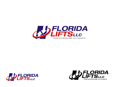
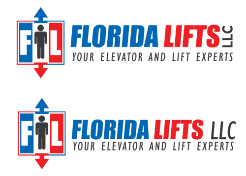
Florida Lifts LLC
|
Contest Holder
EleLift
?
Last Logged in : 5192days14hrs ago |
Concepts Submitted
304 |
Guaranteed Prize
550
|
Winner(s) | A Logo, Monogram, or Icon |
|
Live Project
Deciding
Project Finalized


Creative Brief
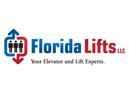
Logo design for a Florida elevator and lift company
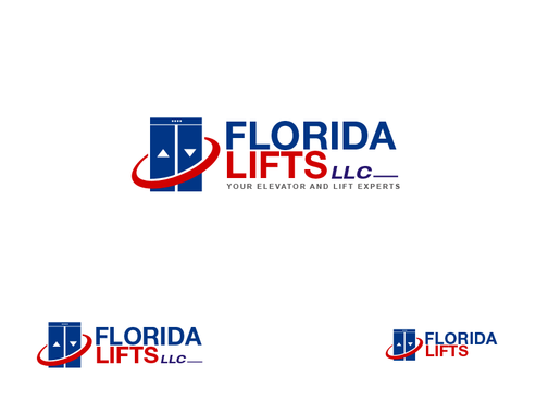
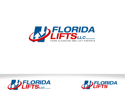
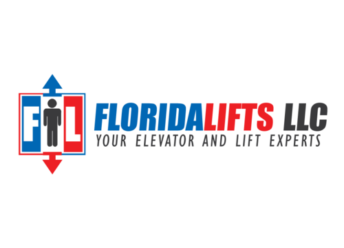
Florida Lifts LLC
Your elevator and lift experts
Yes
Our company sells, installs and services commercial
and residential elevators, wheelchair lifts, stair
chairs, dumbwaiters and material lifts.
Construction
Abstract Mark
![]()
Clean/Simple
Sophisticated
Industry Oriented
Illustrative
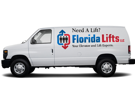
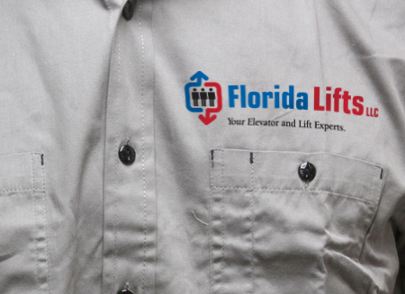
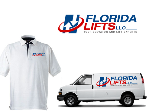
We like reds and blues.The logo will be used on a lot of white backgrounds (our trucks, and stationary) but our work shirts are grey so it must appear clear against that background as well.
not sure
We would like to see the logo with and without the
tag line. I would also ask that the files be
provided in as many formats as possible. (jpg, png,
bmp, gif) etc.
Related Contests


Comments
Project Holder
Project Holder
Project Holder
Project Holder
Project Holder
Project Holder
Project Holder
Project Holder
Project Holder
Project Holder
Project Holder
Project Holder